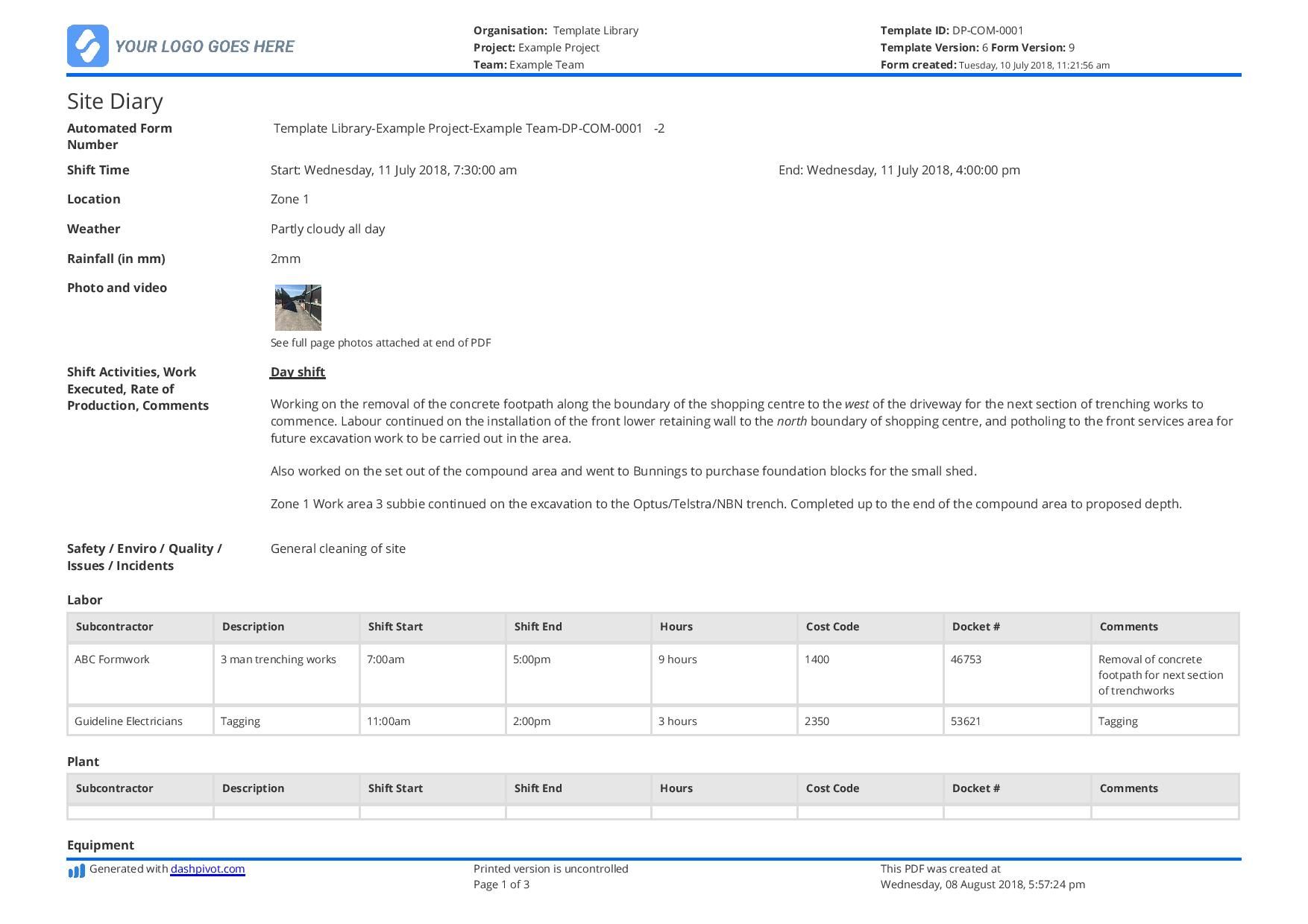
M E Report Template is the cornerstone of transparent, data‑driven decision‑making for any development or monitoring project, and getting it right can mean the difference between a program that learns and improves and one that stalls under vague assumptions. In this article we’ll unpack why a solid template matters, break down every essential component, walk through a step‑by‑step filling process, and share practical tips that keep your reports clear, actionable, and stakeholder‑friendly.
Why Every Project Needs a Robust M E Report Template

Monitoring and Evaluation (M&E) is not just a bureaucratic checkbox; it is the feedback loop that fuels continuous improvement. A well‑crafted template standardizes how data is captured, analyzed, and communicated, ensuring consistency across reporting cycles, teams, and geographic locations. Consistency reduces the time spent re‑formatting information, minimizes errors, and makes it easier for senior managers, donors, and field staff to compare performance over time. Moreover, a template that aligns with donor requirements and internal policies protects your organization from compliance risks while showcasing impact in a compelling narrative.
Core Components of an Effective M E Report Template
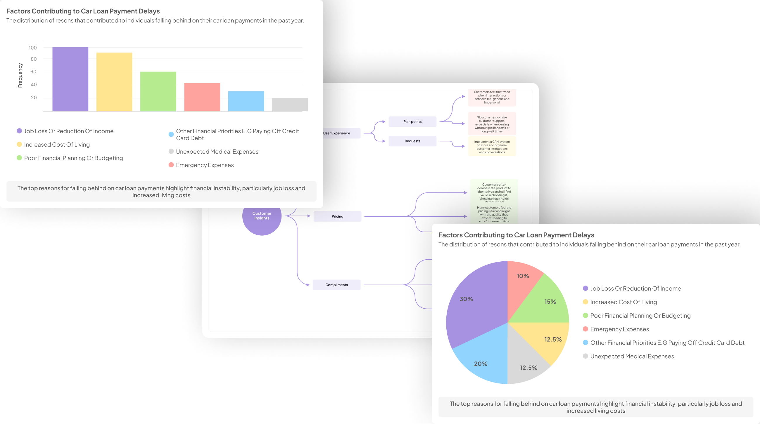
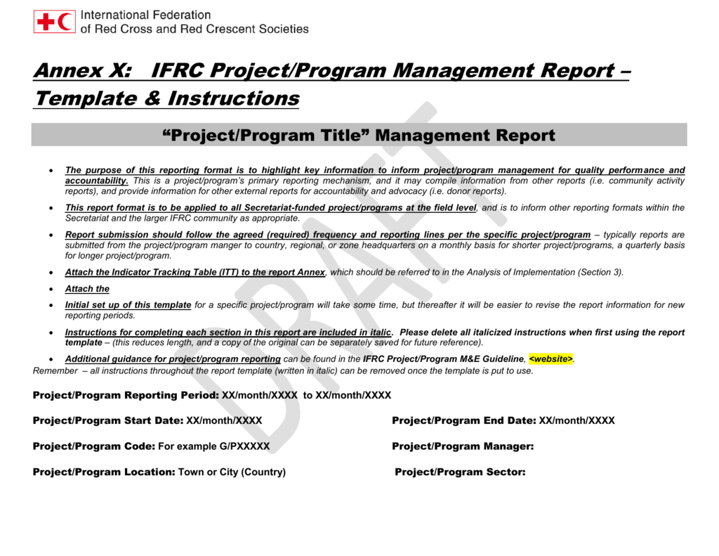
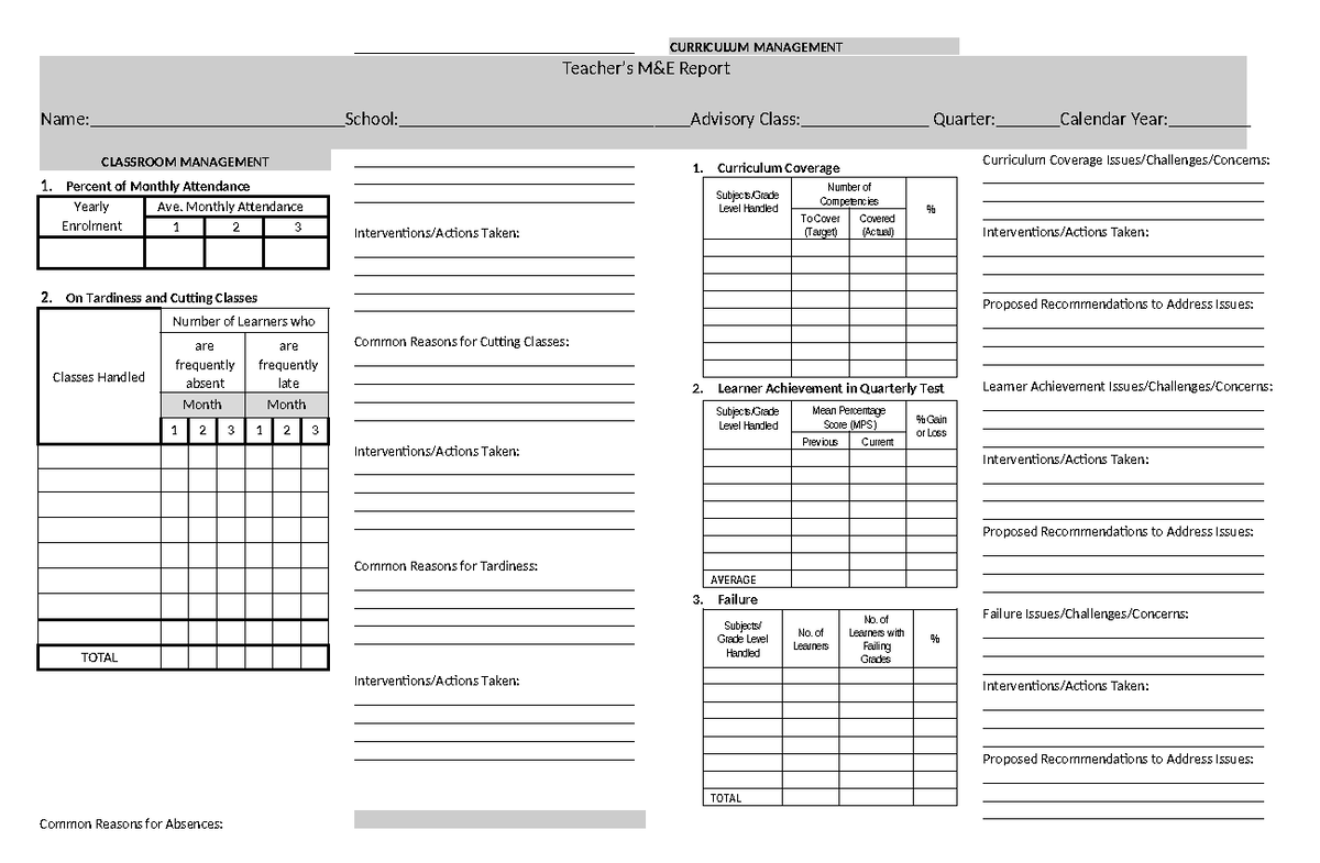
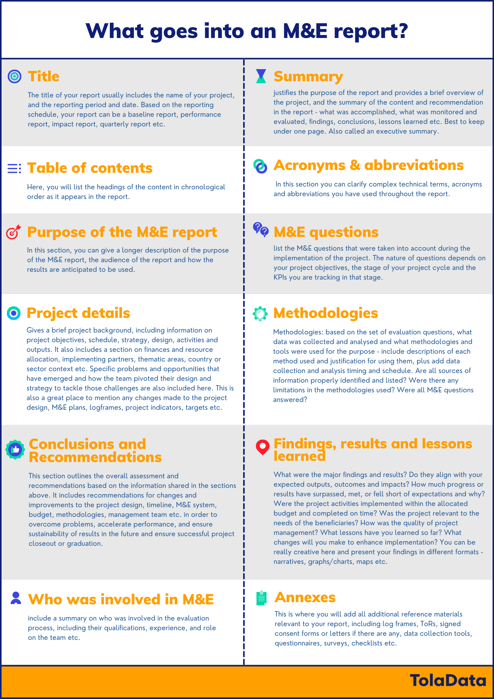
Think of the template as a modular toolkit. Each module serves a specific purpose, and together they create a cohesive story about what was planned, what happened, why it happened, and what comes next. Below we detail the seven core sections that should appear in every high‑quality M&E report.
Executive Summary
The executive summary is the “elevator pitch” of your report. In 150‑200 words, it should highlight key findings, major successes, critical challenges, and top‑line recommendations. Use bullet points for quick scanning, and always place the most important metric—such as the percentage change in target indicator—at the very beginning. This section allows busy executives to grasp the gist without digging into the details.
Project Objectives and Indicators
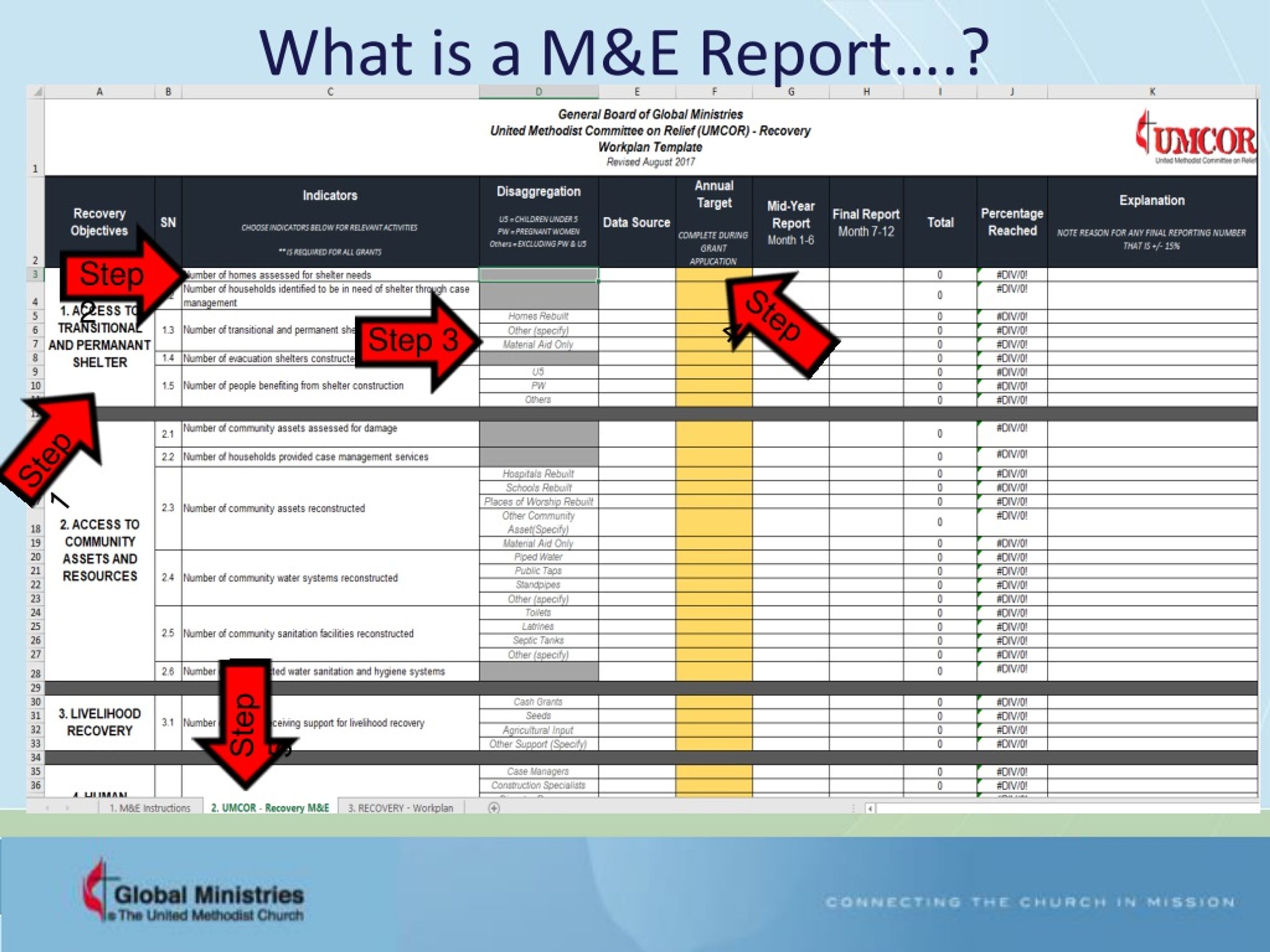
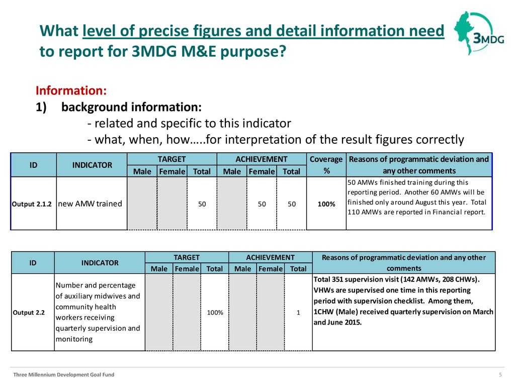
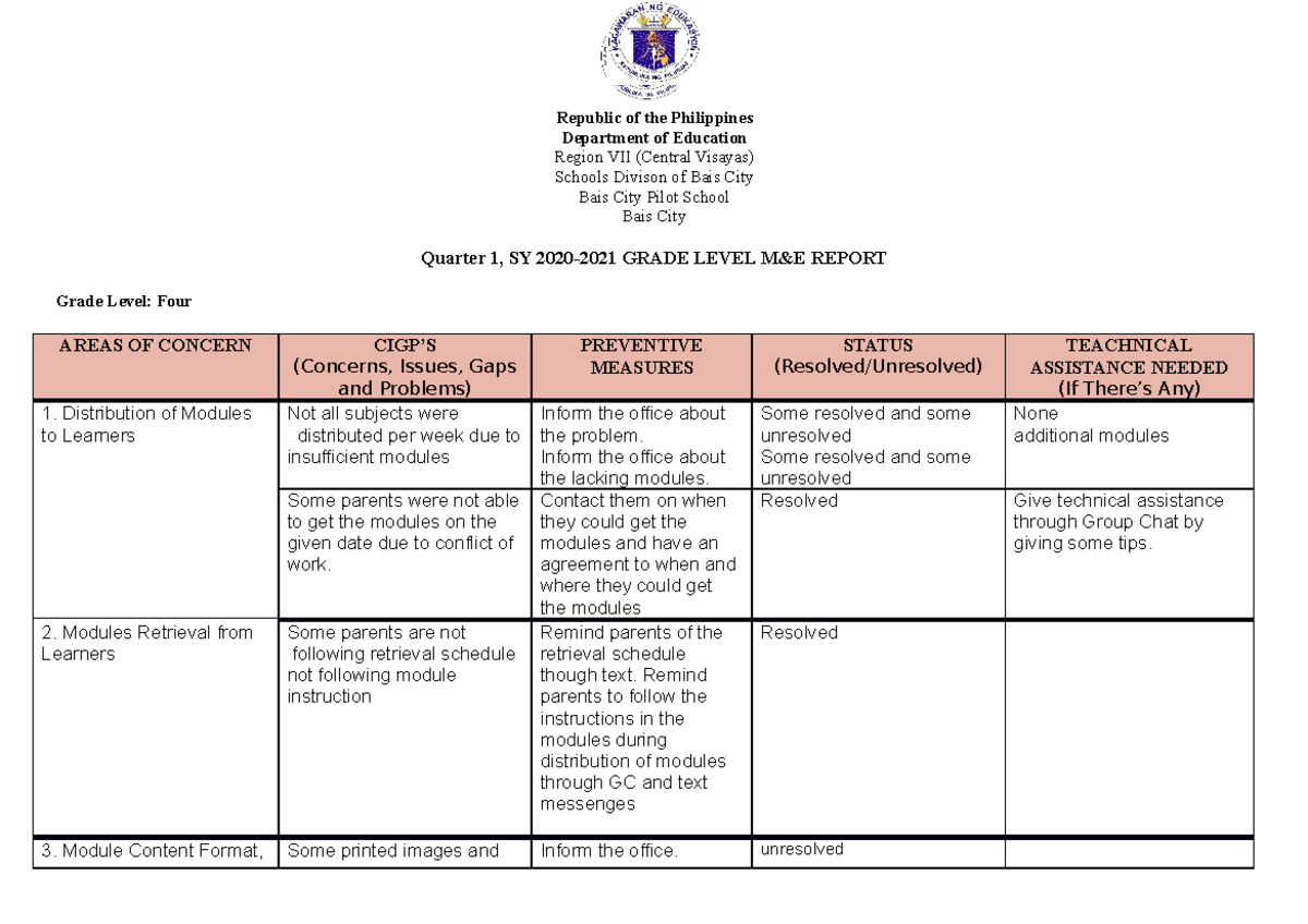
Clearly restate the original objectives and link each to the specific indicators used for measurement. Include baseline values, targets, and the reporting period. A simple table works well:
- Objective 1: Increase primary school enrollment – Indicator: Net enrollment rate (target 95%) – Baseline 78% – Current 84%.
- Objective 2: Improve water quality – Indicator: Percentage of samples meeting WHO standards – Baseline 60% – Current 73%.
This alignment reinforces accountability and makes it obvious where progress is on track or off track.
Data Collection Methodology
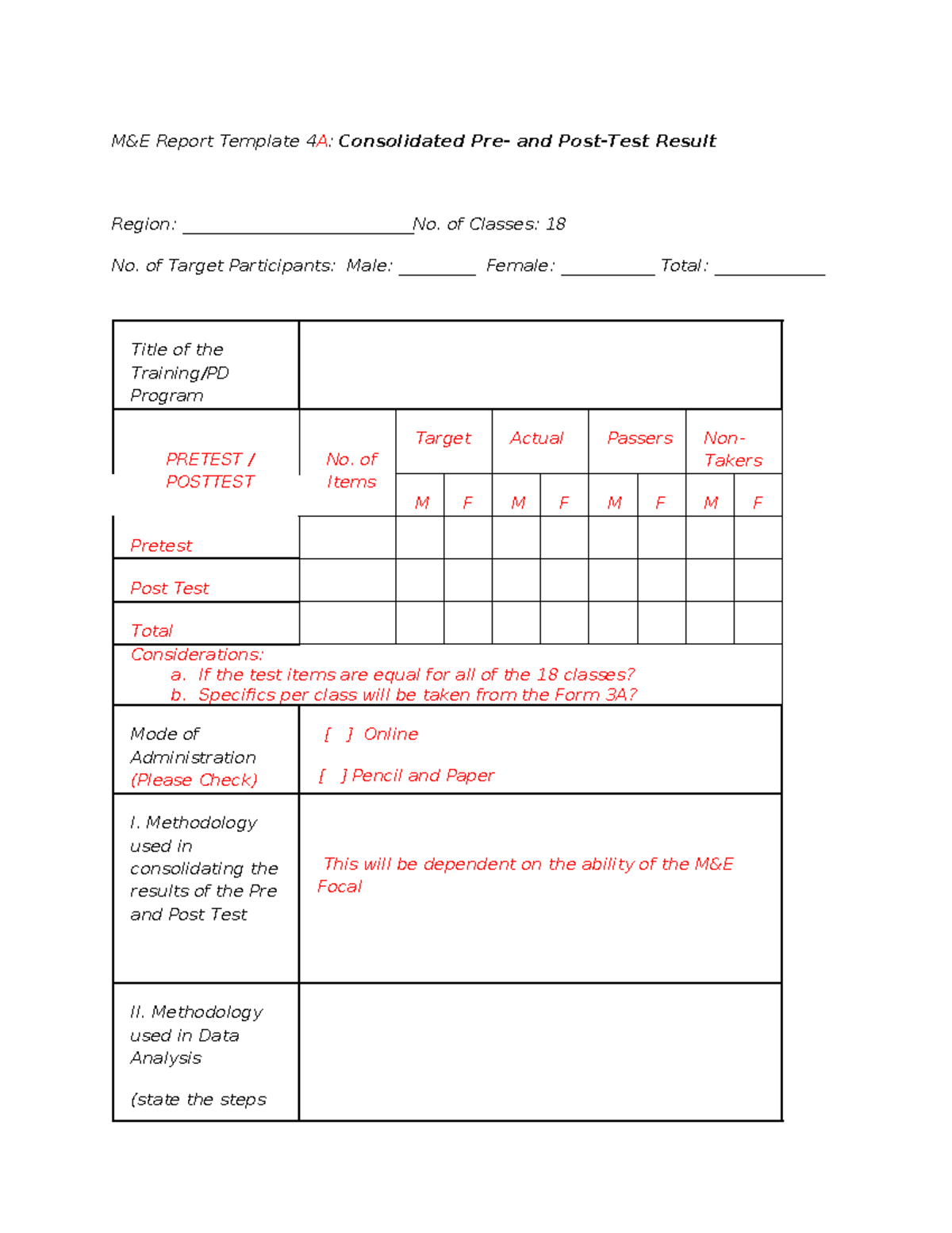
Transparency about how data was gathered builds trust. Describe sampling techniques, data sources (surveys, administrative records, remote sensing), tools used (mobile data collection apps, GIS), and any changes from previous cycles. Mention data quality checks, such as double‑entry verification or outlier analysis, and note any limitations that could affect interpretation.
Findings and Analysis
Present the raw numbers first, then interpret them. Use charts, trend lines, and heat maps to visualize changes over time or across regions. When explaining results, connect them back to the context—seasonal variations, policy shifts, or unexpected events. Highlight both positive outcomes and gaps; a balanced analysis signals credibility.
Recommendations and Action Plan
Recommendations should be specific, measurable, attainable, relevant, and time‑bound (SMART). Pair each recommendation with an action step, responsible party, required resources, and a deadline. For example: “Increase community outreach sessions by 30% in Q4; lead: Field Officer Jane Doe; budget: $5,000; deadline: Dec 31.” This transforms findings into a roadmap for improvement.
Appendices and Supporting Documents
Include detailed data tables, questionnaire instruments, GIS layers, and any raw qualitative excerpts that back up the main narrative. Appendices keep the core report concise while still providing full transparency for auditors or interested stakeholders.
Designing Your Template: Tips and Best Practices
.jpg)
A beautiful template is useless if it is hard to use. Below are design principles that keep the document functional and visually appealing.
Keep It User‑Friendly
Front‑line staff should be able to fill out the template with minimal training. Use clear headings, consistent field labels, and placeholders that illustrate the expected format (e.g., “MM/DD/YYYY” for dates). Provide a brief “how‑to” guide as the first page of the template.
Use Consistent Formatting
Apply the same font size, color scheme, and heading hierarchy throughout the document. Consistency reduces cognitive load and helps readers locate information quickly. Stick to web‑safe fonts like Arial or Calibri, and reserve bold or color for emphasis rather than decorative purposes.
Leverage Visuals Wisely
Charts should simplify, not complicate. Choose the right chart type: bar charts for categorical comparisons, line graphs for trends, and pie charts only when illustrating parts of a whole that sum to 100%. Include descriptive captions and source notes for every visual.
Integrate Real‑Time Data
If your organization uses a digital dashboard, embed live data links or QR codes that allow reviewers to drill down into the most current figures. This demonstrates that the report is part of an ongoing monitoring cycle rather than a static snapshot.
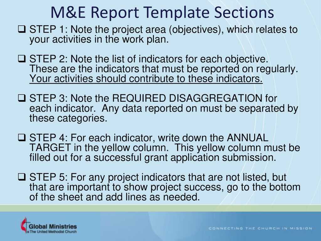
Step‑by‑Step Guide to Fill Out the Template
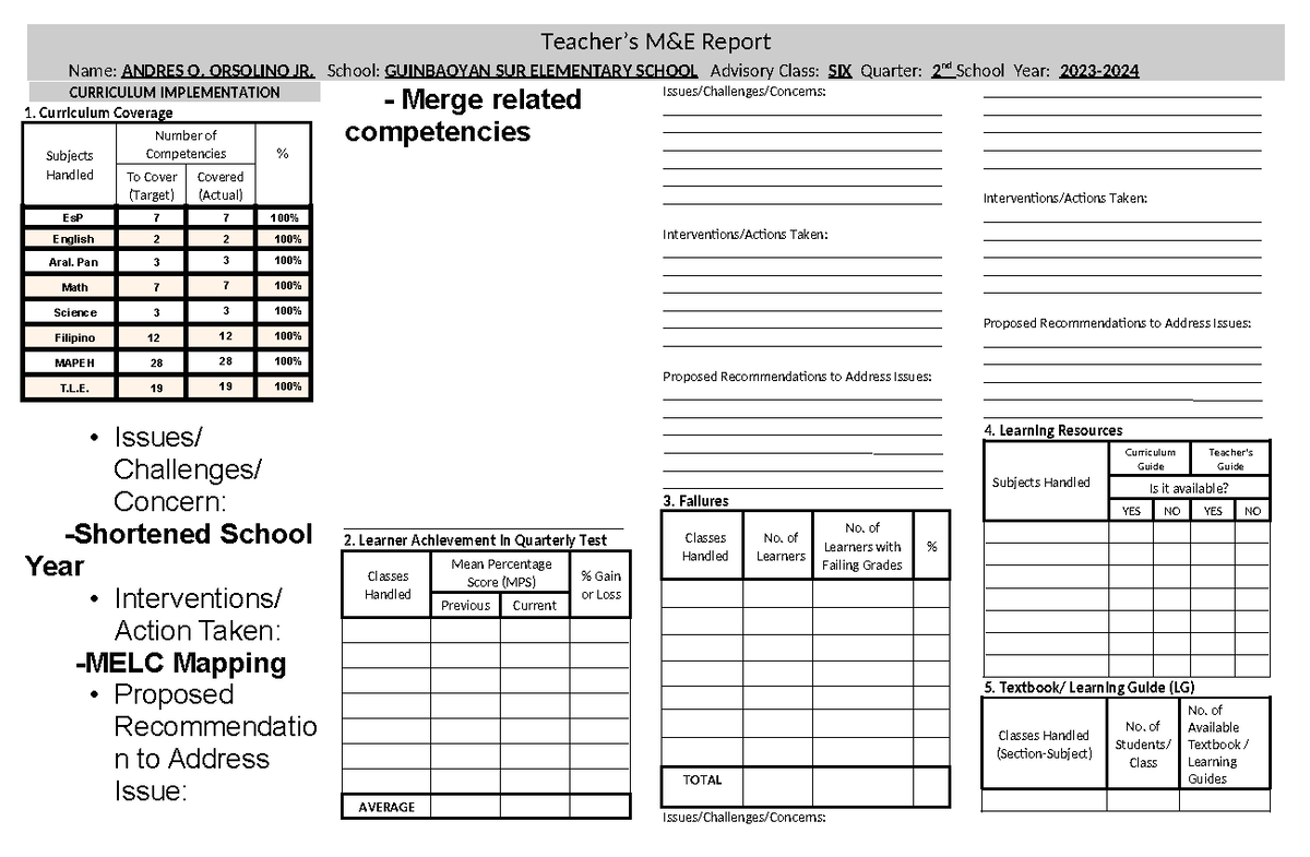
Even seasoned M&E professionals can benefit from a systematic workflow. Follow these eight steps to ensure completeness and accuracy.
Step 1: Gather Baseline Data
Locate the original baseline dataset used when the project launched. Verify that the baseline indicators match the current reporting period’s definitions. If discrepancies exist, document them in the methodology section.
Step 2: Update Indicator Values
Pull the latest data from your monitoring system, clean it according to the quality checklist, and populate the indicator table. Use conditional formatting in Excel (or equivalent) to flag values that fall below target thresholds.
Step 3: Draft the Executive Summary
Summarize the most compelling figures and trends you observed in Step 2. Write the summary after you have completed the findings section, so you can accurately reflect the key messages.
Step 4: Document Methodology Changes
If you introduced a new data collection tool or changed the sampling frame, note it here. Explain why the change was made and how it might affect comparability with previous reports.
Step 5: Analyze Findings
Conduct variance analysis (actual vs. target) and, where appropriate, statistical testing to determine significance. Write concise narrative paragraphs that explain why certain indicators improved or declined, referencing external factors when relevant.
Step 6: Formulate Recommendations
Base each recommendation on a specific finding. Prioritize actions that address the largest performance gaps or that have high stakeholder demand. Ensure each recommendation includes an assigned owner and timeline.
Step 7: Assemble Appendices
Gather raw data extracts, survey instruments, and any qualitative quotes that support your analysis. Label each appendix clearly (e.g., “Appendix A – Survey Questionnaire”).
Step 8: Review, Validate, and Publish
Conduct a peer review within the M&E team, then circulate the draft to project managers and finance leads for validation of figures and resource assumptions. After incorporating feedback, convert the file to PDF for distribution and archive a master copy in the organization’s document repository.
Common Pitfalls and How to Avoid Them
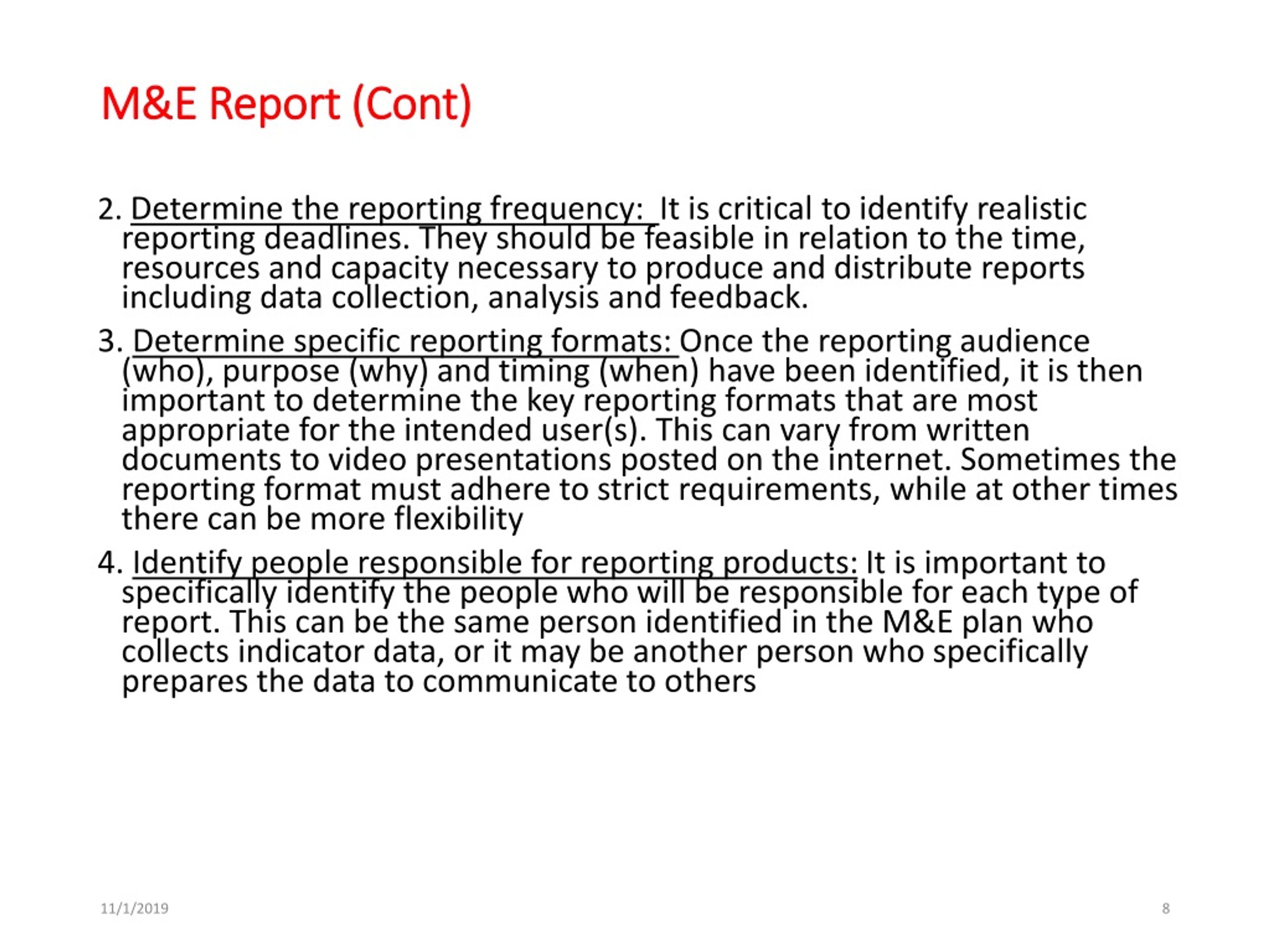
Even with a solid template, teams often stumble into recurring traps. Recognizing these early can save time and preserve credibility.
Overloading With Jargon
Technical acronyms may be second nature to M&E specialists, but they alienate non‑technical readers. Define each acronym on first use and consider a glossary at the end of the report.
Neglecting Stakeholder Input
Reports that ignore feedback from beneficiaries, partners, or donors can miss critical insights. Include a brief “Stakeholder Feedback” subsection that summarizes key comments gathered during the reporting period.
Inconsistent Time Frames
Mixing quarterly data with annual targets creates confusion. Align all data to the same reporting window, and clearly state any deviations in the methodology note.
Missing Visual Context
Numbers alone rarely tell the full story. If you notice a sudden dip in an indicator, supplement the table with a line graph that visualizes the trend and highlights the point of change.
Real‑World Example: A Sample M E Report Walkthrough

Imagine a rural health initiative aiming to increase antenatal care (ANC) visits. The M E Report Template begins with an executive summary noting a 12 % increase in ANC visits from 68 % to 80 % of pregnant women. The objectives section links this rise to the specific indicator “percentage of pregnant women receiving at least four ANC visits.” The methodology explains that health workers used a mobile app to log each visit, with weekly data uploads to the central server. Findings reveal that the increase was strongest in districts with newly trained community health volunteers, while districts lacking transport saw stagnant numbers. Recommendations call for allocating a transport stipend to the low‑performing districts, assigning the finance officer as responsible, and setting a Q4 deadline. Appendices contain the raw visit logs, the mobile app user guide, and a map of volunteer deployment.
This example demonstrates how each template component builds on the previous one to create a logical, evidence‑based narrative that drives actionable change.
Conclusion
A thoughtfully designed M E Report Template does more than organize data; it transforms raw numbers into a strategic story that guides program adjustments, satisfies donor requirements, and showcases impact to the broader community. By embedding the core sections—executive summary, objectives and indicators, methodology, findings, recommendations, and appendices—into a user‑friendly layout, and by following best‑practice design tips, you empower your team to produce reports that are both rigorous and readable. Remember to follow the step‑by‑step filling process, watch out for common pitfalls, and continuously solicit stakeholder feedback. When these practices become routine, your M&E system will evolve from a periodic compliance exercise into a living engine of learning and improvement, propelling your projects toward greater effectiveness and sustainability.

.jpg)

Related posts of "M E Report Template"
