
Sales Manager Monthly Report Templates serve as the backbone of any sales organization, providing a structured framework that transforms raw data into actionable insights. By capturing key performance indicators, trend analyses, and narrative context, these templates empower managers to steer teams, forecast revenue, and demonstrate value to stakeholders.
Why Monthly Reports Matter for Sales Management

In a fast‑moving sales environment, a well‑crafted report can be the difference between reacting to a crisis and proactively shaping strategy. Monthly reports give managers a consistent cadence to benchmark against goals, spot opportunities, and highlight areas that need coaching. They also create a shared language across departments, ensuring that executives, finance, and marketing are aligned around the same metrics.
Key Benefits of Regular Reporting
- Visibility into Performance – Quickly spot wins and shortfalls across product lines, regions, and account tiers.
- Data‑Driven Decision Making – Move from intuition to evidence when allocating resources or revising quotas.
- Accountability and Transparency – Clear metrics hold teams accountable and build trust with higher management.
- Continuous Improvement – Track the impact of training, process changes, or new tools over time.
Core Components of an Effective Template
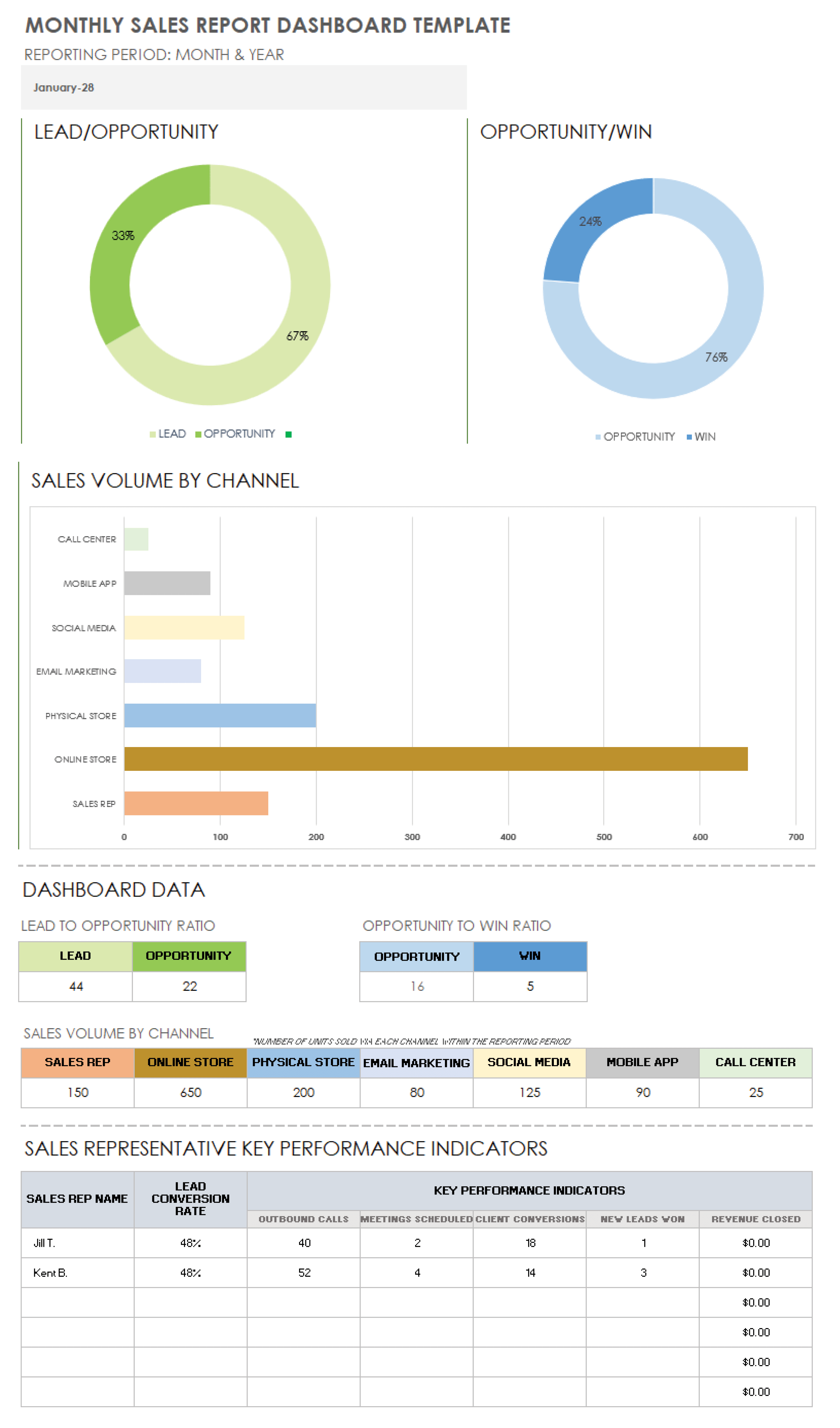
While every organization has unique needs, a robust monthly report typically includes the following sections:
Executive Summary
This one‑page snapshot condenses the month’s highlights. Include a short narrative about overall revenue, key wins, and any anomalies. Use a bullet list for quick metrics: total sales, quota attainment, and average deal size.
Financial Metrics
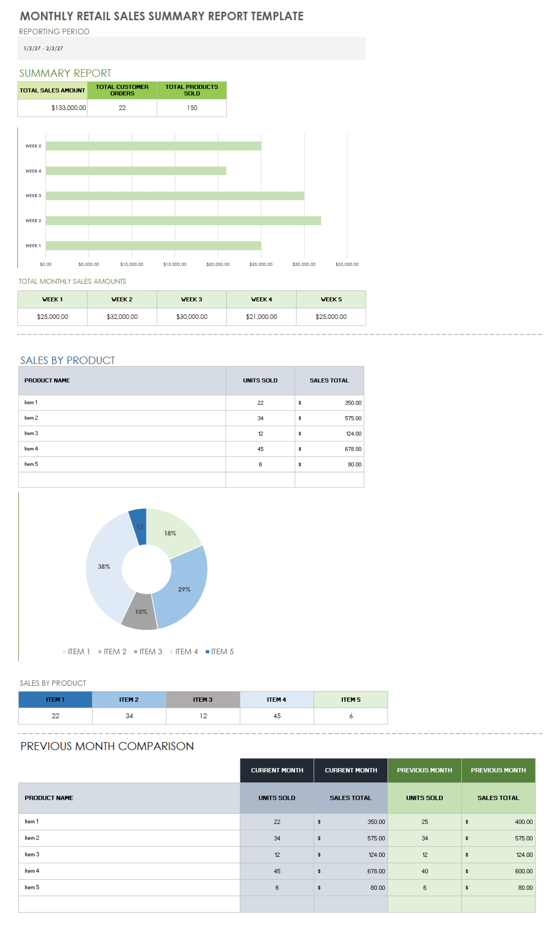
Detail revenue, gross margin, and pipeline health. Present figures both numerically and visually—charts, bar graphs, or heat maps—to help readers grasp trends at a glance. Incorporate year‑to‑date comparisons and month‑over‑month growth rates.
Sales Activity
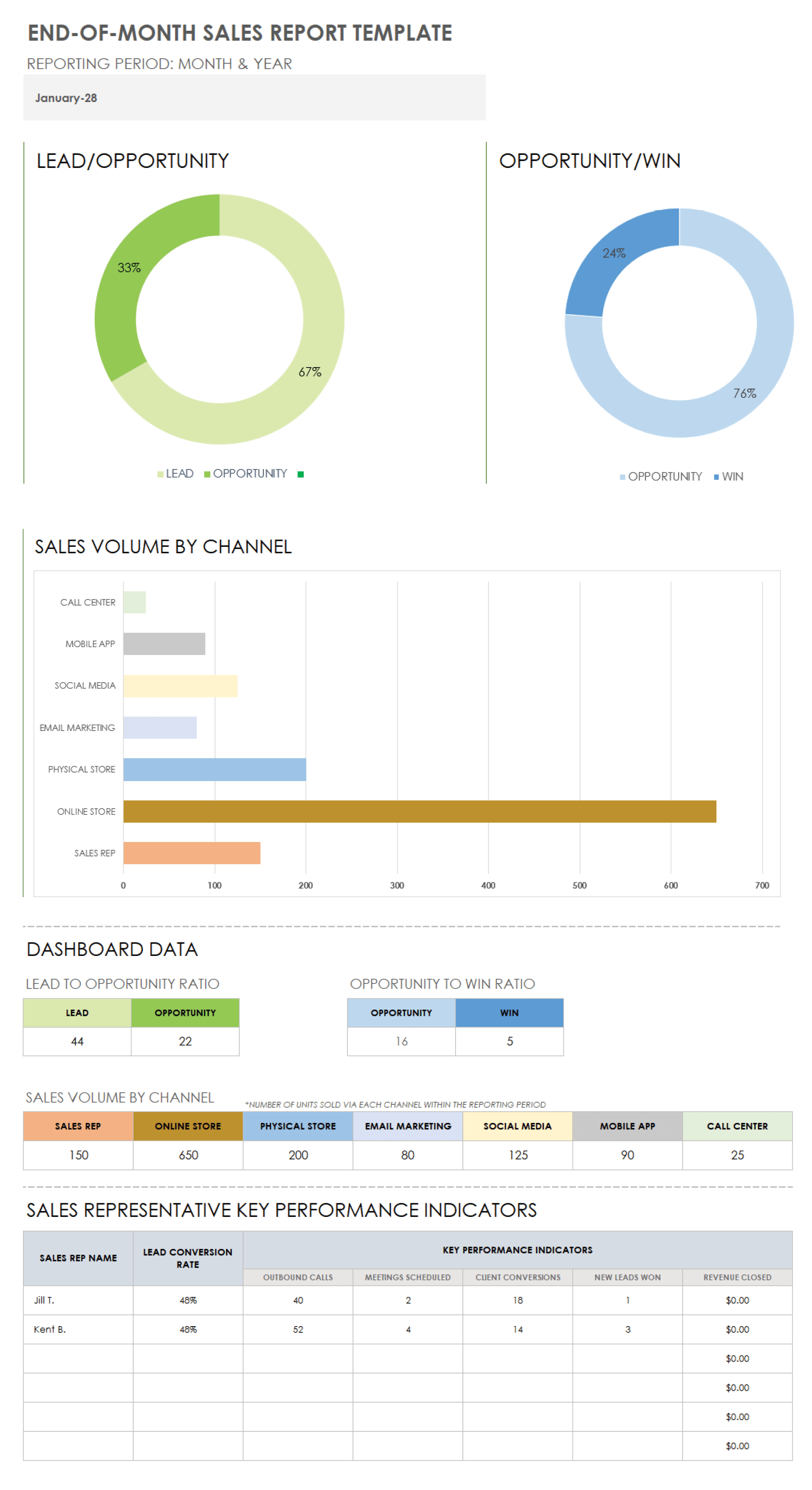
Track lead generation, prospecting volume, and conversion rates. Break activity by channel (email, calls, meetings) and by sales rep to surface best practices and identify support gaps.
Pipeline Analysis
Display the pipeline by stage, probability, and expected close date. Highlight the top opportunities that could drive the next quarter’s revenue. Include a risk assessment for deals at risk of stalling.
Quota and Target Performance
Show each rep’s performance against quota, percentage of attainment, and trajectory toward the goal. Use color coding to quickly indicate over‑performance, on‑track, and under‑performance.
Customer Success and Retention
Report on renewal rates, upsell revenue, and churn incidents. Attach qualitative insights from customer interviews or support tickets that explain the numbers.
Action Items and Follow‑Up
End the report with clear, time‑bound actions for the team, such as coaching sessions, process changes, or strategic outreach. Assign owners and set due dates.
Design Tips for Clarity and Impact

How you present data matters as much as the data itself. A clean, professional layout ensures stakeholders focus on insights instead of deciphering clutter.
Use Visual Hierarchy
Leverage font weights, sizes, and spacing to guide the reader’s eye. Titles and key metrics should stand out; supporting details can be lighter and smaller.
Limit the Color Palette
Stick to three to four colors to avoid visual fatigue. Use one accent color for call‑to‑action elements like “Urgent” or “Completed.”
Incorporate Conditional Formatting
Apply automatic color changes to numbers that exceed thresholds (e.g., green for quota attainment over 110%). This instantly signals performance status.
Keep Text Concise
Avoid long paragraphs. Summarize findings in concise bullet points or short statements. Reserve detailed explanations for an appendix or slide deck if necessary.
Building the Template: A Step‑by‑Step Guide
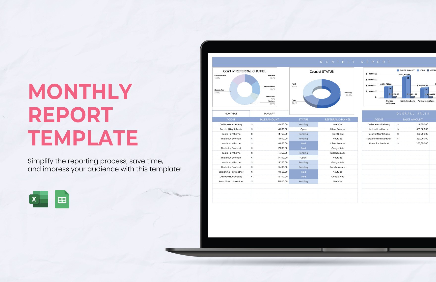
Creating a reusable template can save time and reduce errors. Follow this workflow to build a template that adapts to your evolving needs.
1. Define Your Metrics
Collaborate with sales, finance, and product teams to list the essential KPIs. Prioritize metrics that influence strategy decisions: revenue, conversion rate, average sales cycle length, and win rate.
2. Choose the Right Tool
While Excel is a popular choice, Google Sheets offers real‑time collaboration and cloud accessibility. Alternatively, consider dedicated BI platforms like Tableau or Power BI for richer visualizations.
3. Create a Master Sheet
Set up a master sheet that pulls raw data from your CRM or ERP via import functions or APIs. This sheet serves as the single source of truth.
4. Build Calculated Fields
Use formulas to compute metrics such as Quota Attainment = (Actual Revenue / Target Revenue) × 100. Automate these calculations to eliminate manual errors.
5. Design the Report Layout
On a new sheet, arrange the sections discussed earlier. Use merged cells for titles, and insert charts that reference the master sheet data.
6. Add Dynamic Elements
Implement slicers or drop‑down menus to filter data by month, region, or sales rep. This allows stakeholders to view the report from different perspectives without altering the underlying data.
7. Protect the Template
Lock cells that contain formulas or formatting to prevent accidental edits. Keep raw data sheets separate from the report sheet to maintain data integrity.
8. Test and Iterate
Run the template with a sample month’s data, review the output with senior managers, and refine based on feedback. Iterate until the report consistently delivers insights without requiring manual intervention.
Real‑World Examples of Impactful Reports

Examining how successful organizations use monthly reports can inspire improvements in your own processes.
Case Study 1: A SaaS Company’s Renewal Focus
This company added a “Churn Risk” section to its monthly reports. By flagging accounts with declining engagement scores, the sales team proactively engaged customers, reducing churn from 12% to 7% over six months.
Case Study 2: A Manufacturing Firm’s Lead Funnel Optimization
After incorporating a “Lead Source ROI” metric, the firm discovered that leads from trade shows accounted for 40% of revenue but represented only 15% of the lead volume. They re‑allocated budget to trade shows, boosting overall revenue by 18% in the next quarter.
Case Study 3: A Consulting Firm’s Rep Performance Dashboard
By visualizing each rep’s pipeline health and quota attainment side by side, the firm could quickly identify under‑performers and pair them with high‑achievers for mentoring. This initiative increased average deal size by 9% within three months.
Common Pitfalls and How to Avoid Them

Even well‑designed reports can fail if they fall into common traps.
1. Overloading with Data
Too many charts or numbers can overwhelm readers. Stick to the most critical KPIs and add supplementary data in an appendix.
2. Static Reports
Hard‑copy PDFs or static spreadsheets hinder collaboration. Use cloud‑based tools that allow real‑time editing and sharing.
3. Inconsistent Data Sources
Mixing data from different systems without harmonization leads to inaccuracies. Ensure a single, reliable source of truth.
4. Neglecting Narrative Context
Raw numbers lack meaning. Pair metrics with concise narrative explanations to help stakeholders understand the why behind the data.
Integrating Reports into Your Sales Cadence

A monthly report is only valuable if it is actively used in decision‑making. Embed it into your regular rhythm to maximize its impact.
Weekly Sales Meetings
Start each meeting with a quick recap of the month’s key metrics. Discuss trends, celebrate wins, and address challenges.
Quarterly Strategy Sessions
Use the cumulative data from the last four reports to evaluate strategic initiatives, adjust quotas, and set next‑quarter goals.
Executive Reviews
Present high‑level insights to executives to secure buy‑in for new programs or budget requests. Tailor the report to highlight ROI and alignment with corporate objectives.
Conclusion
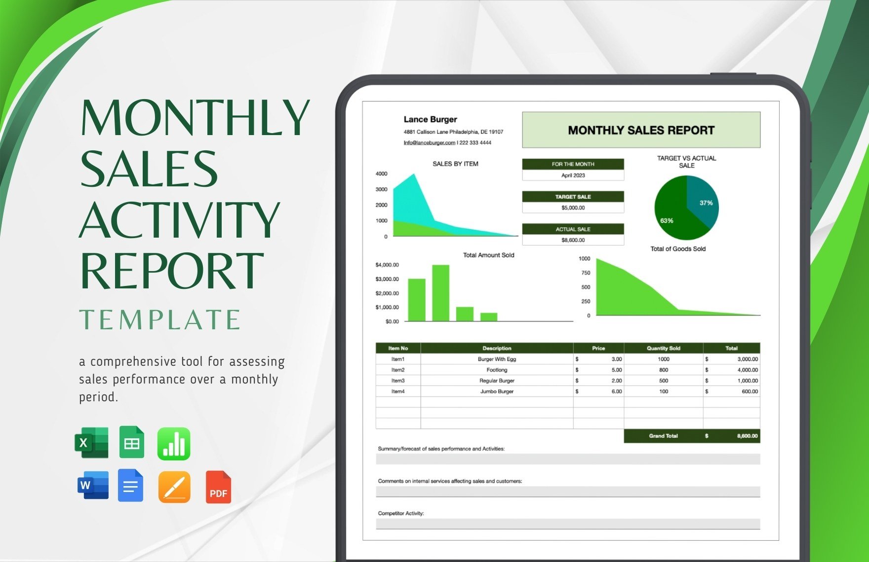
Sales Manager Monthly Report Templates are more than a compliance exercise; they are strategic tools that enable data‑driven leadership, foster accountability, and drive continuous improvement. By defining the right metrics, designing a clean and dynamic layout, and embedding the report into your sales cadence, you transform raw data into actionable insight that propels revenue growth. Whether you start from scratch or refine an existing template, the disciplined approach outlined above will help you create a report that informs, inspires, and ultimately delivers measurable results for your sales organization.



Related posts of "Sales Manager Monthly Report Templates"
