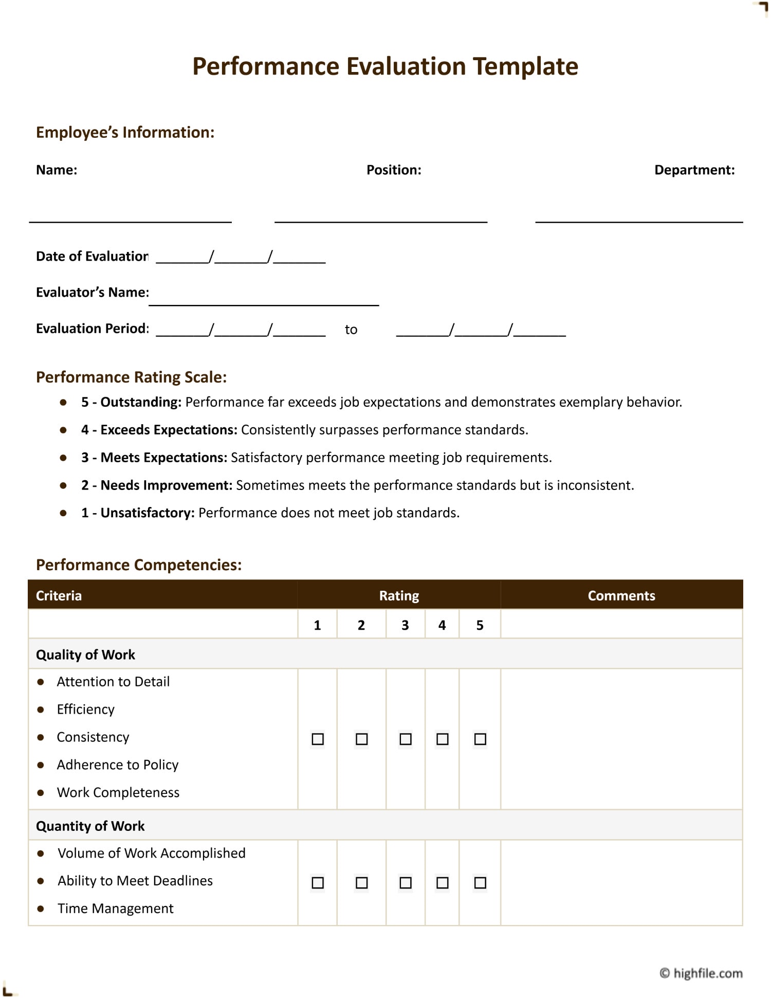
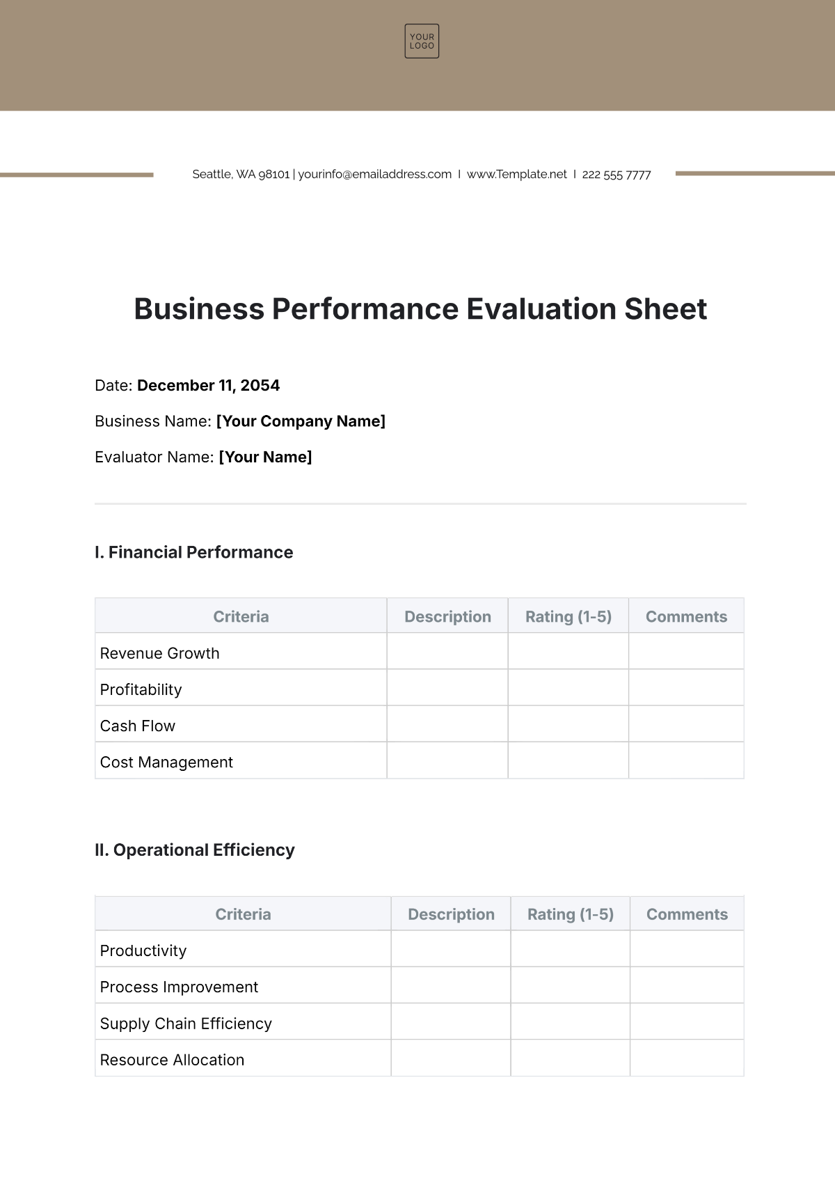
Business Performance Evaluation Template might sound like a bland spreadsheet, but stick with me—this is the comedic, high‑value, performance‑boosting playbook you never knew you needed. Think of it as the business version of a “check your math” cheat sheet, except it actually helps you win at work without doing any brain‑break math.
Why a Template Is Your New Business Sidekick
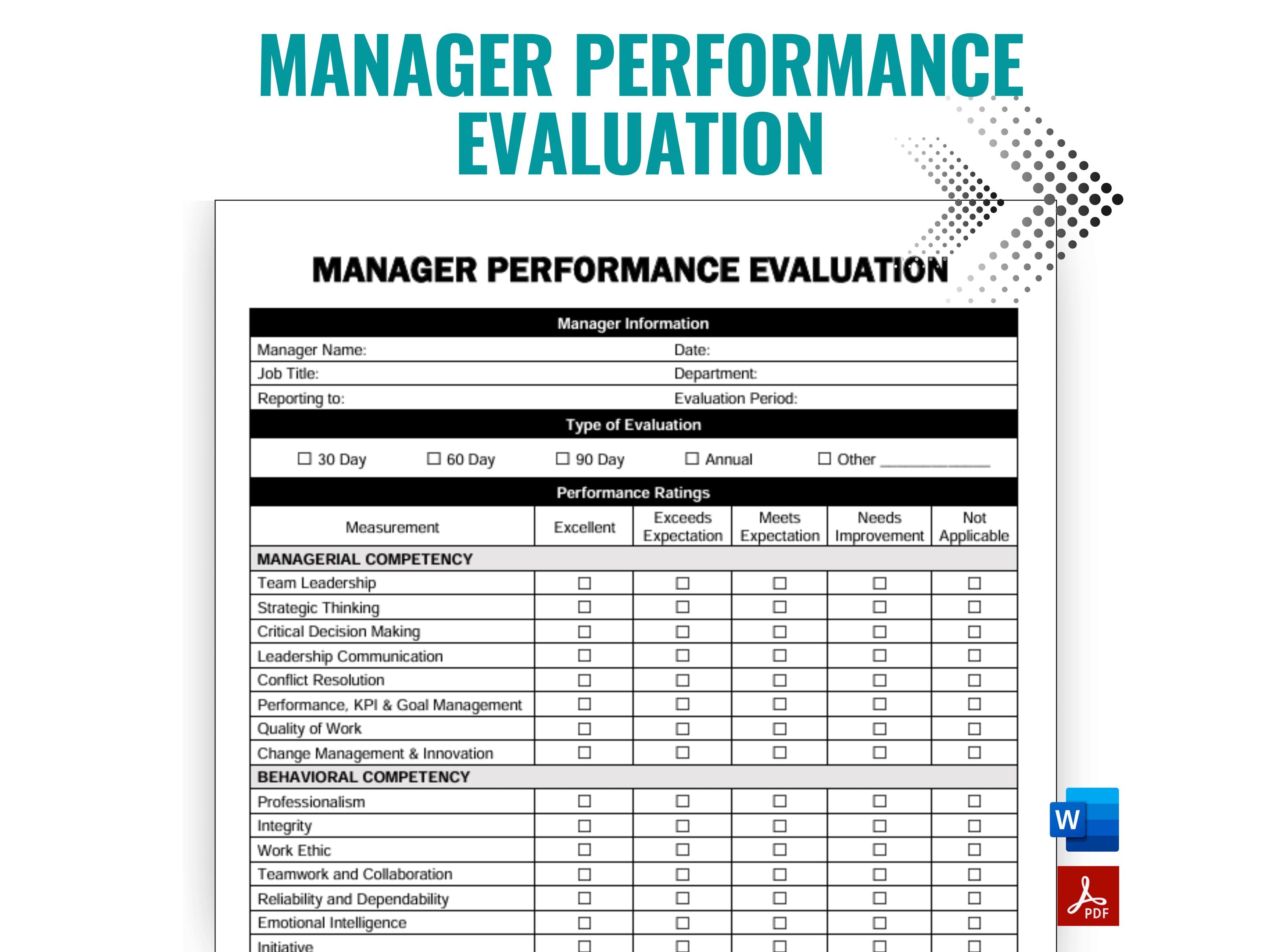
Picture this: you’re a manager, you’ve got a pile of charts that look like a galaxy, and your team’s performance is more confusing than a toddler’s art project. You’re not alone. Businesses that skip the template step often end up feeling like they’re playing a guessing game with their own metrics. A well‑structured template brings order, clarity, and a dash of humor to the process.
Quick Wins with a Template
- Standardization: No more “I drew this chart in PowerPoint.” Every metric lives in the same place, same format.
- Time Savings: Build it once, use it forever—like your favorite meme, but for KPIs.
- Transparency: When everyone uses the same sheet, no more “I thought we were tracking something else.”
- Decision‑Making Power: Spot trends faster, react quicker, and avoid that “who knows what we’re doing?” vibe.
The Anatomy of a Killer Evaluation Template
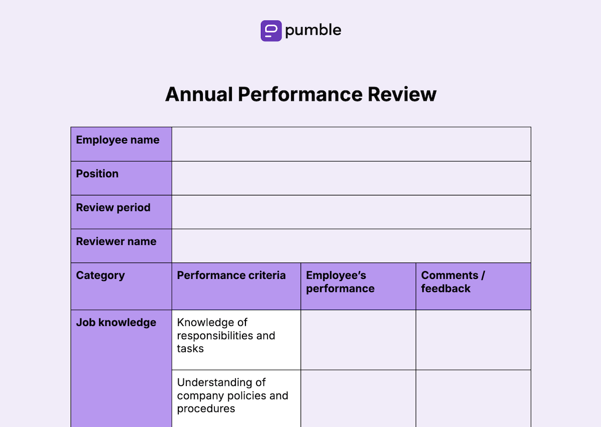
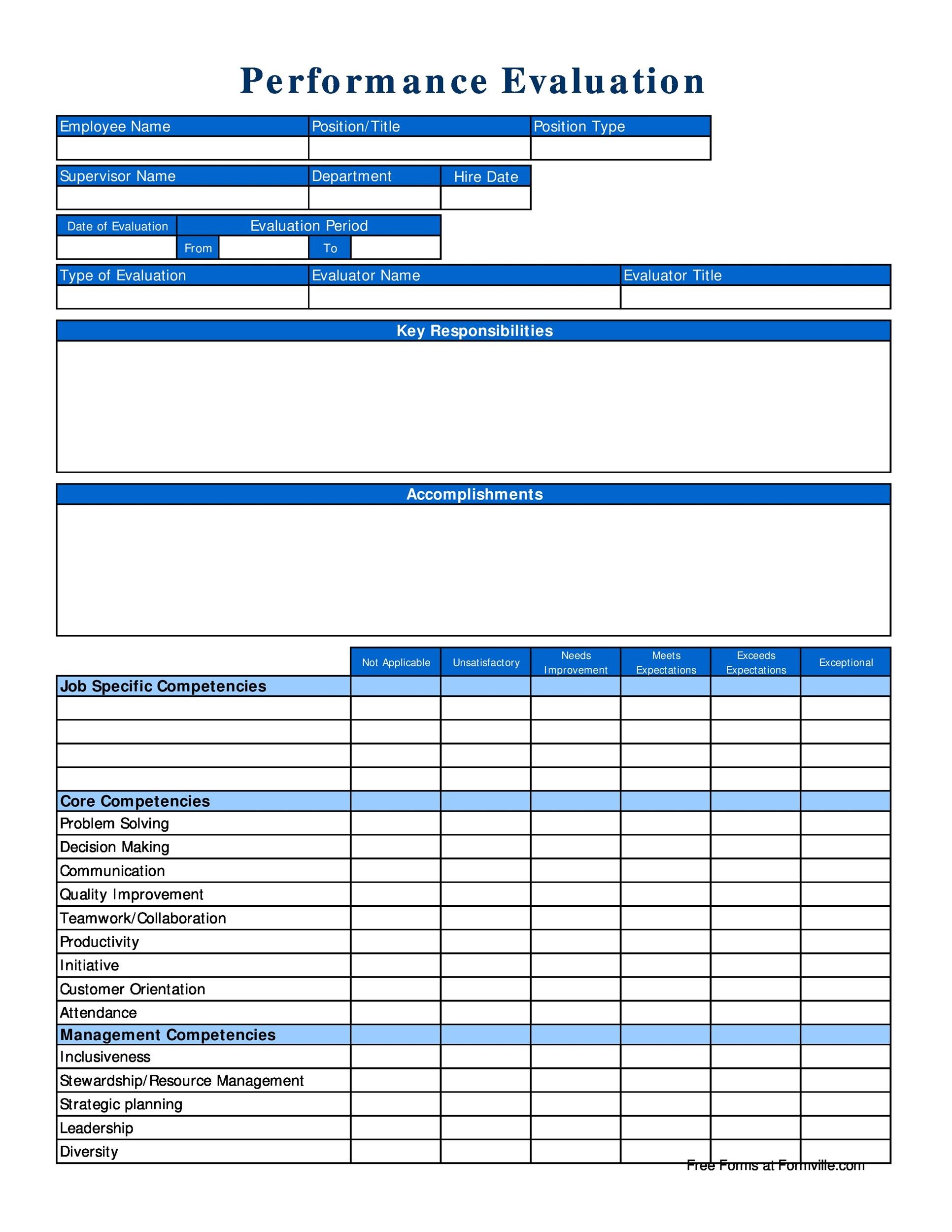
Now that we’ve sold you on the idea, let’s dissect what makes a template so good that your colleagues will actually want to use it.
Header: The “Meet the Metrics” Intro
Start with a punchy header. Give your template a name, a date, and maybe a meme that says “It’s a template, not a magic wand.” Keep it professional enough to survive HR audits but witty enough to keep the eye from sliding.
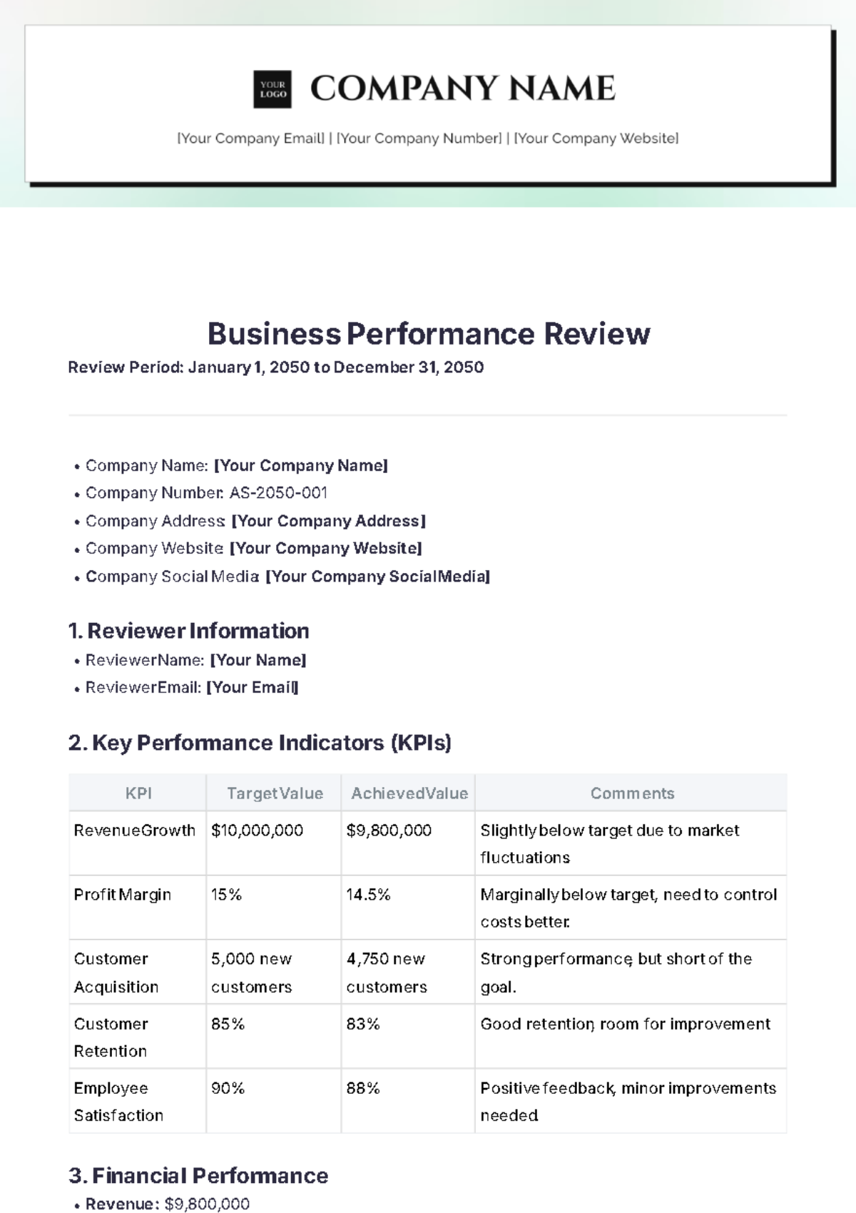
Section 1: Company‑Wide KPIs
These are the high‑level metrics that give you a bird’s‑eye view of the business. Think revenue, gross profit margin, customer acquisition cost—stuff that can make or break the entire company.
Examples of Key Metrics
- Revenue growth rate
- Net profit margin
- Customer lifetime value
- Employee turnover rate
- Operating cash flow
Section 2: Department‑Specific KPIs
Each department needs its own “mini‑template” slice. This is where you get into the details that matter to the sales team, product, marketing, and beyond.
Sales Team Metrics
- Monthly recurring revenue (MRR)
- Lead conversion rate
- Average deal size
- Sales cycle length
Marketing Metrics
- Click‑through rate (CTR)
- Cost per acquisition (CPA)
- Return on marketing spend (ROMS)
- Social media engagement
Product Team Metrics
- Feature usage frequency
- Bug count per release
- Time to market
- User satisfaction score (U.S.S.)
Section 3: Time‑Based Tracking
People love dates. Use a clear calendar or timeline. Include columns for “Quarter,” “Month,” and “Year.” Don’t forget to add a “Previous Period” comparison to keep the trend line visible.
Section 4: Visual Dashboards
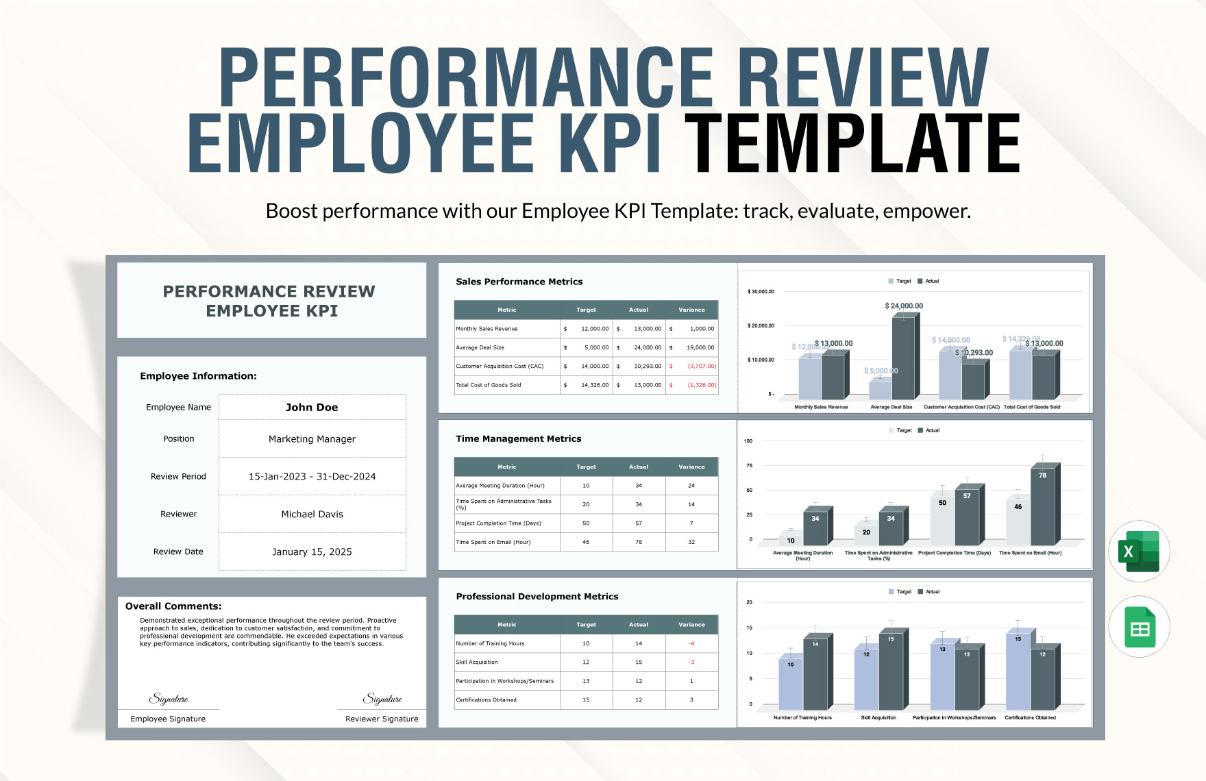
Numbers are great, but visuals make people smile. A line graph, a bar chart, or even a donut chart for a quick glance at who’s winning.
Tip: Use conditional formatting—green for on‑target, red for “uh‑oh.” The color coding will save you from endless “what does this mean?” emails.
Building the Template: Step‑by‑Step

Let’s roll up our sleeves and walk through the creation process. You’ll feel like a wizard (or at least a spreadsheet sorcerer) by the end.
Step 1: Define Your Objectives
Ask yourself: “What do I want to learn from this data?” The answer will dictate which metrics live inside. A quick brain dump can help. If you’re not sure, start with the basics, then iterate.
Step 2: Pick Your Tools
- Excel or Google Sheets for a universal format.
- Tableau, Power BI, or Looker for deeper analytics.
- Simple charting tools like Canva for visual flair.
Step 3: Create Master Columns
Each column should represent a single data point. Keep column names short but descriptive. A typical header line might look like:
Month | Revenue | Cost of Goods Sold | Gross Margin | Net Profit | Comments
Step 4: Add Calculated Fields
Use formulas to auto‑calculate growth rates, margins, and variances. This turns raw data into actionable insights. For example:
Gross Margin % = (Revenue - COGS) / Revenue * 100
Step 5: Embed Conditional Formatting
Set rules: Green for metrics above target, Orange for below target but within warning range, Red for critical underperformance.
Step 6: Design a Dashboard Snapshot
Use a separate sheet to pull key numbers into a clean dashboard. Keep it simple—no one has time for a PowerPoint deck at every meeting.
Step 7: Test with a Small Team
Invite a few teammates to fill out a mock cycle. Watch for confusion, data entry errors, or “we don’t have that metric” moments. Revise before the big launch.
Rolling It Out: Best Practices
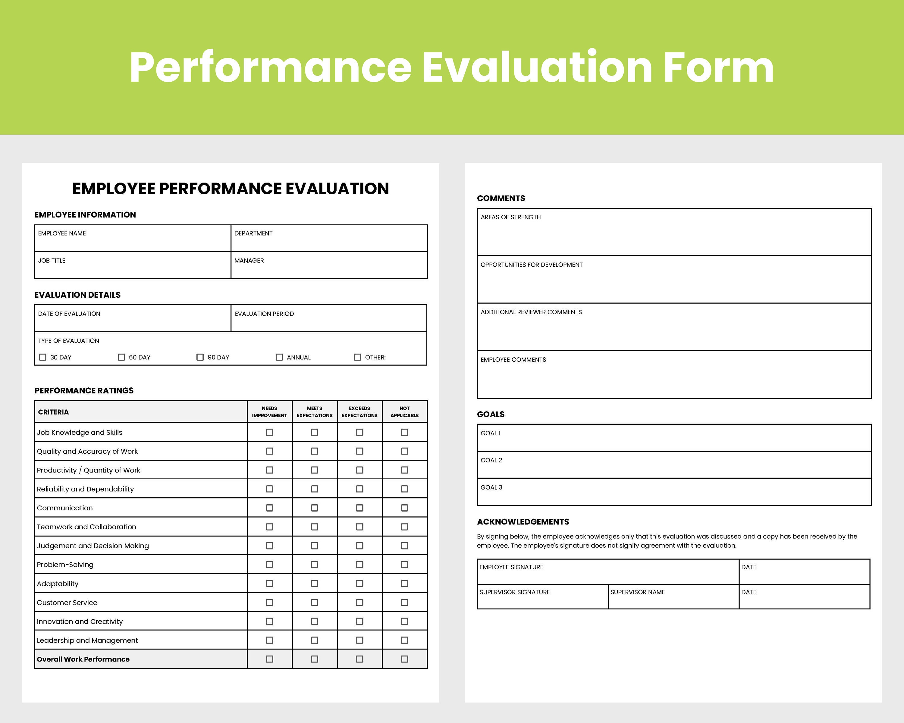
Train the Rookies
Offer a one‑hour workshop. Use a “fun quiz” format—quiz the team on what each column means. The winner gets a coffee, the loser gets a funny office sticker.
Make It Accessible
Store the template in a shared drive, not in your personal folder. Add a readme file with a short explanation and an “FAQ” section.
Set a Review Frequency
Quarterly reviews keep metrics fresh and relevant. If the template feels stale after a month, add or drop a KPI. Think of it like updating your playlist.
Celebrate Milestones
When a team hits a KPI target, highlight it in the template. Add a celebratory emoji or a short congratulatory note in the comments column. Positive reinforcement boosts morale.
Common Pitfalls and How to Dodge Them
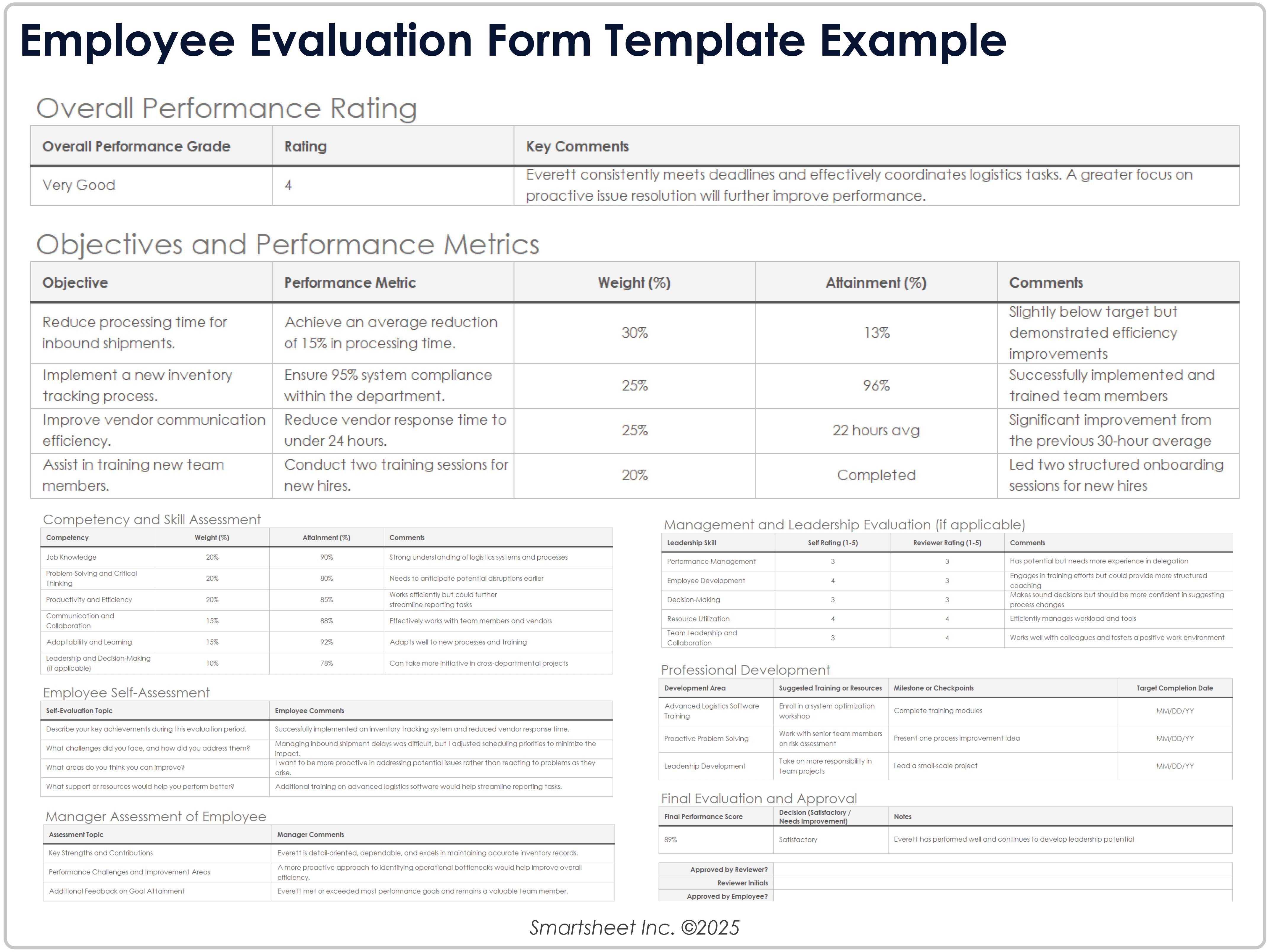
Overloading the Template
More columns aren’t always better. Too many metrics create noise. Keep it focused on what truly drives the business.
Missing Definitions
Everyone needs the same understanding of “lead.” Create a glossary or use tooltips for clarity. Otherwise, you’ll end up with “Lead count” versus “Qualified Lead count” disputes.
Ignoring Data Quality
Garbage in, garbage out. Set up validation rules—no negative sales numbers, no missing dates. A clean dataset is the foundation of a credible evaluation.
Failing to Iterate
Business environments change. Treat the template as a living document, not a static artifact. Schedule a quarterly audit to check its relevance.
Real‑World Examples: How Companies Rock the Template
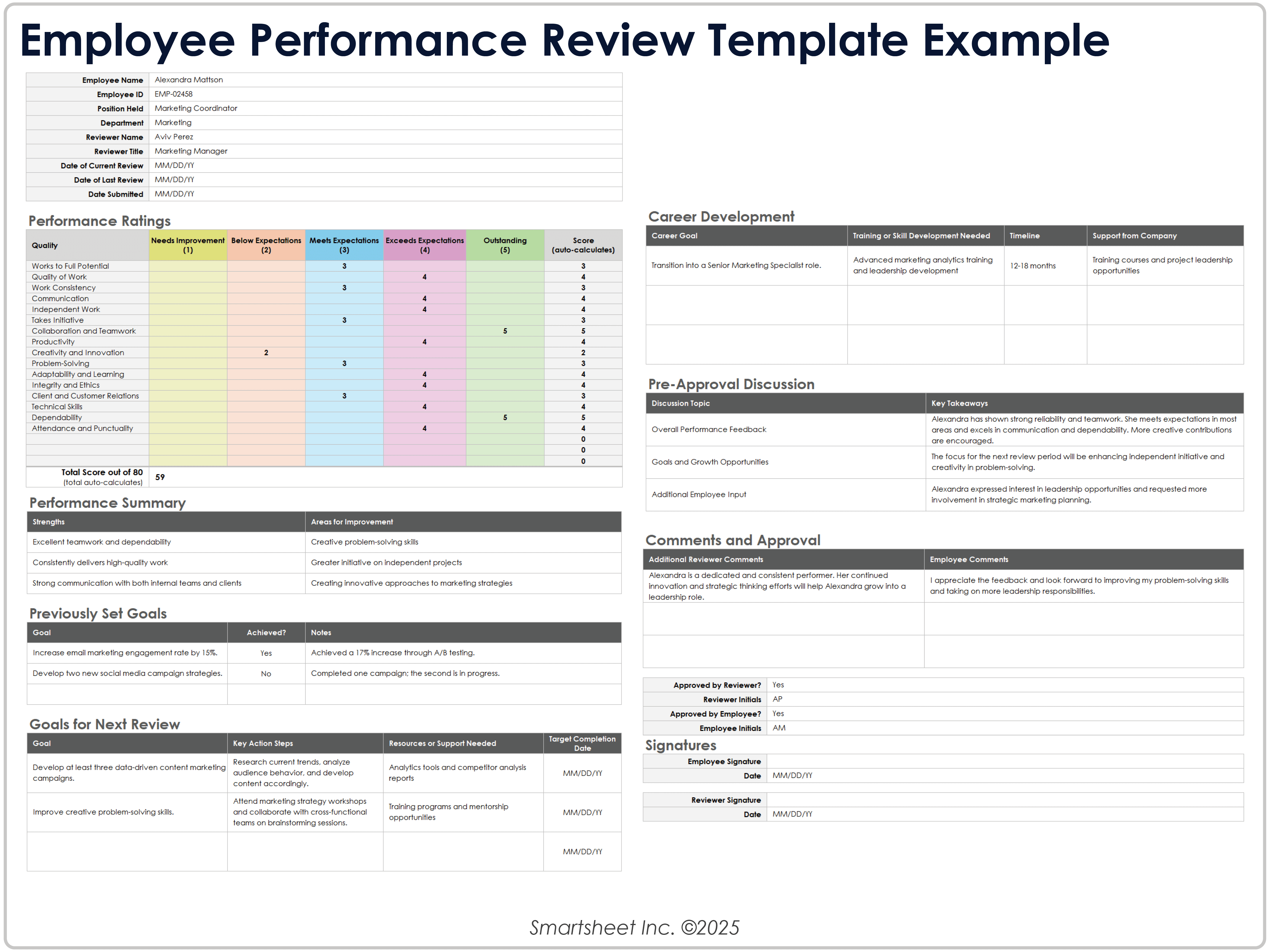
Startup Sprint
At a tech startup, the product team used a template that tracked feature adoption rate, bug count, and customer feedback scores. By visualizing these metrics each sprint, the team cut feature release time by 30% and improved user satisfaction from 4.2 to 4.7 stars.
Retail Rumble
In a retail chain, the sales template included foot traffic, conversion rate, and average basket size. The marketing team used this data to adjust in‑store promotions, increasing quarterly revenue by 12% without raising the marketing spend.
Manufacturing Marvel
A manufacturing firm created a template tracking machine uptime, defect rate, and labor cost. The dashboard revealed that a single machine caused a 4% defect spike. Replacing it saved the company $150k annually.
Adding Humor: Keep the Energy High
Business reports can be a snoozefest. Sprinkle in a joke or a meme that aligns with the data. For example, next to a chart that shows a decline, write, “Looks like our sales are in a bit of a slump—time for a caffeine boost!” This keeps readers engaged and prevents the “I can’t feel my brain cells” feeling.
Funny Data Labels
- “Revenue: Enough for a beach vacation!”
- “Gross Margin: Still higher than my pizza budget!”
- “Customer Acquisition Cost: Is it a typo? 200$??”
Conclusion: Your Template is the Secret Weapon
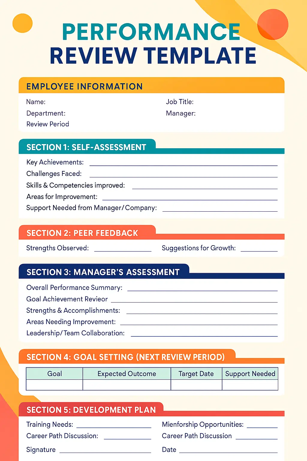
A Business Performance Evaluation Template isn’t just a spreadsheet; it’s a performance‑enhancing, morale‑boosting, time‑saver tool that lets you see the big picture without losing sight of the small details. By defining clear KPIs, designing an intuitive layout, and iterating based on feedback, you turn raw numbers into a narrative that drives action and growth. And remember, a little humor goes a long way in making the process less tedious and more memorable. So go ahead, build that template, share it, celebrate your successes, and watch your business performance soar—while you still have time to crack a joke at the next meeting.




Related posts of "Business Performance Evaluation Template"
