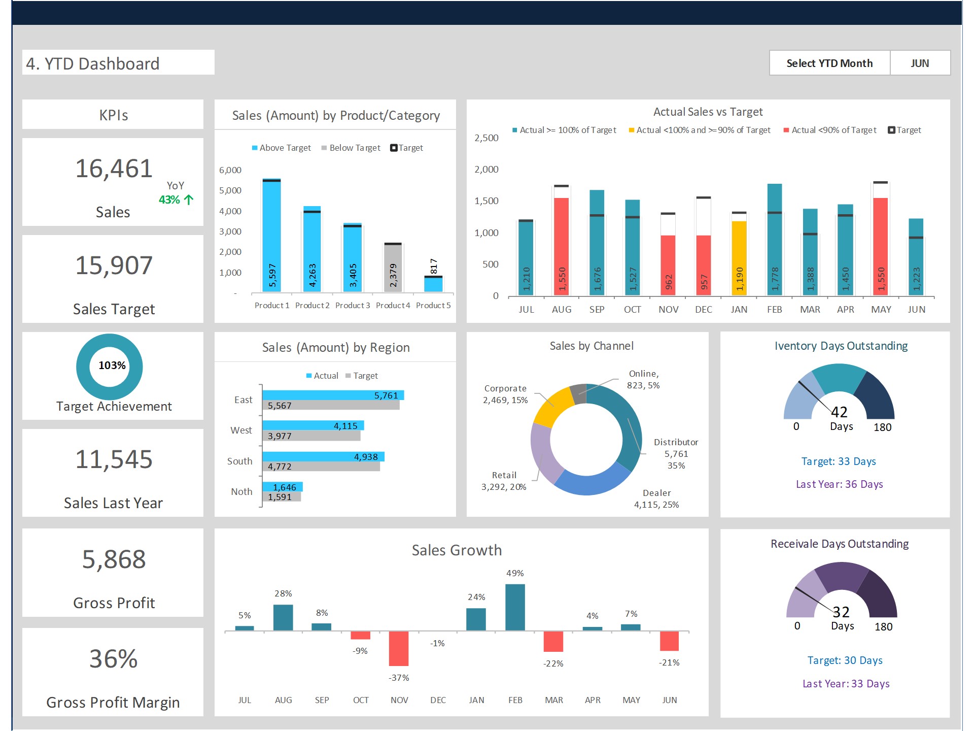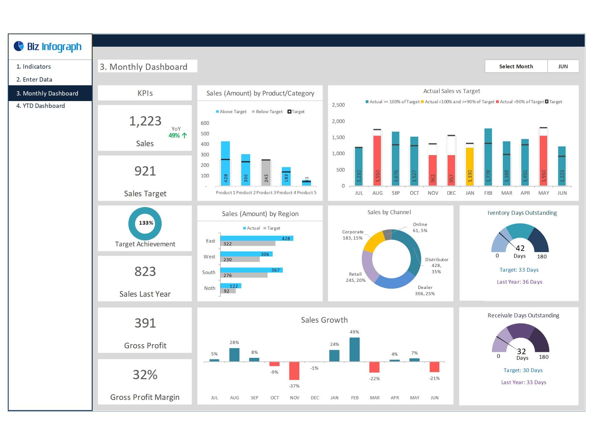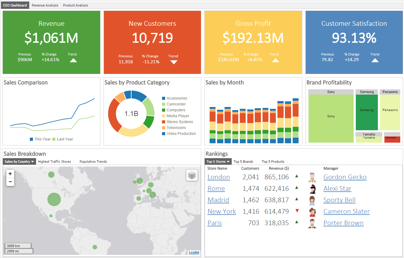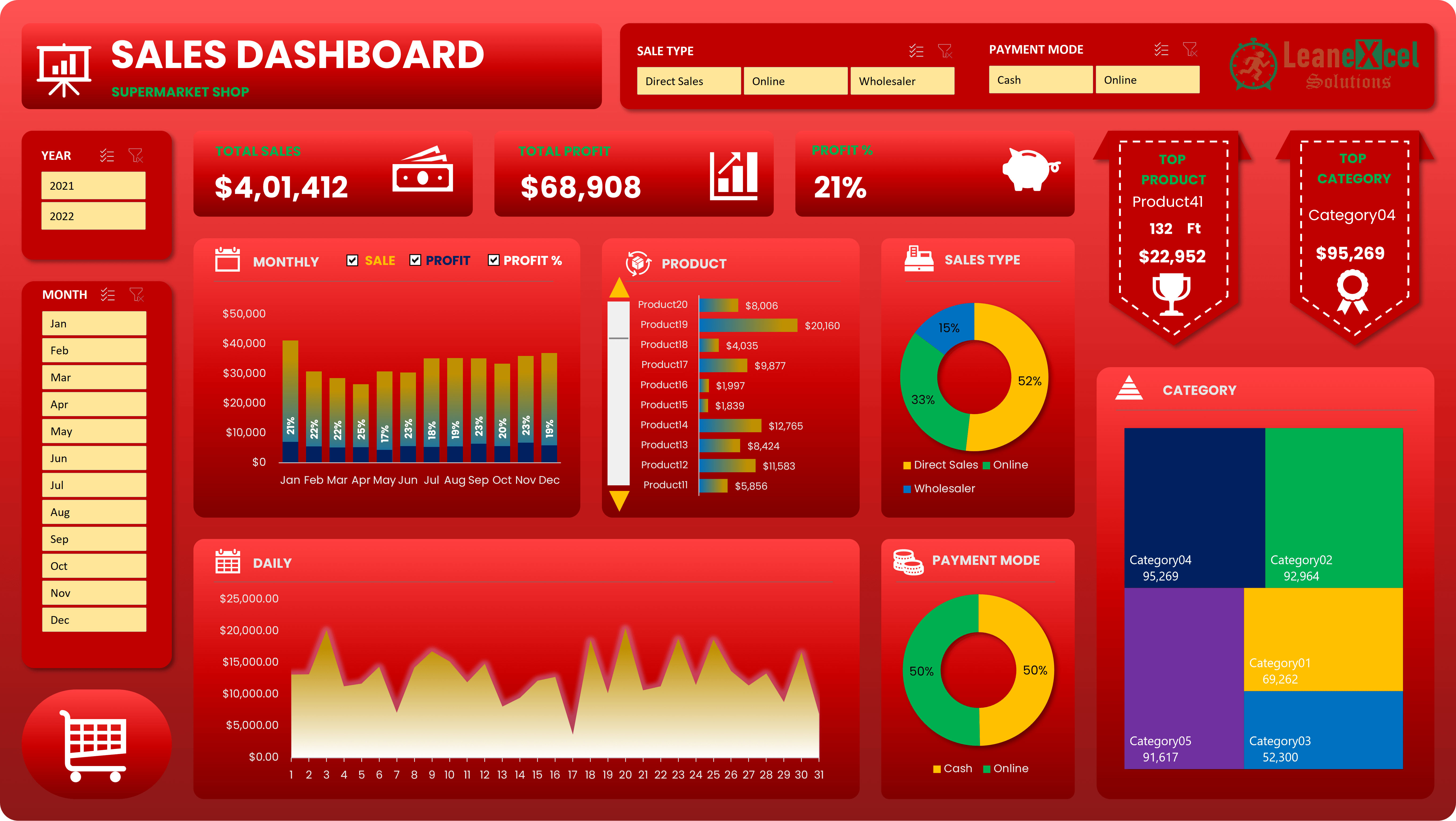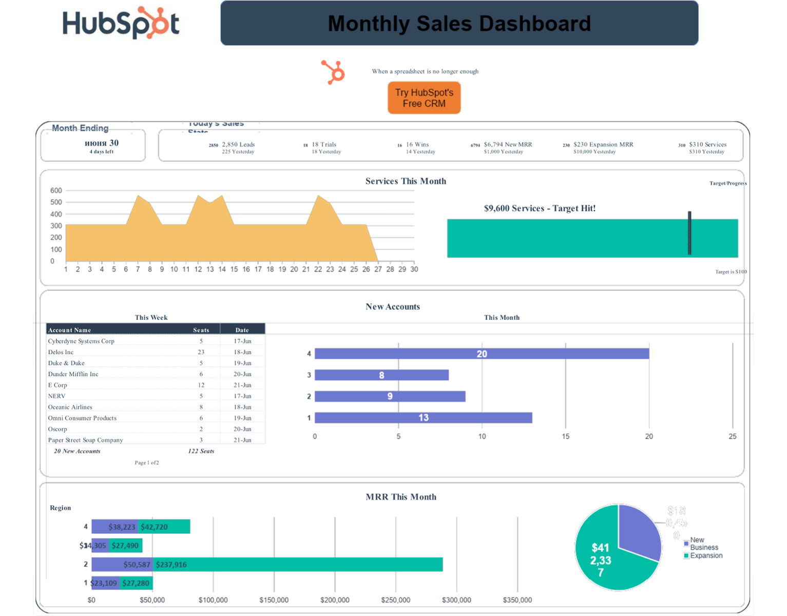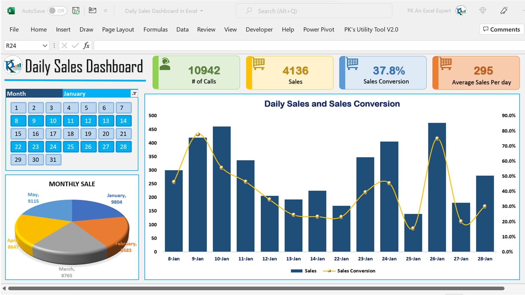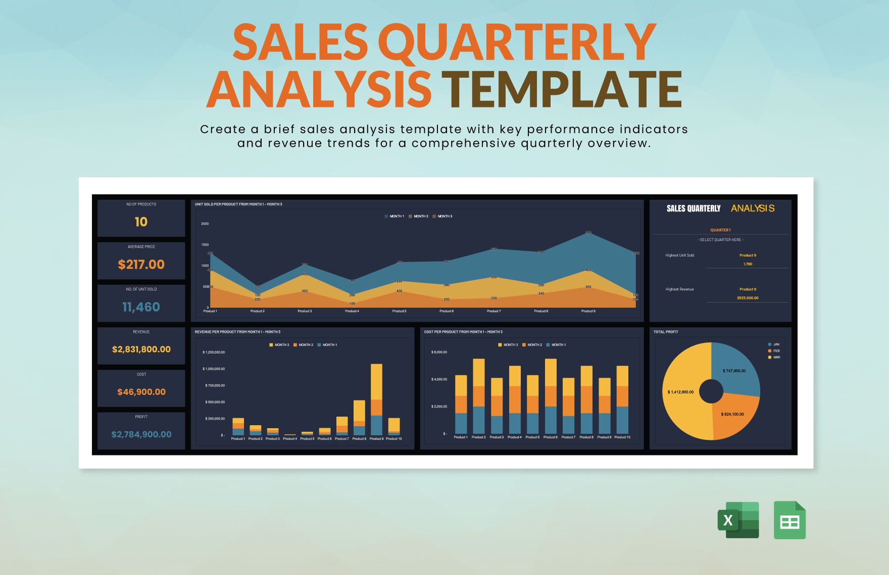
Sales Analysis Dashboard Excel Template is the superhero that swoops into your spreadsheet universe, turning chaotic sales data into a comic strip of insights that even your CFO can laugh at—and learn from.
What Makes a Great Sales Analysis Dashboard Excel Template?

Key Components You Can’t Ignore
First, remember that a dashboard is only as good as its building blocks. Think of it like a pizza: you need a sturdy crust, a flavorful sauce, a sprinkle of cheese, and toppings that satisfy every craving. In Excel terms:
- Data Source Connection – Whether it’s a CSV, an API, or your old dusty SQL server, the data must be pulled reliably.
- Pivot Tables – The heart of dynamic summarization; pivot tables are like the brain of your dashboard, making sense of rows and columns faster than a coffee shop barista.
- Charts & Visuals – From line graphs that track trends to bar charts that compare product performance, visuals should be clear, colorful, and, most importantly, not a nightmare to interpret.
- Conditional Formatting – This is your Excel cape that highlights the good, flags the bad, and makes your numbers pop like disco lights.
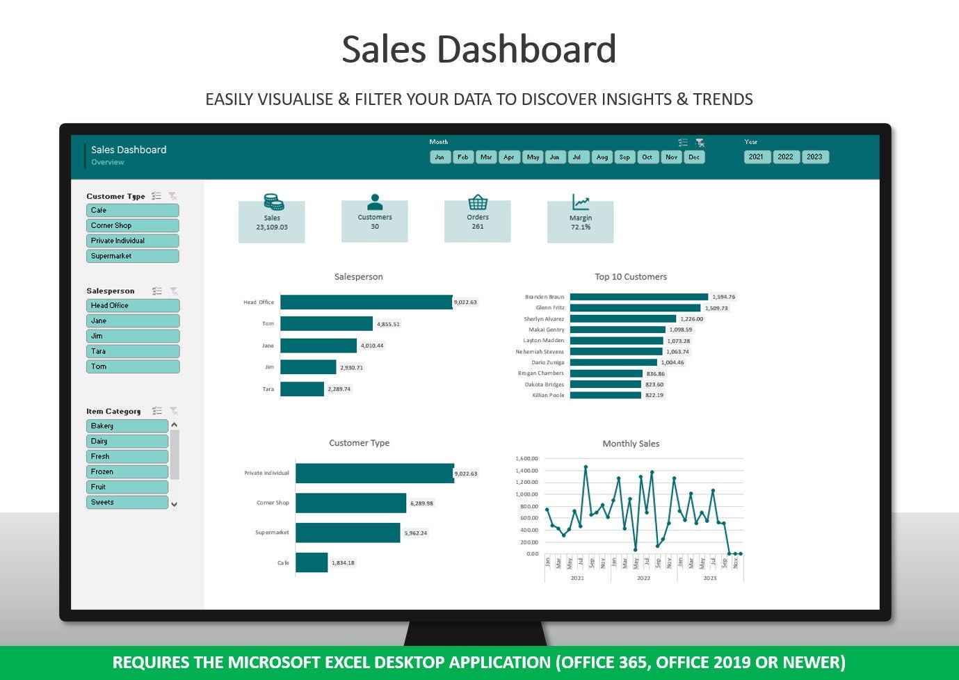
- Slicers & Timelines – Think of them as the dashboard’s remote controls, letting users slice through data with a single click.
- Summary Sheet – The “Executive Summary” where you cram all the big picture takeaways into a single, easy‑to‑read page.
Why the Dashboard Should Look Like a Dashboard
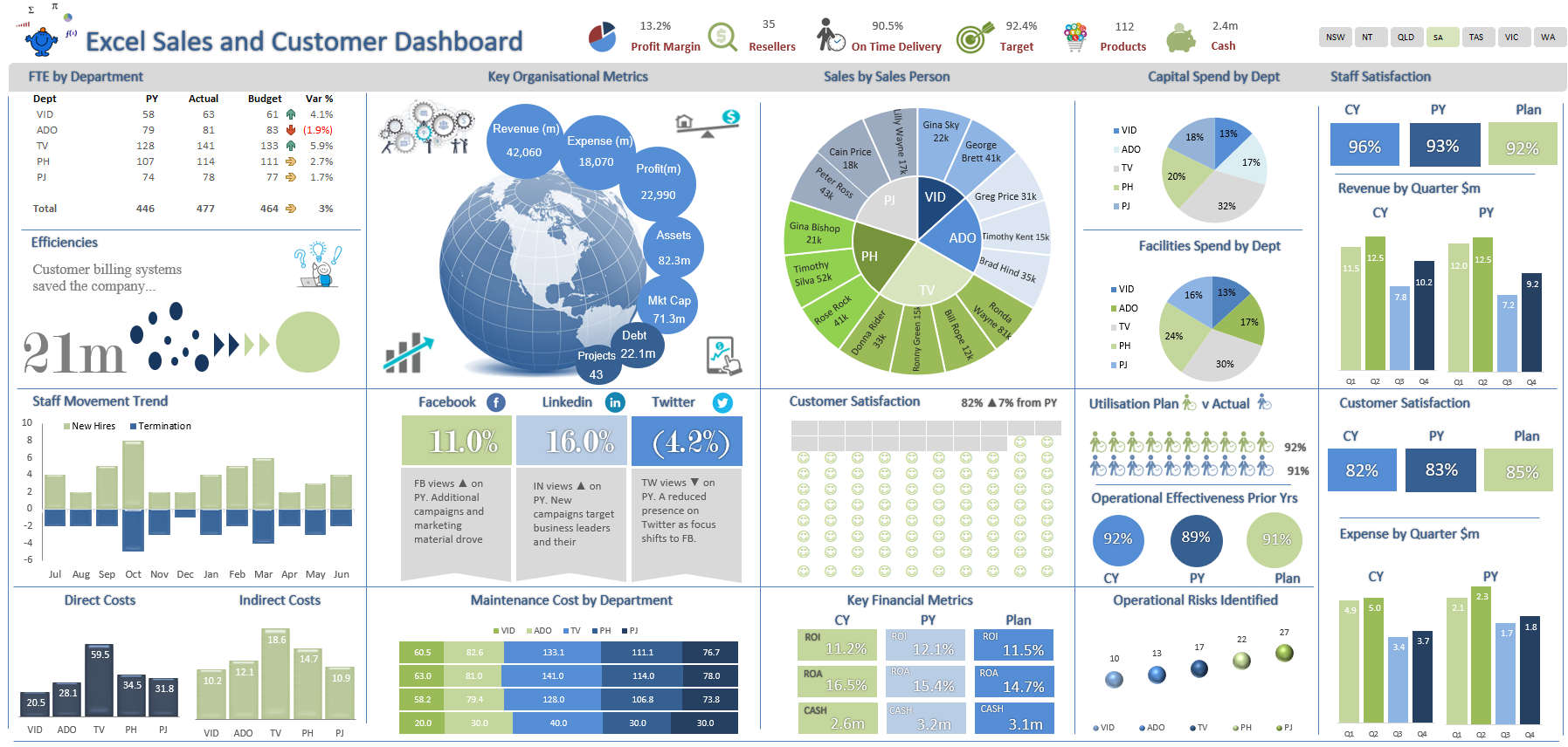
Don’t let your spreadsheet look like a spaghetti junction. Keep the design tidy, use consistent color schemes, and let white space act as a breathing room. A cluttered dashboard is like a clown car—fun at first glance, but you’ll quickly lose track of where the real action is.
Building the Template: Step‑by‑Step Guide
Step 1: Gather the Right Data
Start by asking the big question: “What does the business actually care about?” Common metrics include:
- Monthly and quarterly sales revenue
- Units sold by product line
- Customer acquisition cost
- Conversion rates and churn
- Profit margins by region
Once you know the metrics, map out the source tables. Create a dedicated sheet called “Data” and use named ranges or structured tables to keep everything tidy.
Step 2: Design the Layout with a Dash of Humor
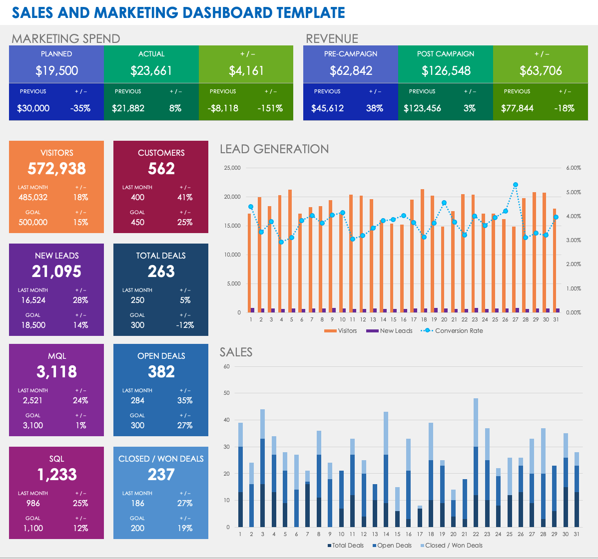
Plan a grid layout: top left for a KPI snapshot, top right for trend charts, bottom for deep dives. Sprinkle in a quirky title like “Sales Sleuth Dashboard” or “Revenue Rodeo” to keep the mood light. Humor can be subtle—use playful icons or a meme in the header—but make sure the data remains front and center.
Step 3: Pull in Pivot Tables Like a Boss
Create a pivot table for each key metric. For example, a pivot that shows “Revenue by Product & Region” will let you slice and dice in real time. Remember:
- Place the pivot on a separate sheet or in a dedicated pivot table area.
- Use the “Add to Data Model” option if you want to link multiple pivots via Power Pivot.
- Refresh the pivot after importing new data to keep everything current.
Step 4: Add Conditional Formatting That Shouts “Look Here!”
Highlight top performers, low performers, and anomalies with colors:
- Green for above target
- Orange for borderline
- Red for below target
Use data bars or color scales for quick visual cues. A quick trick: use the “Icon Sets” feature to add a smiley face for good metrics and a sad face for bad ones—no one likes a frowning number.
Step 5: Insert Slicers for Interactive Fun
Once you have your pivot tables, add slicers for fields like “Product,” “Region,” and “Time Period.” Place them on a floating toolbar so users can filter everything in a single click. To make it even more engaging, use a slicer with a custom shape, like a donut or a rocket, to emphasize the theme.
Step 6: Create a Summary Sheet for Quick Glance
The executive summary should contain:
- Overall revenue trend line
- Top 5 products by revenue
- Monthly growth rate (YoY)
- Key alerts (e.g., revenue drop >10%)
Use large fonts for KPIs, keep the color palette consistent, and add a small “Last Updated” timestamp so your stakeholders know the data’s freshness.
Real‑World Use Cases That Will Make Your Boss Smile

Case Study: The Startup That Sold 200% More
Startup X, a niche SaaS provider, used a sales dashboard to pinpoint which features were driving revenue. By adding a slicer for “Feature” and a trend line for “Monthly Recurring Revenue,” they discovered that the “Advanced Analytics” feature had a 35% higher retention rate. Focus marketing spend on this feature, and within three months, they doubled sales. The dashboard became their secret weapon—so much so that the founder joked it was “more powerful than a double espresso.”
Case Study: The Retailer Who Found the Dark Horse Product
Retailer Y had a massive product catalog but struggled to see which items actually mattered. They set up a pivot table summarizing “Units Sold” by “Product Category” and added a bar chart. The chart revealed a surprising surge in a niche “Eco‑Friendly” product line that hadn’t been highlighted. By boosting the inventory of this dark horse, they increased overall margin by 12% in the next quarter. The dashboard not only saved money but also gave the marketing team a new storyline: “Go green and go rich!”
Common Pitfalls and How to Avoid Them
Overloading the Dashboard with Too Many Charts
Less is more. Too many visualizations create visual noise and dilute insights. Keep the number of charts to five or fewer per page and prioritize the most actionable metrics.
Using Inconsistent Color Schemes
Consistency in colors ensures that viewers can immediately interpret the data. Stick to a palette of 2–3 primary colors and a few neutrals. Avoid using colors that clash or are too bright—unless you’re building a neon circus.
Forgetting to Refresh Data Sources
Static dashboards become stale fast. Automate the data import with Power Query or a VBA macro that refreshes all connections at workbook open. Add a “Refresh Now” button for quick updates during meetings.
Advanced Tricks to Take Your Dashboard From Good to Great
Dynamic Dashboard Titles with Formulas
Instead of a static header, use a formula that updates the title based on the current filter. Example: ="Sales Dashboard – "&TEXT(TODAY(),"MMMM YYYY"). This keeps the dashboard relevant without manual edits.
Using Power Query for Cleaner Data
Power Query can transform raw data into a clean, normalized table before it reaches the pivot. Steps include removing duplicates, trimming spaces, and adding calculated columns (e.g., “Revenue per Unit”). It also allows you to combine data from multiple sources seamlessly.
Embedding VBA for Auto‑Refresh
For advanced users, a simple macro can refresh all data connections, pivot tables, and slicers in one click. Add a button that runs the macro, and you’re essentially giving your dashboard a coffee boost every time you open it.
Conclusion

With the right mix of clean data, thoughtful design, and a touch of humor, a Sales Analysis Dashboard Excel Template can turn raw numbers into a story that even the most skeptical stakeholder will binge‑read. Build it with clear metrics, interactive slicers, and a dash of personality, and you’ll have a tool that’s as useful as a Swiss Army knife and as fun as a carnival ride. So, grab your keyboard, hit Ctrl + T to create a table, and let the data fiesta begin. Happy dashboards!