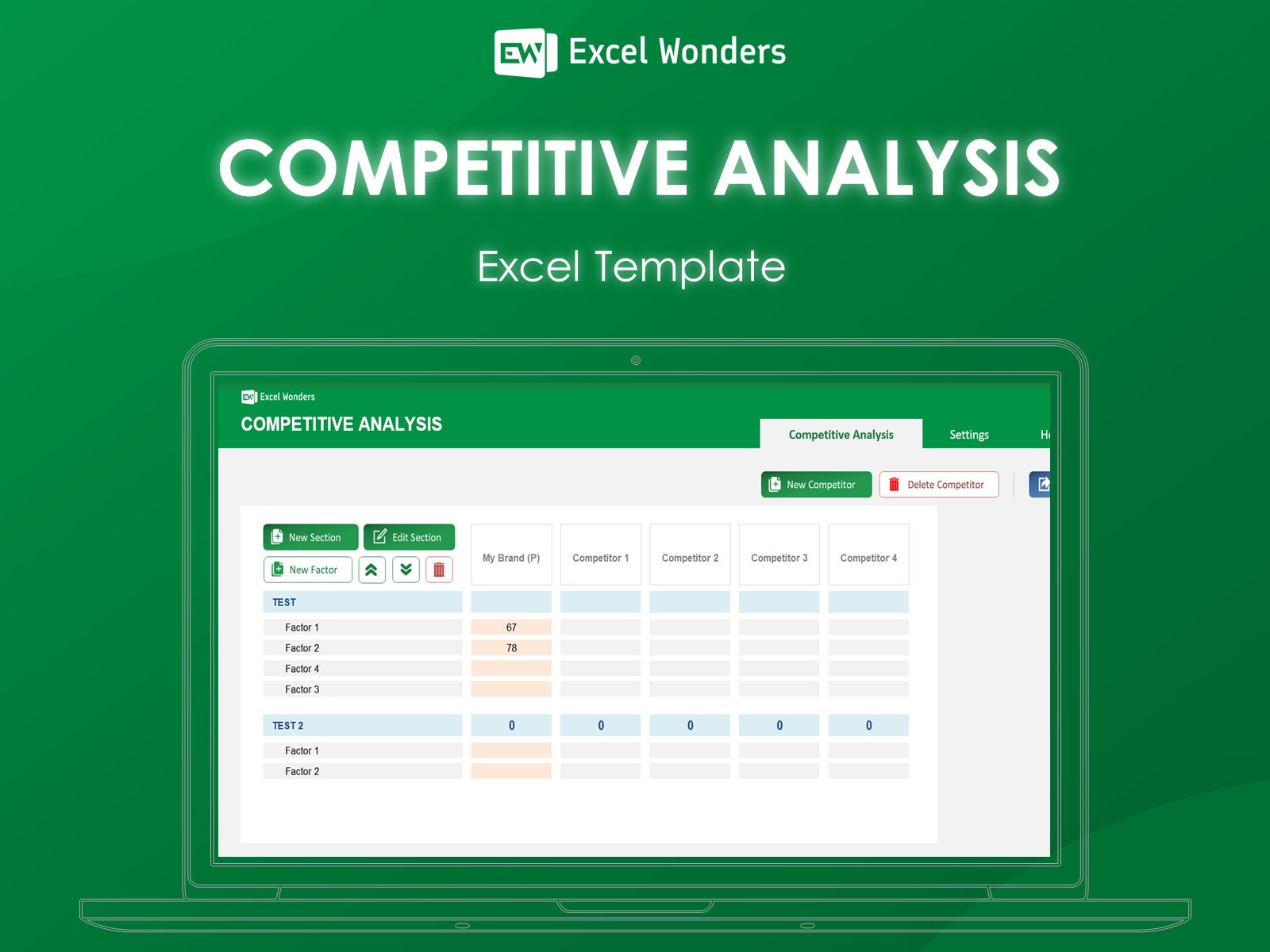
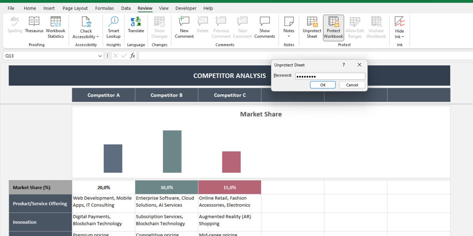
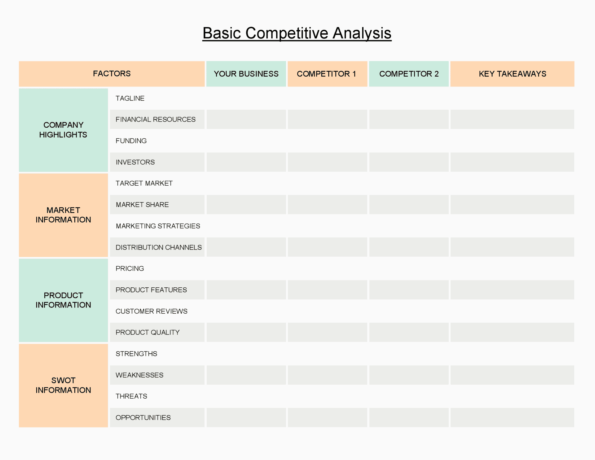
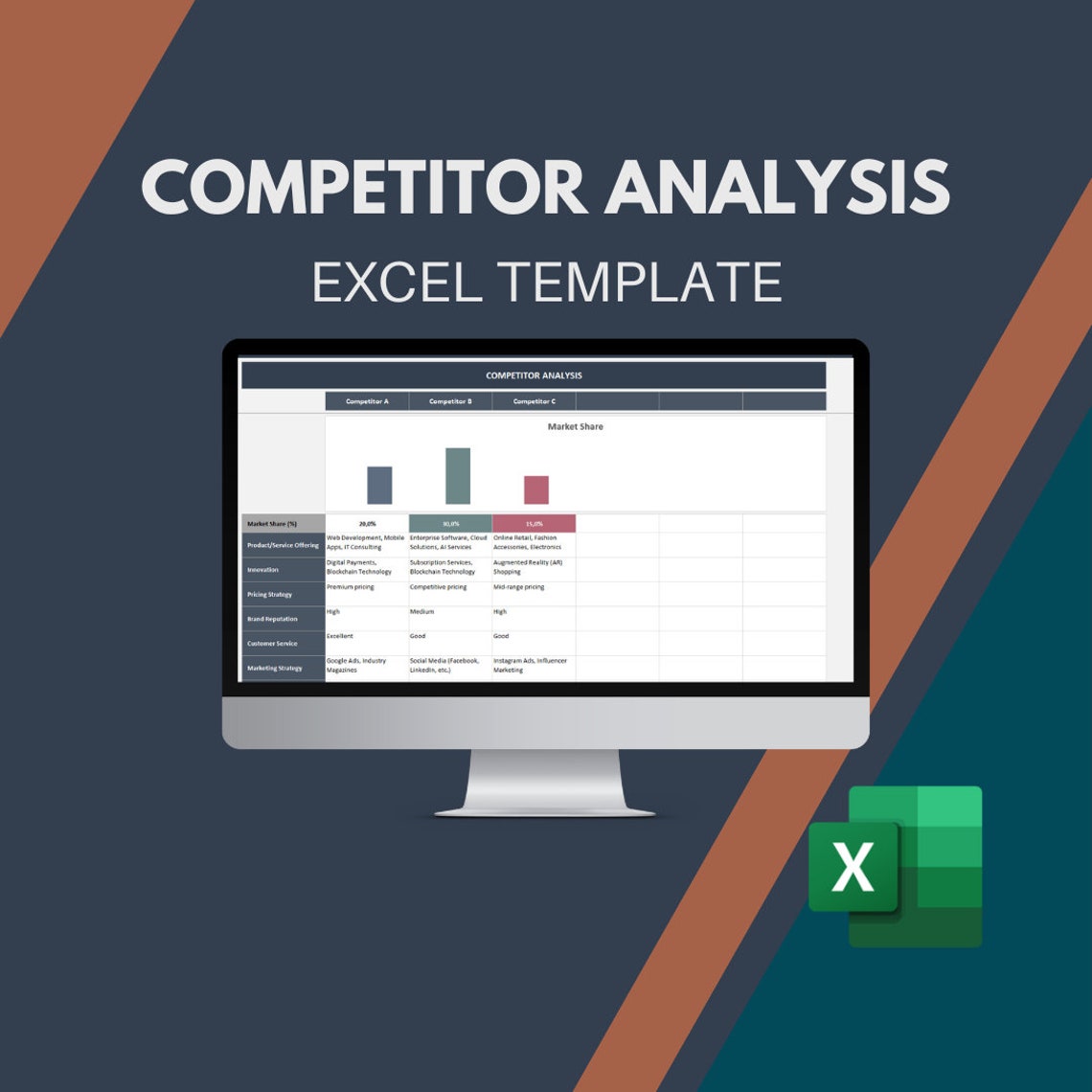
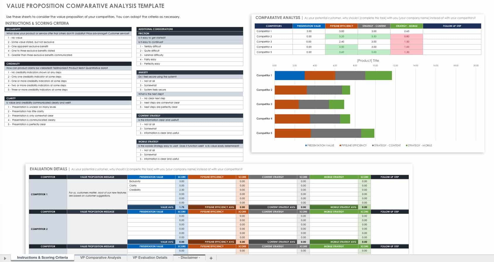
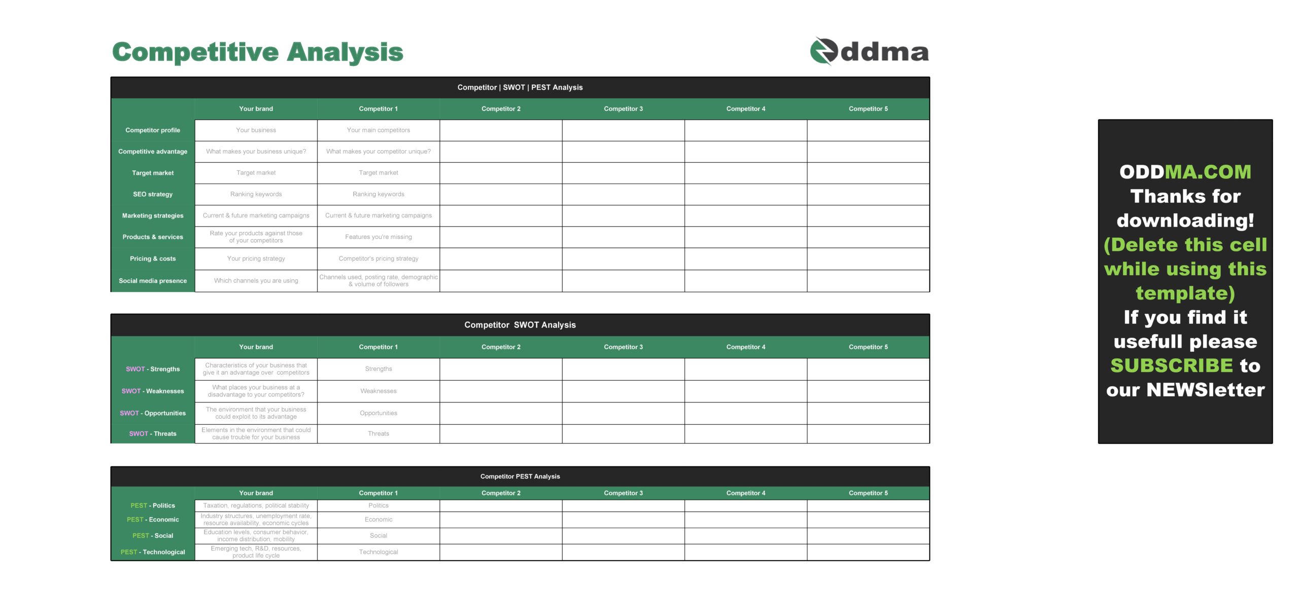
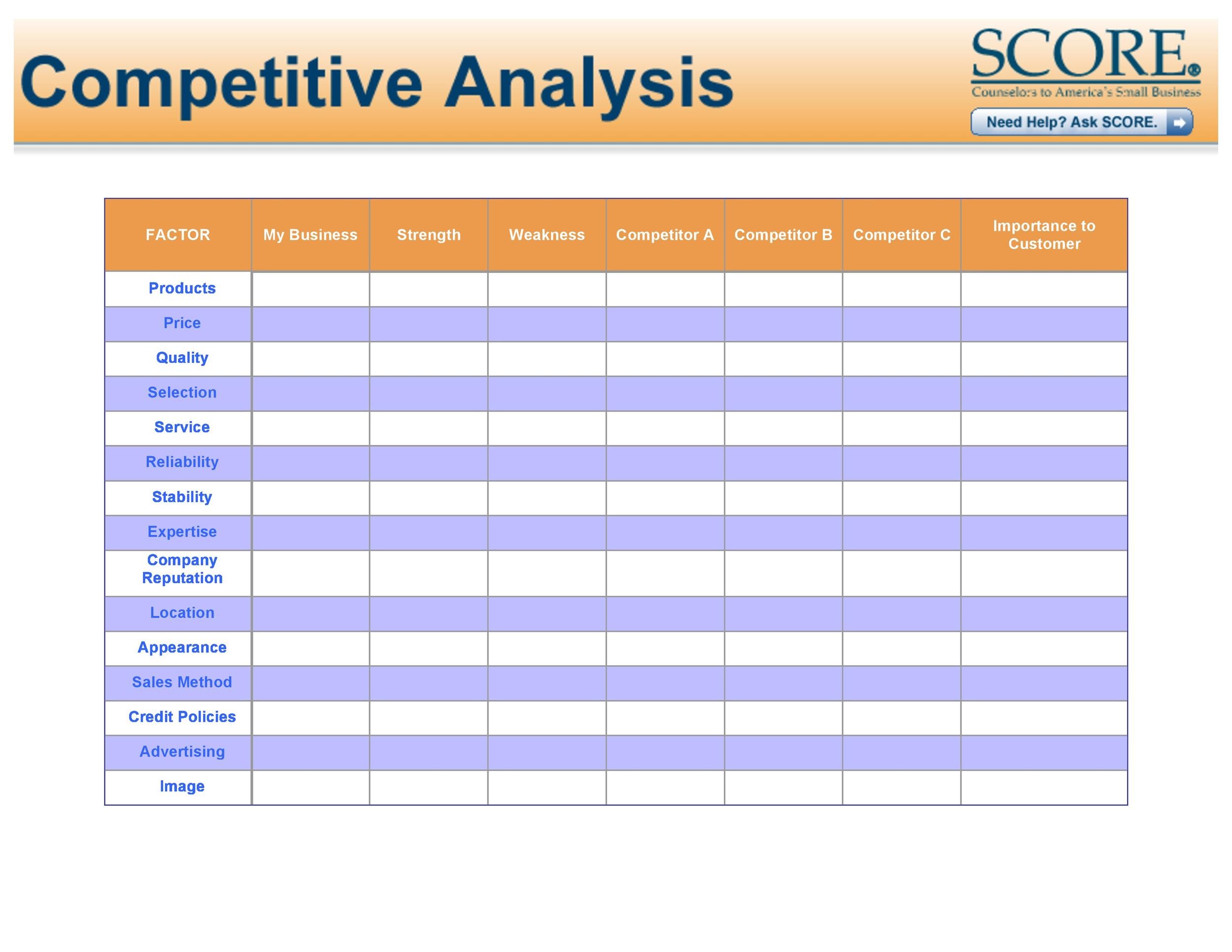
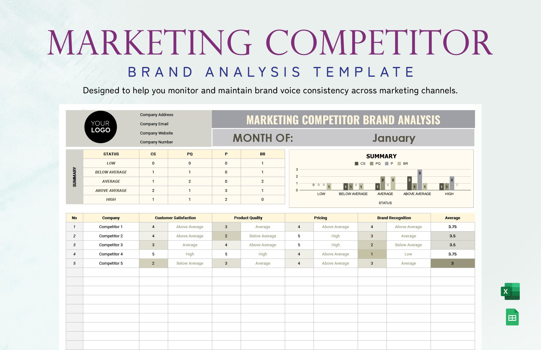
Ux Competitive Analysis Template Excel is more than a simple spreadsheet—it becomes a living repository that guides product teams in crafting user experiences that resonate with Asian audiences while staying competitive on a global scale.
Understanding UX Competitive Analysis
What Is UX Competitive Analysis?
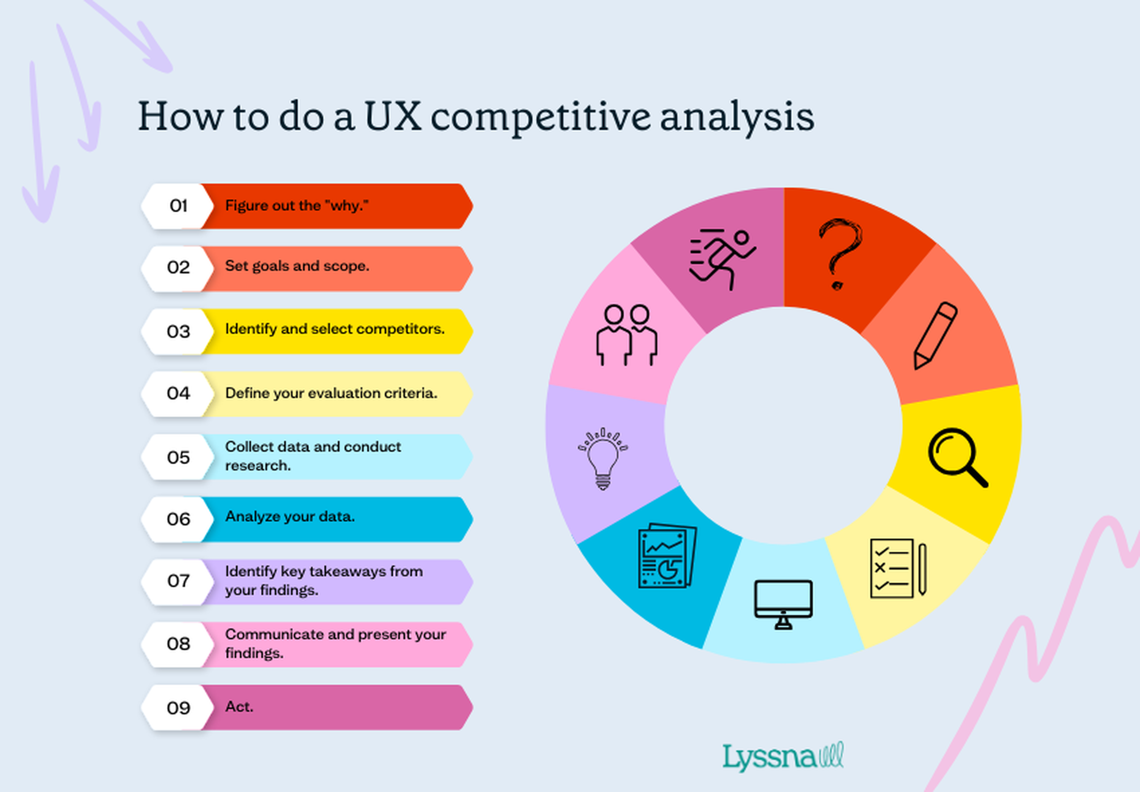
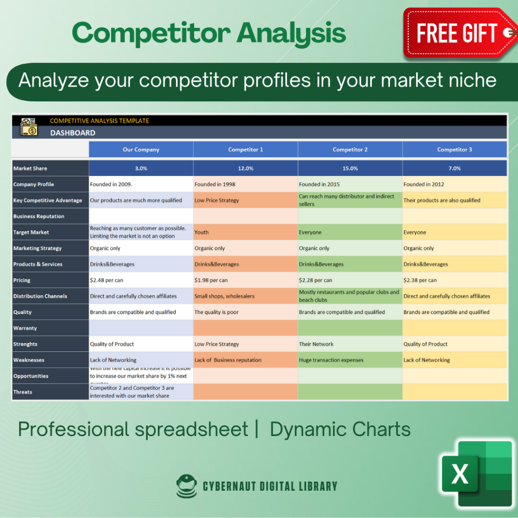
UX competitive analysis involves systematically comparing the user experience aspects of rival products. It focuses on design, navigation, performance, and emotional engagement rather than just feature lists. By dissecting competitors’ strengths and weaknesses, teams uncover opportunities to differentiate and elevate their own offerings.
Why It Matters for Asian Markets
Asia’s digital landscape is diverse, with varied cultural preferences, device ecosystems, and regulatory constraints. A well‑crafted UX competitive analysis template can surface region‑specific insights—such as localization nuances, mobile payment habits, or visual hierarchy preferences—that inform design decisions tailored for markets like Japan, South Korea, India, and Southeast Asia.
Key Components of the Ux Competitive Analysis Template Excel
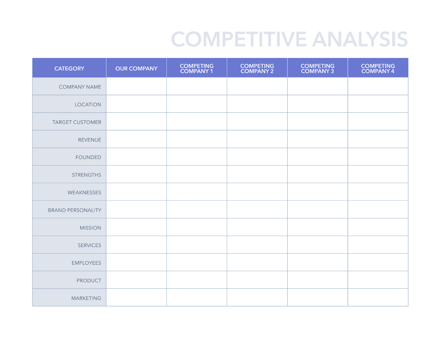
Feature Comparison Grid
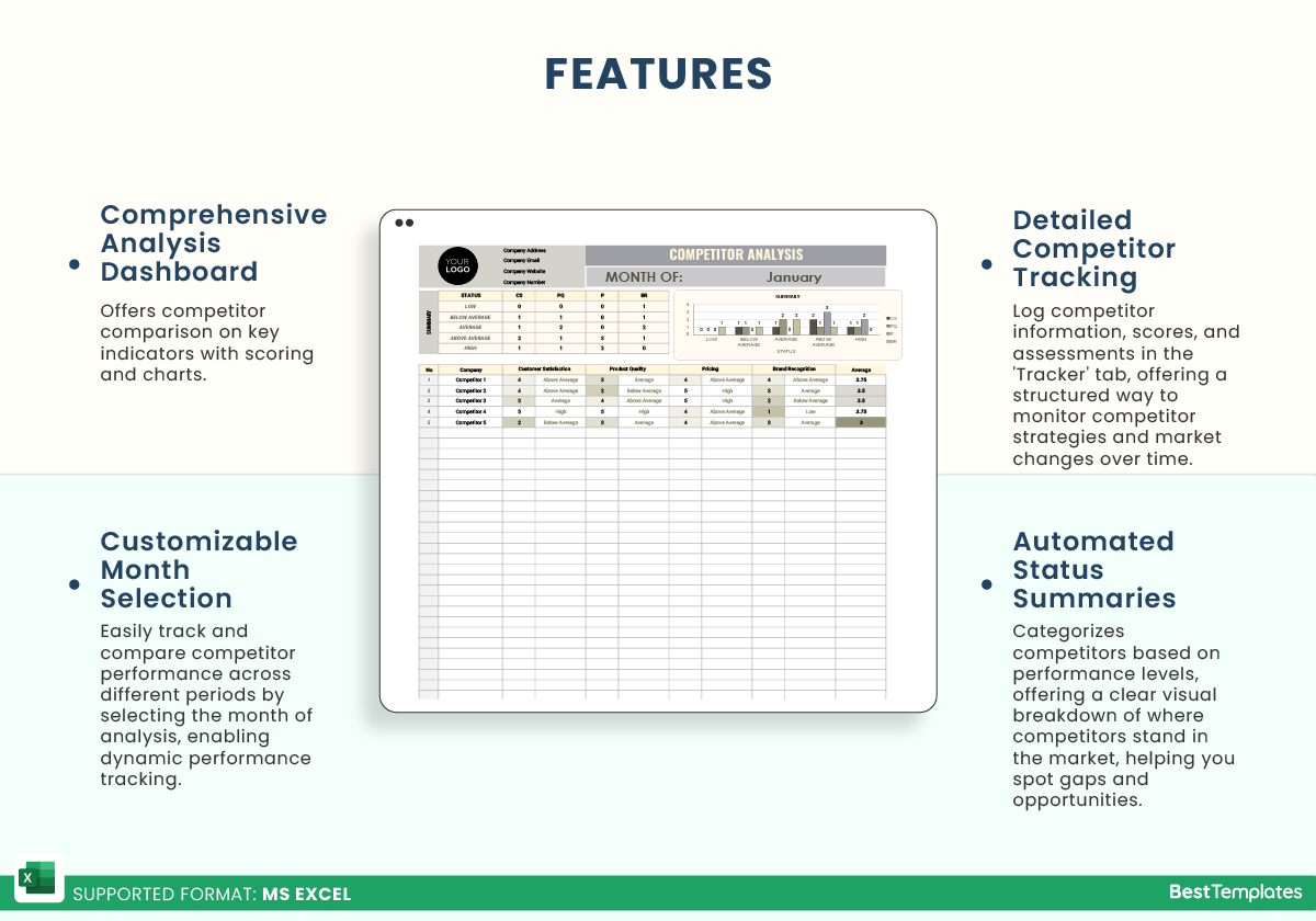
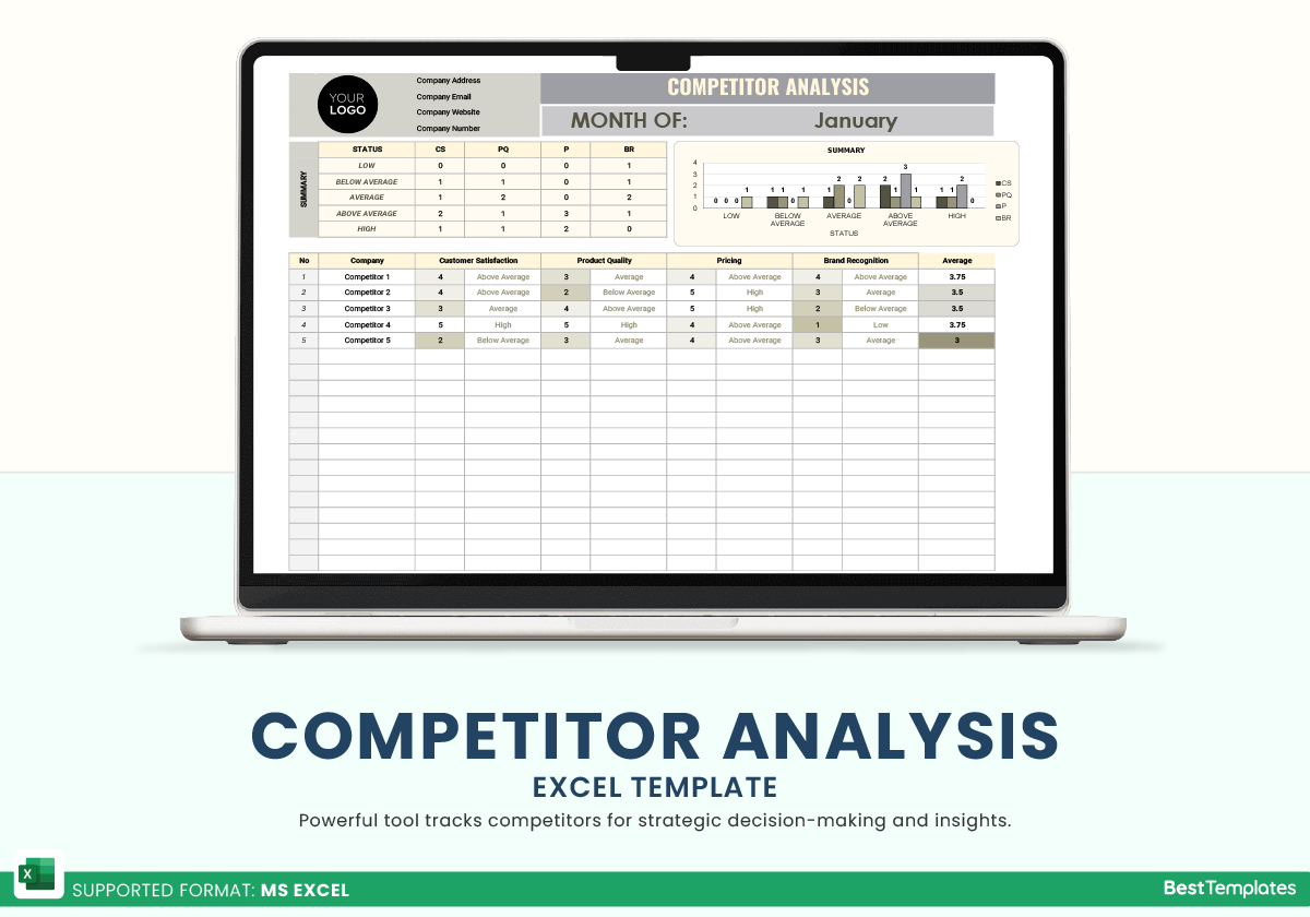
List core features in rows and competitors in columns. Use Boolean flags, numeric scores, or icons to indicate presence and quality. This visual matrix instantly reveals gaps and market leaders.
Usability Metrics
Include objective measures such as task completion time, error rates, and satisfaction ratings gathered from usability tests or surveys. Incorporating metrics like Time on Task and Success Rate quantifies how smoothly users navigate each product.
Visual Design Scoring
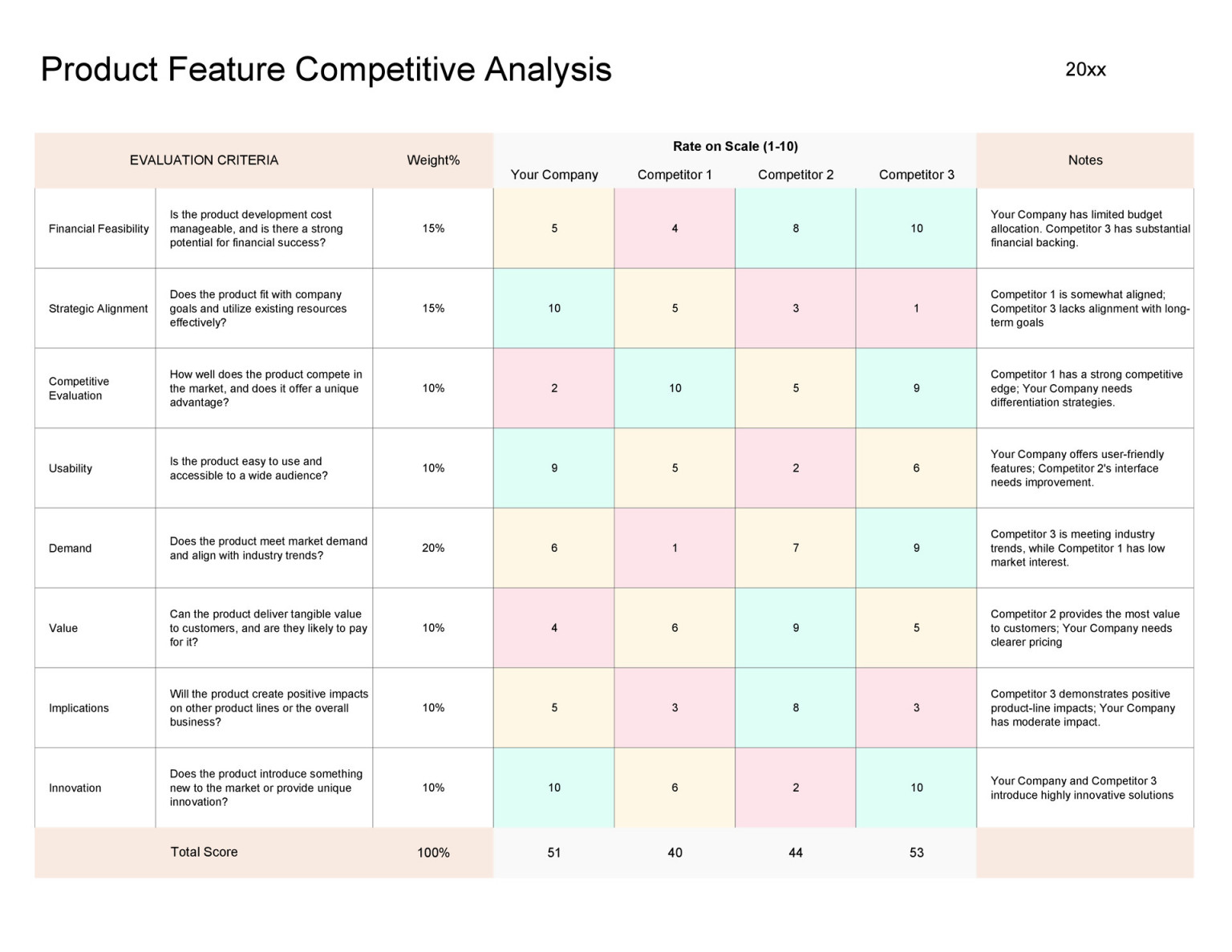
Assign a standardized scale (1‑10) to elements like color harmony, typography clarity, and visual consistency. Adding a column for Aesthetic Appeal encourages designers to balance form and function.
User Feedback Segments
Dedicate rows for qualitative insights sourced from reviews, social media, and support tickets. Tag sentiments—positive, neutral, negative—and link them to specific feature clusters. This contextual layer bridges quantitative scores with human experience.
Step‑by‑Step Guide to Building Your Own Template
Setting Up the Spreadsheet Structure
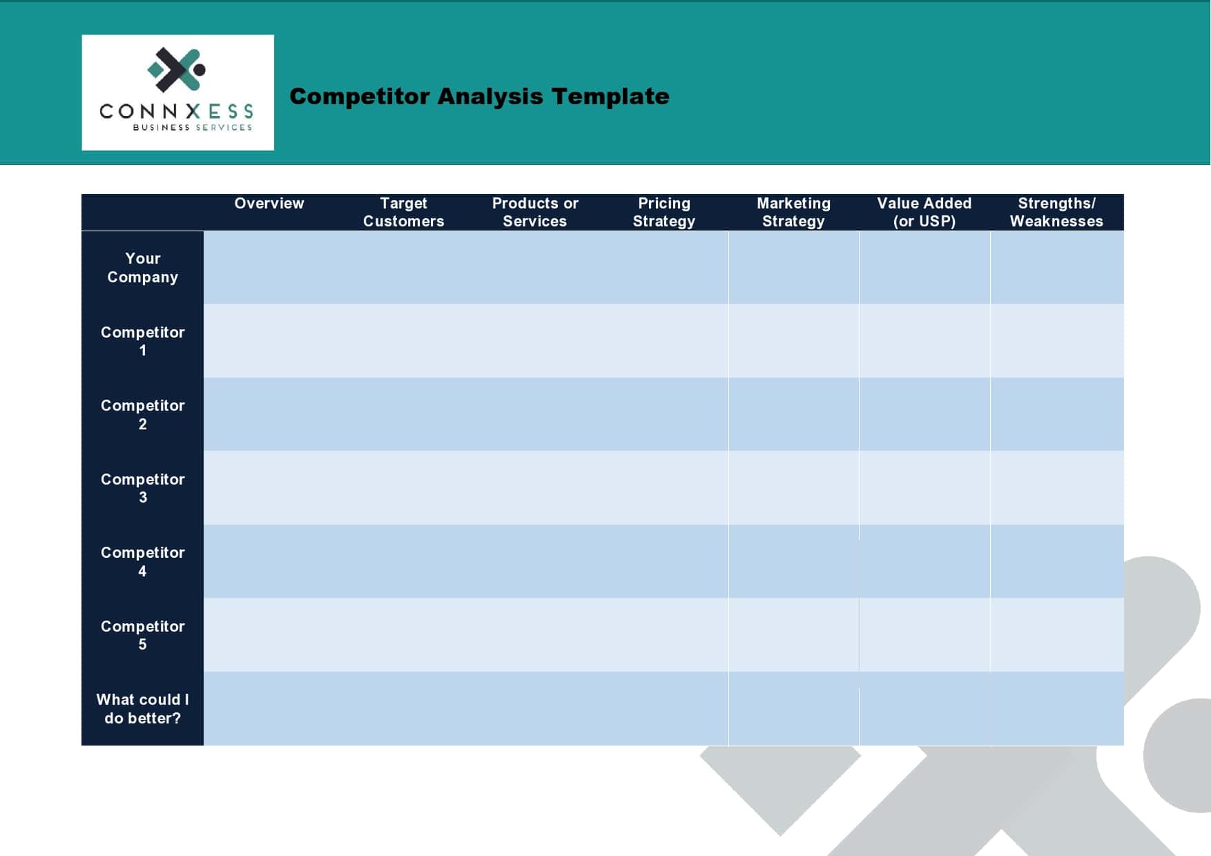
Begin with a master sheet that houses the competitor list and a control panel. Then create individual sheets for each major category: Features, Usability, Visual Design, and Feedback. Use Data Validation to standardize inputs and protect against errors.
Defining Competitors and Data Sources
Select 3–5 primary competitors that match your market scope. Gather data from public sites, app stores, beta releases, and third‑party analytics. For Asian markets, prioritize local platforms like Shopee, Lazada, or KakaoPay, which may not have comprehensive documentation elsewhere.
Collecting Quantitative Data
Run usability tests with participants from your target demographics. Capture metrics in a dedicated sheet. Employ tools like UserTesting, Lookback, or native analytics that support Session Recordings to ensure accuracy.
Inputting Qualitative Insights
Compile feedback from app reviews, social media sentiment analysis, and focus group transcripts. Use a Tagging System—e.g., “Navigation,” “Accessibility,” “Cultural Fit”—to cluster comments. This will help later when mapping feedback to design decisions.
Calculating Weighted Scores
Assign weights to each dimension based on business priorities (e.g., usability 40%, visual design 25%, features 20%, feedback 15%). Apply formulas like =SUMPRODUCT to produce a composite score per competitor. This quantitative synthesis clarifies where each product excels or lags.
Visualizing the Results
Use conditional formatting, heat maps, and bar charts to transform raw numbers into actionable visual stories. A heat‑map of feature gaps, for example, immediately highlights what your product should prioritize.
Real-World Case Study: A Japanese E-commerce Brand
Context and Objectives
“KitsuneMart,” a mid‑tier online marketplace, aimed to increase conversion rates in a market dominated by Amazon Japan and Rakuten. Their goal: identify UX gaps that hindered checkout completion.
Data Collection Process
The team executed a three‑phase analysis. First, they mapped all checkout steps across competitors. Second, they recorded time‑on‑task and error rates from a sample of 30 Japanese users. Finally, they gathered sentiment data from Twitter and local review sites, filtering for terms like “buy,” “payment,” and “cart.”
Analysis Findings
Results revealed that competitors excelled in localized payment options (QR code, bank transfer), whereas KitsuneMart’s checkout only supported credit cards. The visual design comparison showed competitors’ minimalist layouts, reducing visual clutter for mobile users. Additionally, user feedback highlighted confusion over multi‑currency displays.
Strategic Recommendations
1. Integrate QR‑based payment gateways. 2. Simplify checkout screens, removing unnecessary steps. 3. Localize currency labels and provide clear conversion rates. 4. Conduct A/B tests on the new layout to validate improvements.
Tips for Making Your Template Adaptable Across Regions
Customizing Metrics for Cultural Nuances
In East Asia, color symbolism carries weight—red for luck, white for purity. Add a “Cultural Sensitivity” column to assess how color palettes align with regional preferences. Similarly, adjust Readability metrics to account for different reading directions or font sizes preferred by local users.
Incorporating Mobile‑First Insights
Asia’s mobile penetration is among the highest globally. Include metrics such as First Contentful Paint, Touch Target Size, and Gesture Flow specifically for smartphone users. This ensures the template reflects real device experiences.
Leveraging Local Data Sources
Use region‑specific analytics platforms like Baidu Analytics for China or Gojek’s internal dashboards for Indonesia. These sources provide insights on page load speeds, regional traffic, and local user behavior patterns.
Integrating the Template into Agile UX Workflows

Sprint Planning with Competitive Insights
Embed the competitive analysis spreadsheet into your sprint backlog. During planning, team members reference the latest scores to prioritize feature enhancements. For instance, if competitors score high on accessibility but your product is low, a sprint dedicated to improving accessibility can be planned.
Continuous Improvement and Iteration
Schedule quarterly reviews of the template to capture market shifts. Update competitor lists, adjust weights, and refine metrics based on new releases or evolving user expectations. This iterative loop keeps your UX strategy data‑driven and responsive.
Common Pitfalls and How to Avoid Them
Overloading with Irrelevant Data
Focus on metrics that directly impact your business objectives. A cluttered spreadsheet dilutes insights. Use a Prioritization Matrix to keep only high‑impact data visible.
Misinterpreting User Metrics
Remember that raw numbers lack context. Always pair quantitative data with qualitative feedback. A high error rate might reflect a confusing label rather than a technical fault.
Neglecting the Human Touch
UX is ultimately about people. Don’t let the template replace empathy. Conduct periodic user interviews to validate assumptions drawn from spreadsheet analyses.
Conclusion
By harnessing a thoughtfully structured Ux Competitive Analysis Template Excel, designers and product managers in Asia can systematically compare their offerings against regional leaders, surface actionable insights, and align UX improvements with localized user expectations. The template’s modular design ensures it grows with your product, while its data‑driven foundation provides clarity amid the dynamic, culturally rich Asian digital ecosystem. Armed with this tool, teams can move beyond guesswork, make evidence‑based decisions, and ultimately create experiences that resonate, convert, and endure across diverse markets.