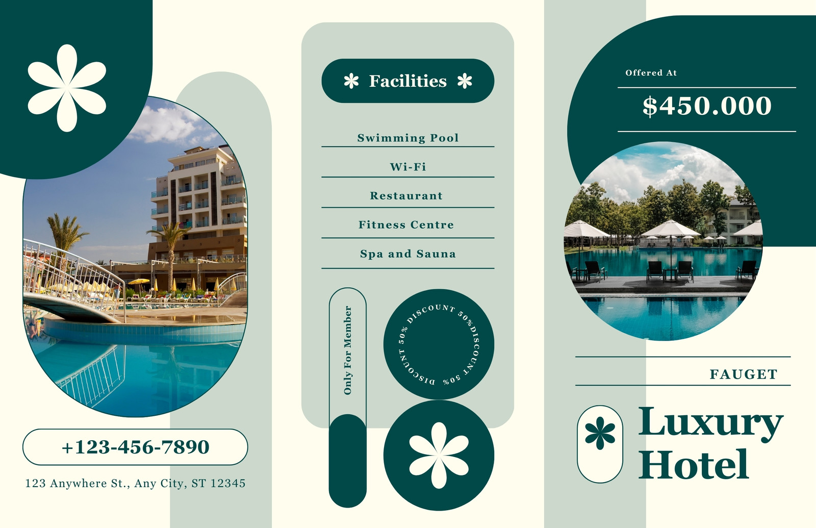
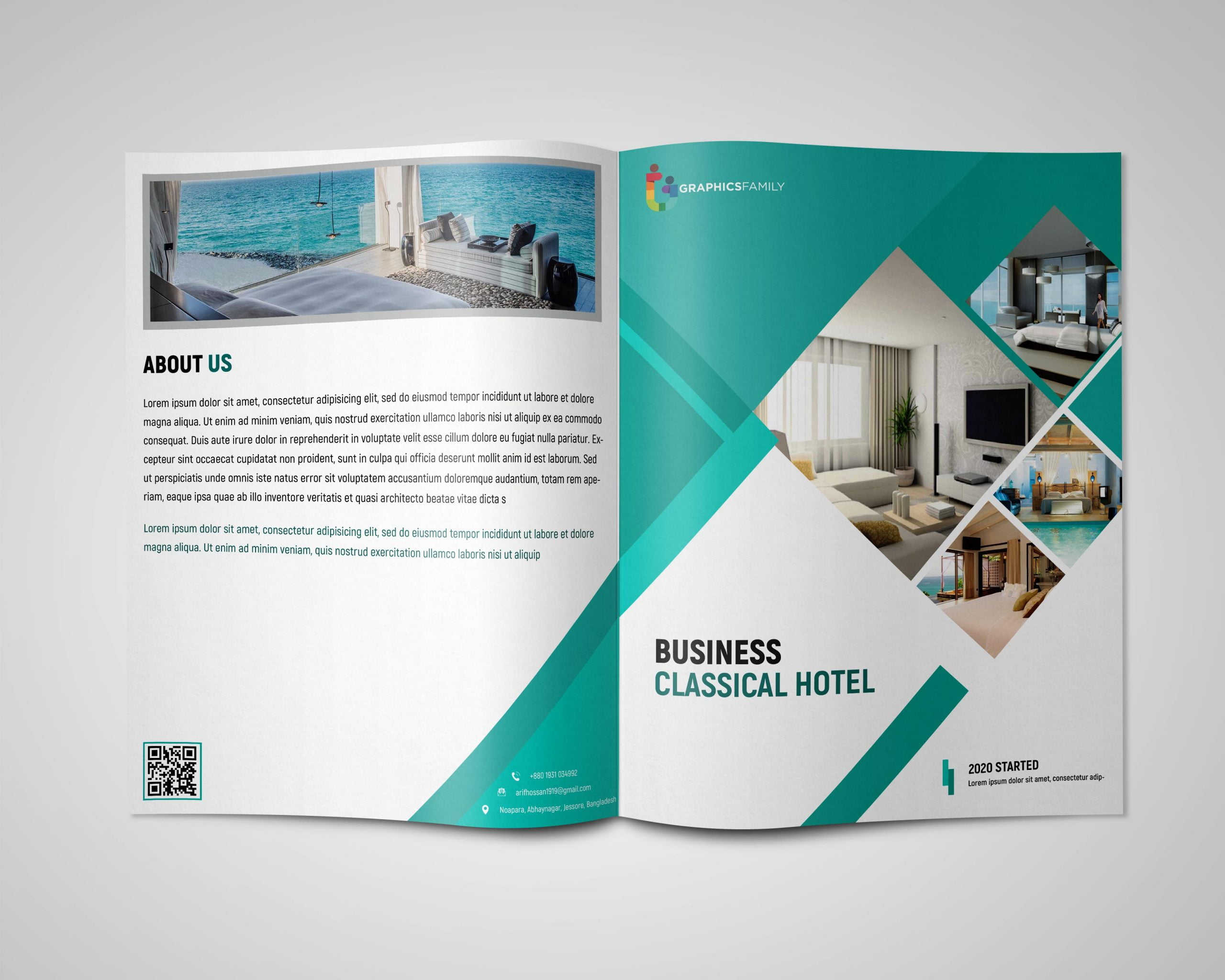
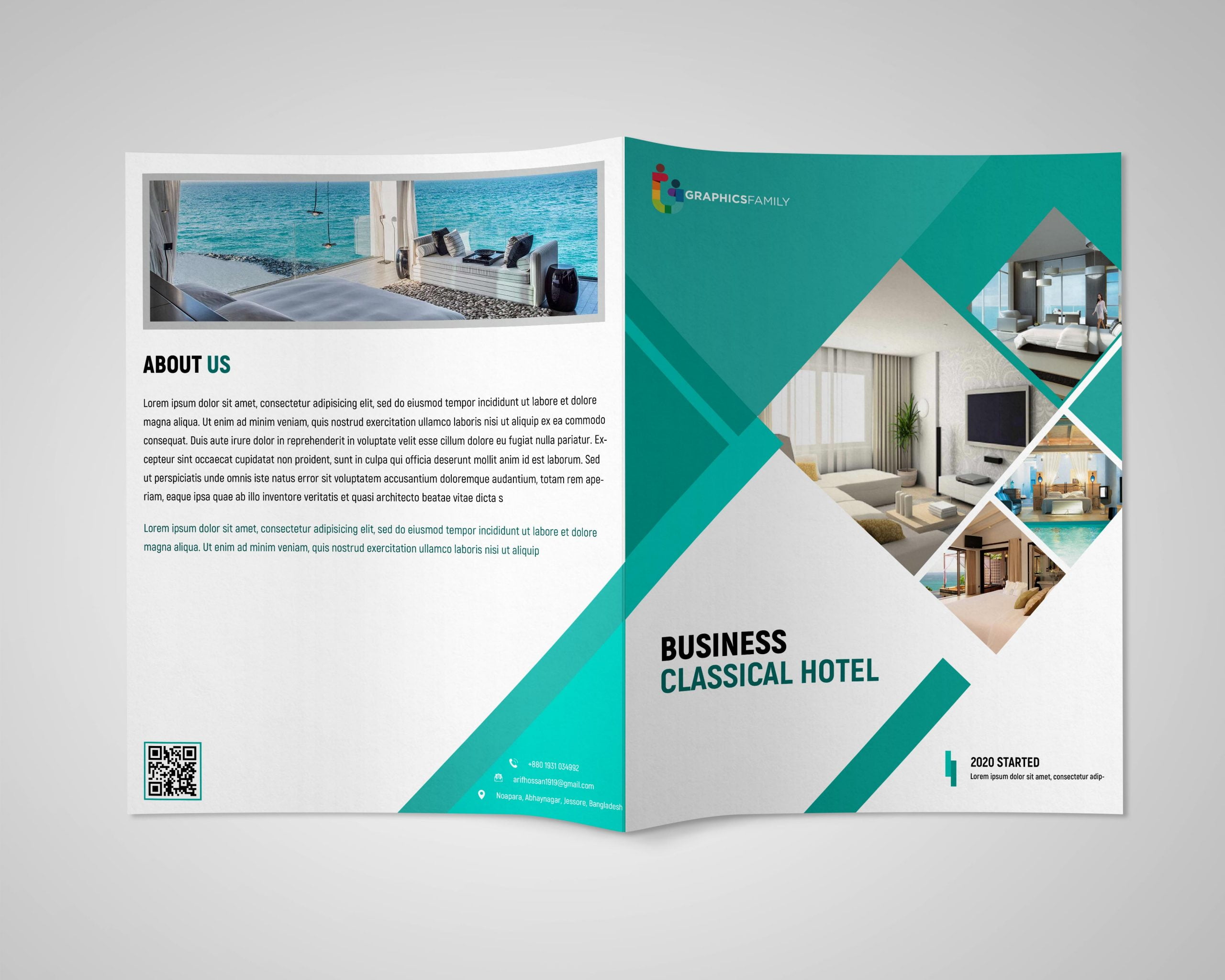
Hotel Brochure Design Templates are the secret sauce that turns a bland piece of paper into a five‑star culinary experience for the eyes, and today we’re dishing out the full menu of how to make yours unforgettable while keeping the tone as light as a pillow‑fluffed cloud in a boutique resort lobby.
Why Every Hotel Needs a Snazzy Brochure
First off, a hotel brochure is the only piece of marketing collateral that can simultaneously make you feel like royalty, a beach‑loving dolphin, and a savvy business traveler—all before you’ve even stepped foot in the lobby. It’s the tactile version of your website’s “About Us” page, except it doesn’t crash when you open it on a dial‑up connection. In a world where attention spans are shorter than a minibar snack, a well‑crafted brochure grabs prospects by the lapels and whispers, “Stay here, we’ve got the best pillows.”
First Impressions That Stick
Think of your brochure as the hotel’s handshake. A firm, confident grip (or in print terms, a striking cover) makes guests want to shake it again. Bold colors, crisp images, and a headline that reads like a promise (“Sleep Like a King, Wake Up Like a Champ”) instantly convey personality and set expectations.
Brand Consistency Across Touchpoints
When the brochure mirrors your logo, font, and color palette, you create a seamless brand journey from the moment a potential guest reads a flyer to the moment they check out. Consistency builds trust, and trust is the golden key that unlocks bookings.
Core Elements of a Winning Hotel Brochure

Every great brochure is built on a solid foundation of design principles that could make even a minimalist monk smile. Below are the essential ingredients that turn a plain pamphlet into a page‑turning masterpiece.
Captivating Cover Design
The cover is the front door of your brochure. Use high‑resolution images that showcase your property’s most Instagrammable spot—whether it’s a sunset‑kissed pool, a chandelier that looks like a crystal forest, or a breakfast spread that could tempt a monk. Pair the image with a concise tagline that conveys your unique selling proposition.
Compelling Copy That Sells
Copy should be short, sweet, and peppered with benefits. Instead of “Our rooms are spacious,” try “Sleep in a room big enough to practice yoga without bumping into the nightstand.” Use active verbs, humor, and sensory language to paint a vivid picture.
High‑Quality Photography
Blurry photos belong in a 1990s family album, not in a 2024 hotel brochure. Hire a professional photographer or, at the very least, rent a DSLR and a tripod. Capture each amenity—spa, gym, dining, and rooms—from multiple angles, and remember that natural light is your best friend.
Smart Layout and Flow
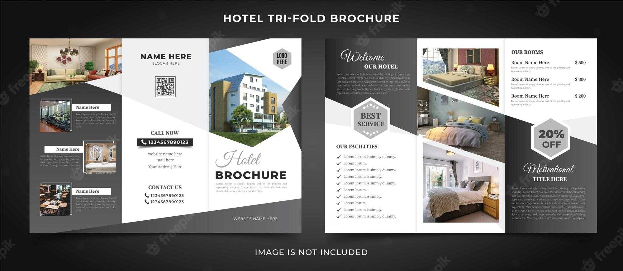
Readers skim before they read. Use a logical flow: start with an attention‑grabbing cover, then an overview of the hotel, followed by rooms, amenities, dining, events, and finally contact information. White space is not a mistake; it’s a breath of fresh air for the eyes.
Typography That Speaks Volumes
Pick two complementary fonts: one for headings (bold, luxurious) and one for body copy (clean, readable). Avoid using more than three font families, and keep font sizes consistent—usually 12‑14 pt for body text and larger for headings.
Color Palette That Reflects Your Brand
If your brand is ocean‑blue and sea‑foam green, use those hues strategically. Complementary colors can highlight calls to action (CTAs) like “Book Now” buttons. Use contrast wisely to ensure text remains legible against background images.
Choosing the Right Template: A Comedy of Errors Avoided

Templates are like ready‑made pizza dough: they save time, but you still need to add the toppings. Selecting the wrong template can lead to a design disaster faster than you can say “room service.” Here’s how to pick the perfect match without pulling your hair out.
Know Your Audience
Luxury travelers expect sleek, minimalist designs with gold accents, while family‑oriented resorts thrive on playful colors and whimsical illustrations. Align the template’s vibe with the demographics you’re courting.
Match the Format to the Distribution
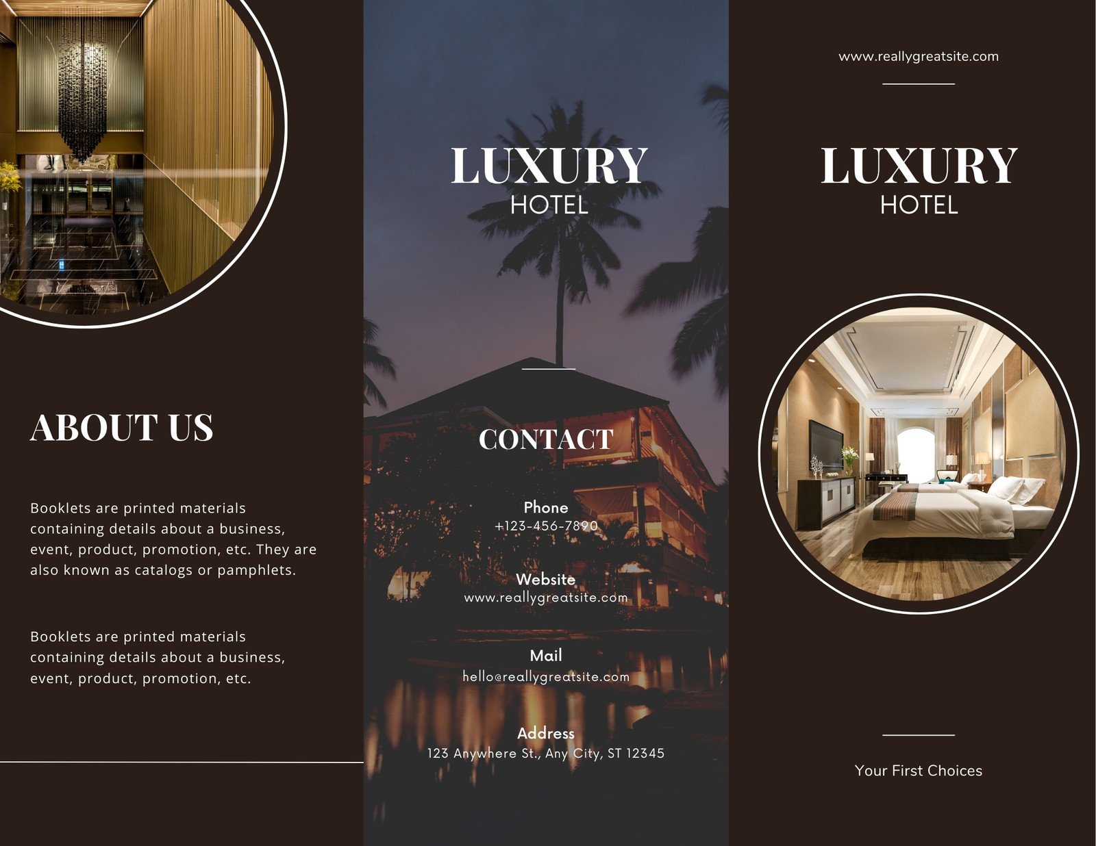
Are you printing a trifold that will sit on a reception desk, or a digital PDF that will be emailed to corporate clients? Trifold templates often require concise copy and bold visuals, whereas digital brochures can include interactive elements like clickable links and embedded videos.
Flexibility and Customization
Pick a template that lets you move sections around, change colors, and swap fonts without breaking the layout. Rigid templates are like a tuxedo that only fits one body type—uncomfortable and unflattering.
Check for Mobile Responsiveness
Even printed brochures get photographed and shared on phones. Ensure the design looks good when zoomed in, and that any QR codes are large enough to scan without a microscope.
Step‑by‑Step Guide to Customizing a Hotel Brochure Template

Now that you’ve selected the ideal template, it’s time to roll up your sleeves, put on your design cape, and turn that blank canvas into a guest‑magnet. Follow these steps for a foolproof customization process.
Step 1: Gather All Assets
Collect high‑resolution photos, brand guidelines (logo files, color codes, font files), and copy drafts. Organize them in clearly labeled folders—“hero‑image,” “room‑photos,” “spa‑icons,” etc.—to avoid the classic “Where did I save that picture of the pool?” panic.
Step 2: Set Up Your Document
Open your design software (Canva, Adobe InDesign, or even PowerPoint if you’re feeling adventurous) and set the page size to the final printed dimensions, accounting for bleed (usually an extra 0.125 in on all sides). This prevents white edges after trimming.
Step 3: Replace Placeholder Images
Swap out the template’s stock photos with your own. Use the “fit” option to avoid stretching, and align images with the grid lines for a polished look. Remember to keep the focal point of each photo centered to avoid awkward cropping.
Step 4: Insert Your Copy
Paste your pre‑written copy into the appropriate text boxes. Adjust line spacing (1.15‑1.5) for readability, and ensure there’s sufficient contrast between text and background. If the template’s default font doesn’t match your brand, replace it now.
Step 5: Fine‑Tune Colors and Branding Elements
Apply your brand’s primary and secondary colors to headings, icons, and CTA buttons. Insert your logo on the cover and back page, making sure it’s at least 0.5 in wide for clear visibility.
Step 6: Add Interactive Features (Digital Only)
For PDFs, embed clickable links that open your booking engine, social media pages, or a virtual tour. Include QR codes that lead to exclusive offers—just be sure they’re at least 1 in square for easy scanning.
Step 7: Proofread, Proofread, Proofread
Even the most meticulous designers miss a typo. Run a spell‑check, read the copy aloud, and ask a colleague to review. A single misspelled word (“pillow” vs. “pillow”) can ruin the credibility you worked so hard to build.
Step 8: Export in the Right Format
For print, export as a high‑resolution PDF with CMYK color mode and 300 dpi. For digital, use an RGB PDF or an interactive HTML version if your platform supports it. Double‑check that all fonts are embedded to avoid substitution nightmares.
Common Mistakes and How to Dodge Them

Even seasoned marketers stumble into pitfalls. Here’s a quick cheat sheet of the most frequent blunders and the witty ways to sidestep them.
Overcrowding the Page
Less is more. If you cram every amenity onto a single page, readers will feel like they’re in a cramped economy seat. Use bullet points, icons, and whitespace to break up information.
Using Low‑Resolution Images
Pixelated pictures scream “budget motel,” not “luxury resort.” Always choose images at least 300 dpi for print. If you must use a lower‑resolution image, upscale it with a smart algorithm—don’t just stretch it.
Ignoring Accessibility
Color‑blind guests might miss a crucial CTA if you rely solely on red text. Pair color cues with icons or bold fonts to ensure everyone can navigate your brochure effortlessly.
Forgetting Contact Details
A stunning brochure without a phone number, email, or website is like a delicious cake without frosting—still good, but missing the finishing touch. Place contact info prominently on the back page.
Choosing the Wrong Paper Stock
Glossy paper works wonders for high‑glam hotels, while matte finishes lend a sophisticated, understated vibe. The wrong paper can make your design look cheap or, conversely, overly flashy.
Printing and Distribution Tips for Maximum Impact

Even the most dazzling design can fizzle out if printed poorly or distributed incorrectly. Follow these guidelines to ensure your brochure reaches the right eyes in pristine condition.
Select a Reputable Printer
Look for printers that specialize in marketing collateral, offer color proofs, and have experience with high‑quality finishes. Request a sample before committing to a large run.
Choose the Right Finish
UV coating adds a glossy, durable surface perfect for high‑traffic locations, while soft‑touch coating provides a velvety feel that guests love to run their fingers over. Match the finish to your brand personality.
Determine Quantity Wisely
Print enough to stock the front desk, conference rooms, local travel agencies, and nearby attractions. Over‑printing ties up budget, while under‑printing leaves you scrambling for flyers at the last minute.
Strategic Placement
Leave brochures in high‑visibility spots: lobby tables, elevator interiors, partner cafés, and even on the back of receipts. The more places guests can pick them up, the higher the chance of a booking.
Track ROI
Insert a unique promo code or QR code on the brochure and monitor how many bookings come from that source. This data helps you gauge the effectiveness of your design and distribution strategy.
Digital Alternatives: When Paper Isn’t King

Not every hotel wants to print a mountain of brochures—especially eco‑friendly boutique inns. Here’s how to translate your printed masterpiece into a digital delight.
Interactive PDFs
Embed clickable links, videos, and slide‑shows. Use a clean layout that mirrors the print version, but add animation sparingly to avoid overwhelming the reader.
Online Flipbooks
Convert your PDF into a flipbook that simulates page turning. This format works well on hotel websites and social media, offering an engaging, mobile‑friendly experience.
Email Campaigns
Attach a lightweight version of your brochure to newsletters or send a link to an online version. Include a bold CTA button that stands out in the inbox.
Social Media Teasers
Create carousel posts that showcase each page of the brochure as individual images. Add captions that tease the full version, prompting followers to click through to your booking page.
Tools of the Trade: Where to Find the Best Templates

If you’re wondering where to snag a high‑quality template without a PhD in design, here’s a quick rundown of platforms that offer both free and premium options, each with a library of hotel‑focused layouts.
Canva
Canva provides drag‑and‑drop simplicity, a plethora of hotel‑themed templates, and the ability to collaborate in real time. Perfect for marketing teams that need quick turnarounds.
Adobe InDesign
For designers who crave total control, InDesign offers advanced typography, precise grid systems, and professional output settings. It’s the gold standard for high‑end print projects.
Envato Elements
A subscription service that grants unlimited access to thousands of premium templates, stock photos, and icons. Ideal for agencies handling multiple hotel brands.
Microsoft PowerPoint
Surprisingly versatile for simple brochures, especially if you’re on a tight budget. Use its built‑in slide master to maintain consistency across pages.
Frequently Asked Questions
Here are the most common queries that pop up when hoteliers dive into brochure creation, answered with a sprinkle of humor and a dash of practicality.
How many pages should a hotel brochure have?
Typically, a trifold has six panels (three on each side), which is enough space to showcase your brand story, rooms, amenities, and contact info without overwhelming the reader. If you have more content, consider a multi‑page booklet.
Can I use the same brochure for both print and digital?
Yes, but you’ll want to tweak a few elements. For digital, add clickable links and make sure any QR codes are large enough to scan on a screen. For print, double‑check bleed, trim lines, and color mode (CMYK).
Do I need a professional photographer?
While a smartphone can produce decent images, a professional photographer ensures consistent lighting, composition, and resolution—critical for a luxurious look. If budget is tight, consider hiring a freelancer for a few key shots.
How often should I update my brochure?
Refresh your brochure at least once a year or whenever you renovate rooms, add new amenities, or rebrand. Stale content can mislead guests and damage credibility.
What paper weight is ideal?
For a premium feel, choose 300‑350 gsm (grams per square meter) for the cover and 200‑250 gsm for interior pages. This provides durability without feeling like a brick.
Conclusion: Your Blueprint to Brochure Brilliance
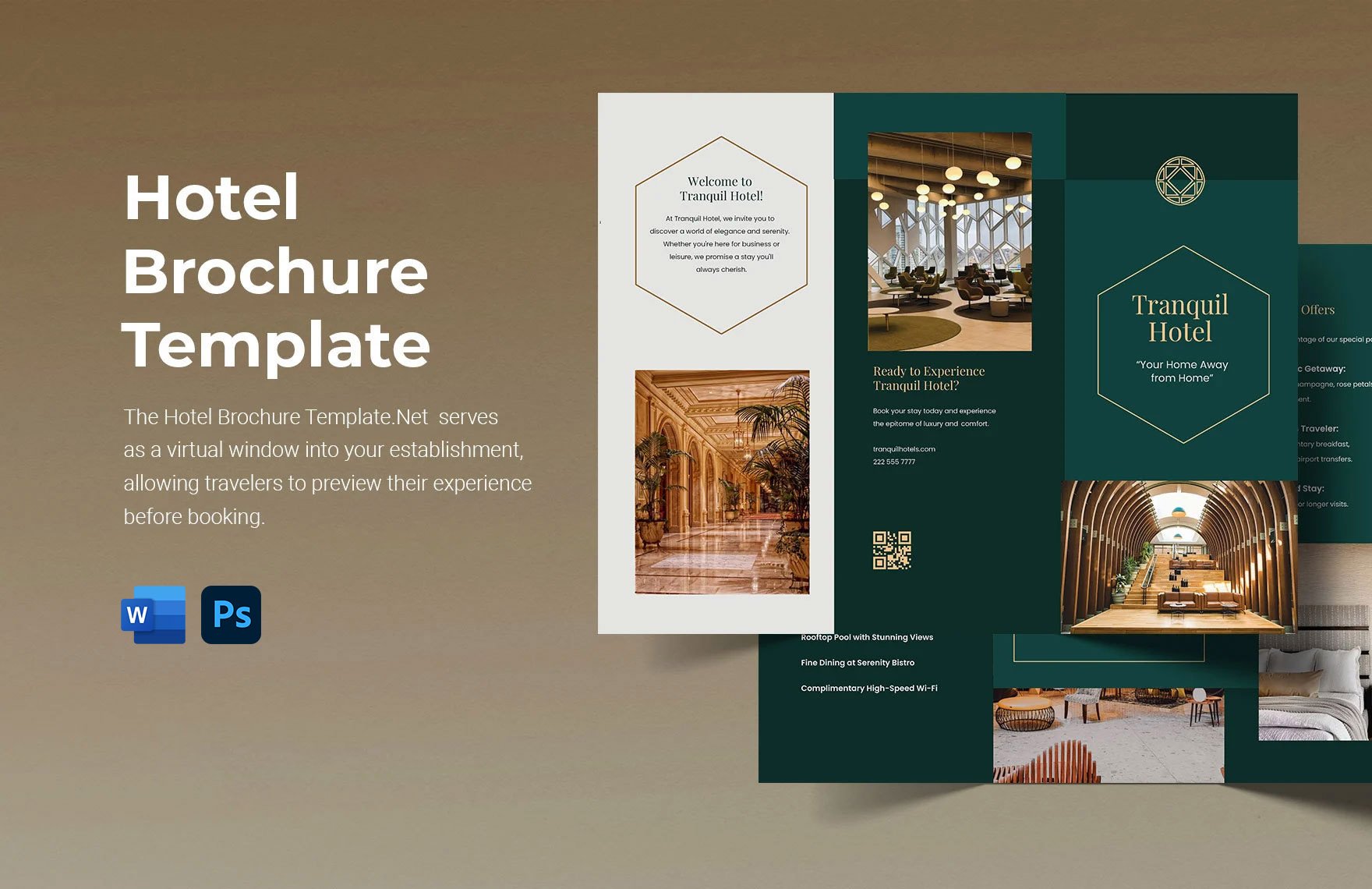
Creating a knockout Hotel Brochure Design Template is part art, part science, and a whole lot of fun if you approach it with the right mindset. By understanding your audience, selecting the perfect template, customizing every element with high‑quality assets, and avoiding common pitfalls, you’ll produce a brochure that not only looks stunning but also drives bookings like a magnet. Remember to proofread, test your print and digital versions, and track performance with unique codes or QR scans. With these strategies in your marketing toolbox, your hotel will stand out on the shelf, in the inbox, and in the hearts of travelers everywhere. Happy designing, and may your brochures always be as full of guests as your lobby on a sunny Saturday morning.