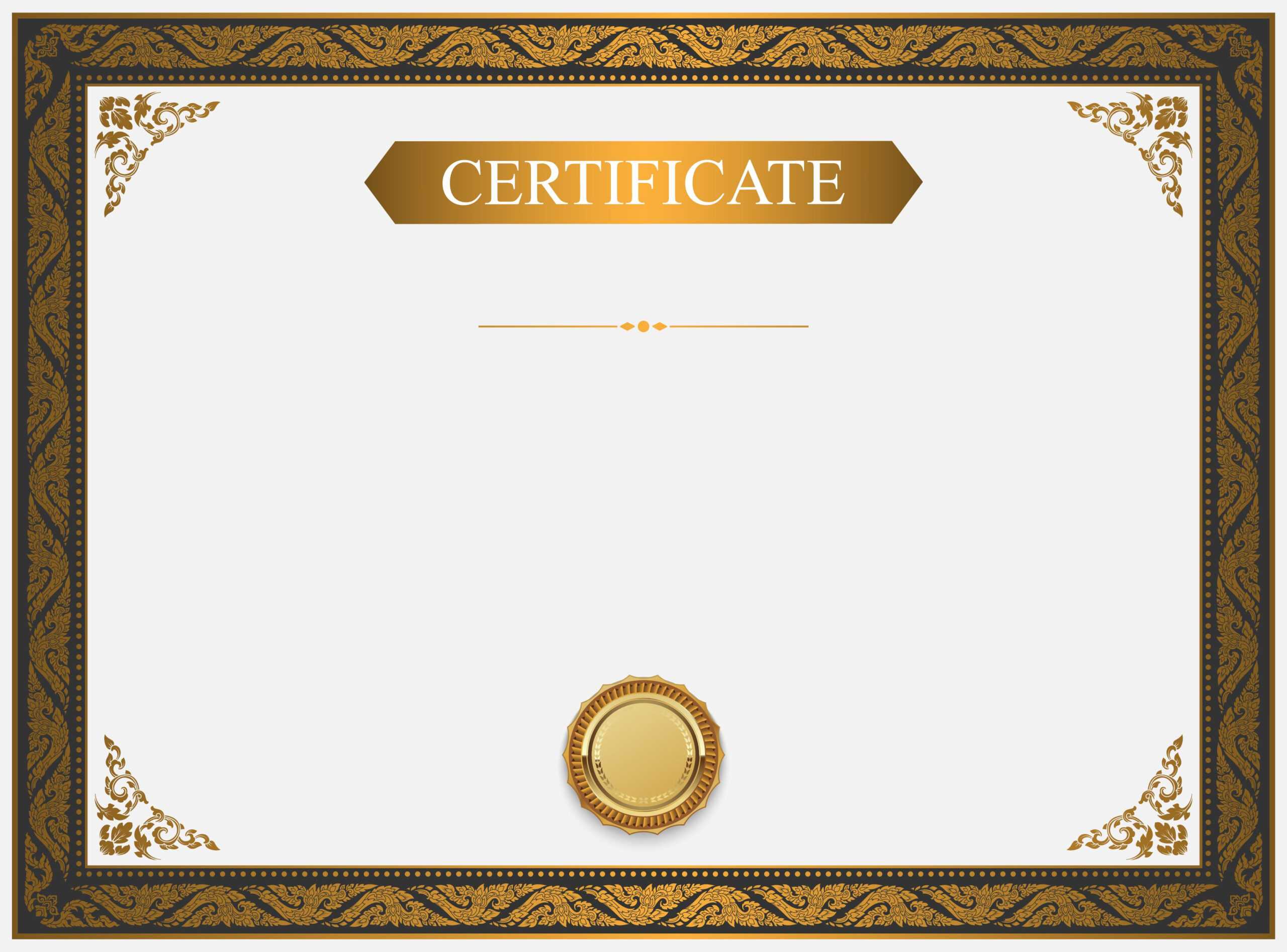
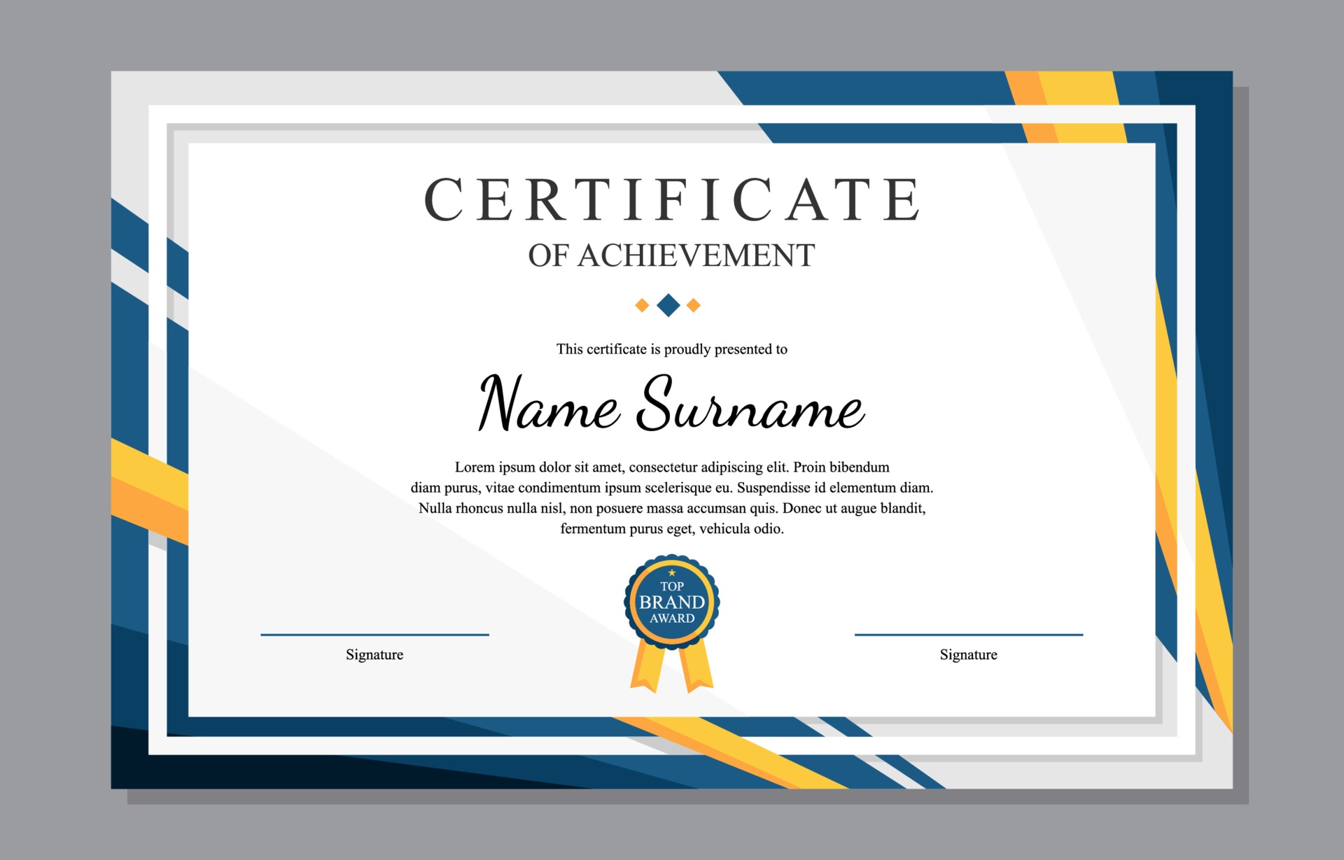
Certificate Border Design Templates are the unsung heroes that turn a bland piece of paper into a masterpiece that even your grandma would frame and proudly display on the fridge, alongside that macaroni art masterpiece from 1998. In this wildly entertaining guide, we’ll dive into the wacky world of borders, explore why they matter more than your morning coffee, and hand you a treasure chest of actionable tips so you can create certificates that scream “I’m official!” without actually shouting.
Why Borders Matter More Than Your Aunt’s Advice
Everyone has that one aunt who insists on giving unsolicited life advice, like “you should eat more carrots” or “never trust a man in a three‑piece suit.” Borders, on the other hand, are the polite, stylish way of saying “I’m serious about this achievement.” A well‑crafted border frames the content, adds gravitas, and can even hide a few ink smudges—because let’s face it, no one wants to see the evidence of a frantic pen attack.
Here are three psychological perks of a good border:
- Authority Boost: A regal frame makes the text inside feel like it belongs in a museum, not a printer jam.
- Visual Hierarchy: It directs the reader’s eye to the most important information, like the recipient’s name, without needing a neon sign.
- Emotional Impact: A fancy border can evoke pride, nostalgia, or even a gentle giggle, depending on the style you choose.
Types of Certificate Borders That Make Your Diploma Look Like a Royal Decree

Not all borders are created equal. Some are as subtle as a whisper, while others shout louder than a marching band at a silent auction. Below, we break down the major families of border designs and the personalities they embody.
Classic Ornamental
Think Victorian lace, scrollwork, and filigree that would make Queen Victoria raise an eyebrow. These borders are perfect for academic honors, professional certifications, and any occasion where you want to channel a touch of old‑world elegance.
Modern Minimalist
Sleek lines, geometric patterns, and a generous amount of whitespace. Minimalist borders are the go‑to for tech certifications, startup achievements, or when you want your certificate to look like it was designed by a robot with a taste for style.
Playful & Whimsical
Cartoon clouds, confetti bursts, and doodles that look like they were drawn by a well‑trained hamster. These are ideal for kids’ awards, community events, or any scenario where you want to sprinkle a bit of joy onto the accomplishment.
Vintage & Grunge
Distressed textures, parchment‑like backgrounds, and borders that look like they’ve survived a few decades of attic storage. Great for retro-themed events, artistic accolades, or certificates that need to say “I’m cool, but I also have a sense of history.”
Themed Borders
From nautical rope designs for sailing clubs to laurel wreaths for sports trophies, themed borders let you match the visual language of the event. They’re like costume parties for your certificate—everyone’s invited, but only the right outfit fits.
How to Choose the Perfect Border for Your Occasion

Selecting the right border is akin to choosing the perfect outfit for a first date; you want to impress without overdoing it. Follow this decision‑making flowchart (in your mind, not an actual flowchart) to avoid fashion faux pas for your paper.
Identify the Audience
If your recipients are corporate executives, lean towards classic ornamental or modern minimalist. For school kids, go whimsical. For art collectives, vintage or themed works shine.
Match the Tone of the Achievement
A high‑stakes certification (think “Certified Cloud Architect”) deserves a clean, professional border. A community volunteer award can sport a friendly, hand‑drawn border that says, “We see you, and we thank you.”
Consider the Printing Method
Inkjet printers love fine lines but can struggle with heavy embossing textures. Laser printers handle bold, dense patterns with ease. If you plan to print on textured cardstock, choose a border that doesn’t get lost in the background.
Think About Color Psychology
Gold and bronze evoke prestige, blue conveys trust, green hints at growth, and bright colors like orange or pink bring energy. Choose a color palette that aligns with the emotions you want to invoke.
Step‑by‑Step Guide to Customizing a Border Template

Now that you know what you want, let’s roll up those sleeves and get hands‑on. Below is a foolproof process that works whether you’re a design guru or someone who once used Paint to draw a stick figure.
Step 1: Pick a Template Platform
There are countless free and premium platforms offering Certificate Border Design Templates. Look for one that offers editable layers, vector formats, and a user‑friendly interface. A good platform will let you tweak every curve without needing to speak fluent SVG.
Step 2: Download the Template in the Right Format
Preferably choose a vector file (AI, EPS, or SVG). Vectors scale without pixelation, meaning you can print a tiny pocket‑size certificate or a massive wall‑mounted award without losing crispness.
Step 3: Open the File in Your Design Software
Adobe Illustrator, Affinity Designer, or the free Inkscape are excellent choices. If you’re a Canva fan, look for a PNG with a transparent background and layer it over your design.
Step 4: Adjust Colors and Line Weights
Swap out the default colors for your brand palette or the event’s theme. Thicken thin lines if you’re printing on coarse cardstock, or thin them for a sleek, modern look. Remember: less is more, unless you’re going for “extravagant”.
Step 5: Insert Your Content
Place the recipient’s name, award title, date, and signature fields inside the safe zone—usually indicated by a dotted line or a subtle background shade. Keep the text centered and use fonts that complement the border style (serif for classic, sans‑serif for modern, playful script for whimsical).
Step 6: Add Finishing Touches
Consider subtle embellishments like a watermark, a faint gradient, or a tiny icon that matches the achievement (a tiny gear for engineering, a paintbrush for arts). Don’t go overboard; you want the border to star, not the extra glitter.
Step 7: Export for Print
Export as PDF/X‑1a or high‑resolution PNG. Set the resolution to at least 300 dpi for crisp results. If you’re printing on specialty paper, consult your printer’s guidelines for bleed and margin settings.
Step 8: Proof and Print
Print a single test copy. Check alignment, color accuracy, and readability. Adjust as needed, then unleash the full batch. Celebrate with a victory dance; you’ve just turned a plain sheet into a masterpiece.
Free vs Premium: The Great Border Debate
Free templates are like the free samples at a grocery store—great for a quick taste but often limited in flavor. Premium templates, however, are the artisanal cheeses of the design world: richer, more refined, and usually backed by professional support.
Advantages of Free Templates
- Cost‑effective for small budgets.
- Quick to access and often come with basic customization.
- Great for testing ideas before committing.
Advantages of Premium Templates
- Higher resolution and more intricate designs.
- Fully editable layers, giving you full creative control.
- Exclusive design assets and priority customer support.
- Licensing that allows commercial use without legal headaches.
Decision Matrix
If you’re designing a one‑off certificate for a local club, free is perfectly fine. If you’re a business creating a brand‑wide certification program, the investment in premium templates pays off in professionalism and time saved.
Tips for Printing and Displaying Your Certificate

Even the most dazzling border can fall flat if the printing or display is mishandled. Follow these pro tips to keep your certificates looking like they belong in a trophy case, not a cafeteria fridge.
Select the Right Paper Stock
Heavyweight cardstock (around 80–110 lb) offers durability and a luxurious feel. For a vintage vibe, try linen‑textured paper; for a modern look, go matte or glossy depending on the border’s style.
Mind the Bleed
Set a bleed margin of at least 0.125 inches (3 mm) around the edges to prevent white borders after trimming. Most print shops require this, and it ensures your decorative edge runs right to the edge of the paper.
Color Calibration
If you’re printing at home, calibrate your monitor and printer to match colors accurately. For professional printing, request a proof copy before the full run.
Lamination and Framing
Lamination protects against spills, fingerprints, and the occasional office coffee splash. Alternatively, frame the certificate behind glass for a museum‑worthy presentation. Choose a frame style that compliments the border—gold frames for classic designs, sleek metal for modern ones.
Digital Distribution
Not every award needs a physical copy. Export a high‑resolution PDF for emailing, or generate a PNG for sharing on social media. Keep the border intact by preserving the transparent background if the design calls for it.
Common Mistakes and How to Avoid Them

Even seasoned designers stumble. Here’s a cheat sheet of pitfalls and the antidotes to keep your certificates flawless.
Overcrowding the Design
Resist the urge to cram every decorative element you can find. A cluttered border competes with the recipient’s name, diluting the impact. Stick to one primary style and use secondary elements sparingly.
Ignoring Legibility
If your border is so intricate that it makes the text look like a jumbled mess, you’ve lost the battle. Ensure sufficient contrast between text color and background, and maintain a clear safe zone.
Using Low‑Resolution Images
Pixelated borders scream “I made this in MS Paint.” Always use vector files or high‑resolution raster images (300 dpi minimum) to keep edges crisp.
Wrong Color Profiles
Printing in RGB can result in unexpected colors. Switch to CMYK mode when preparing files for print to ensure colors appear as intended.
Neglecting Proofreading
Even the prettiest border won’t save a typo in the recipient’s name. Double‑check all textual content, dates, and titles before finalizing.
Conclusion

In the grand saga of certificate creation, Certificate Border Design Templates are the unsung protagonists that turn ordinary acknowledgment into a work of art worthy of applause, framing, and perhaps even a spot on the mantelpiece. By understanding the types of borders, aligning them with your audience, mastering the customization process, and printing with precision, you’ll produce certificates that make awardees beam with pride and maybe even brag a little on social media. So go forth, pick your favorite border style, and let every achievement be wrapped in the perfect visual hug—because every success deserves a border that says, “You did it, and we look fabulous doing it.”