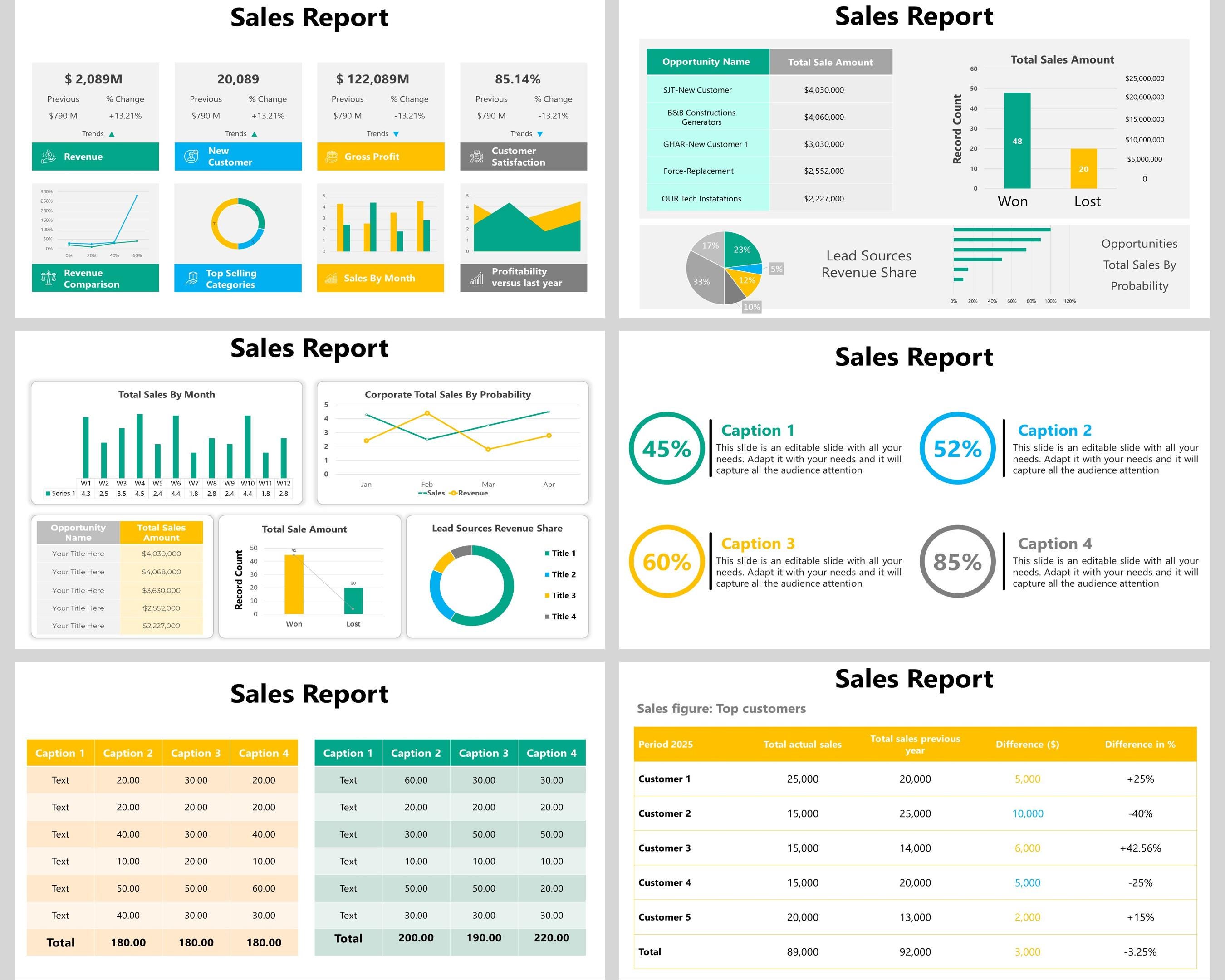
Sales Report Template Powerpoint is a powerful tool that transforms raw sales data into clear, actionable insights, enabling teams to make informed decisions quickly and confidently.
Why a Structured Sales Report Matters

In today’s fast-paced business environment, stakeholders demand concise yet comprehensive snapshots of sales performance. A well‑crafted PowerPoint report delivers that balance, presenting metrics in an engaging visual format that facilitates discussion and strategy development. Without structure, data can overwhelm; with structure, it illuminates trends, highlights opportunities, and identifies areas for improvement.
Key Performance Indicators Every Sales Team Should Track

Revenue and Growth Metrics
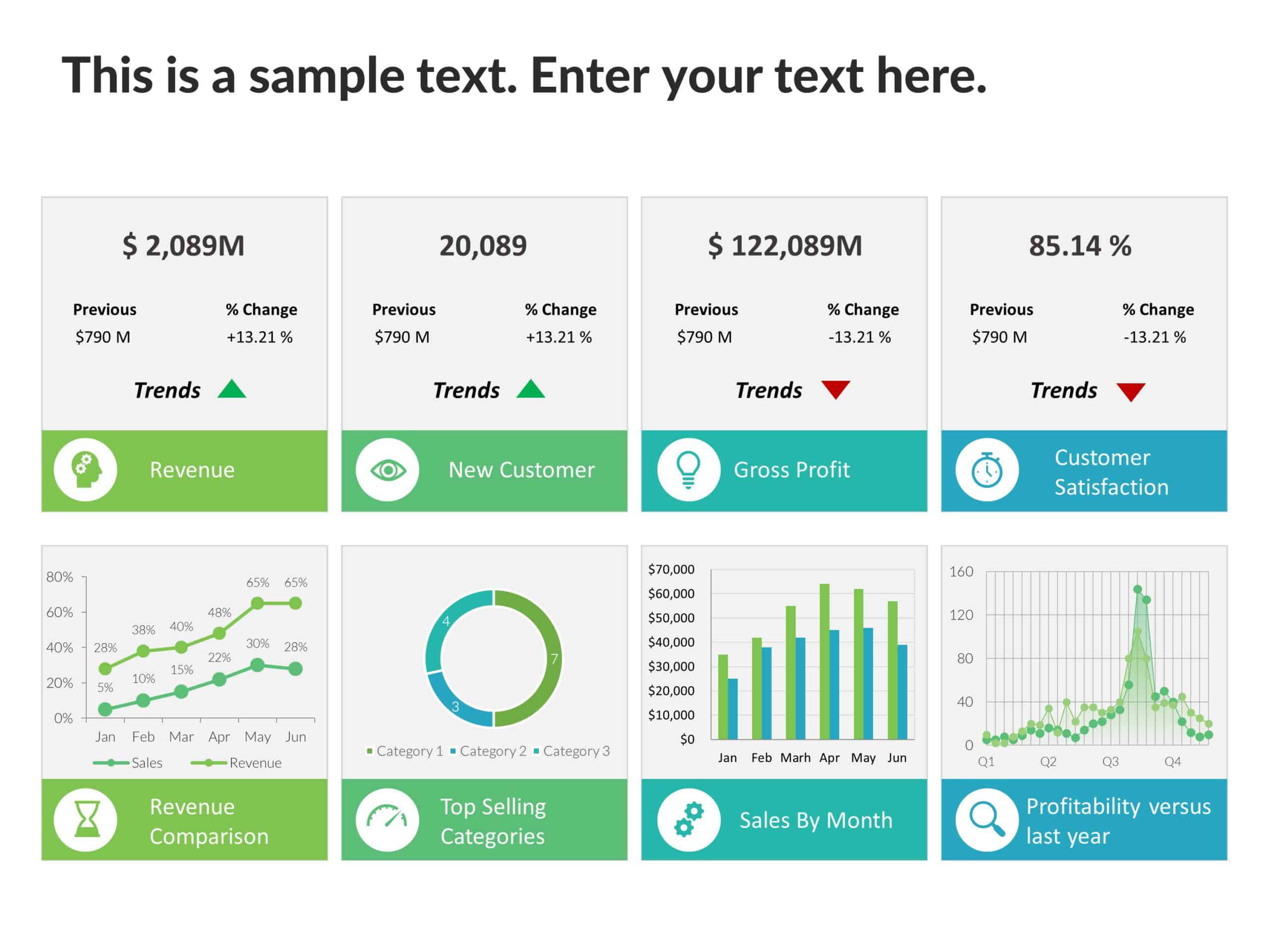
Start with the most fundamental KPI: total sales revenue. Track month‑over‑month and year‑over‑year growth to gauge overall momentum. Include a visual trend line that shows seasonal fluctuations and highlights any spikes or drops.
Sales Pipeline Health
Showcase the pipeline by segmenting opportunities into stages—lead, prospect, qualified, proposal, and closed. A funnel chart can immediately reveal bottlenecks and the conversion rates at each step, helping sales managers prioritize resources.
Conversion Rates and Average Deal Size
Display conversion rates from leads to customers, as well as the average deal size per product line. These metrics help determine whether pricing strategies or sales tactics need refinement.
Quota Attainment and Target Achievement
Present each team member’s performance against their individual or regional quota. Color‑coding can quickly identify who is overachieving and who may need additional support.
Customer Acquisition Cost (CAC) and Lifetime Value (LTV)
Balancing CAC against LTV is critical for sustainable growth. Use a dual‑axis chart to compare these figures over time, illustrating the return on investment for each acquisition channel.
Design Principles That Elevate Your PowerPoint

Consistency in Color and Typography
Choose a color palette that reflects your brand and maintain it throughout the deck. Consistent font families and sizes prevent visual distraction and reinforce a professional aesthetic.
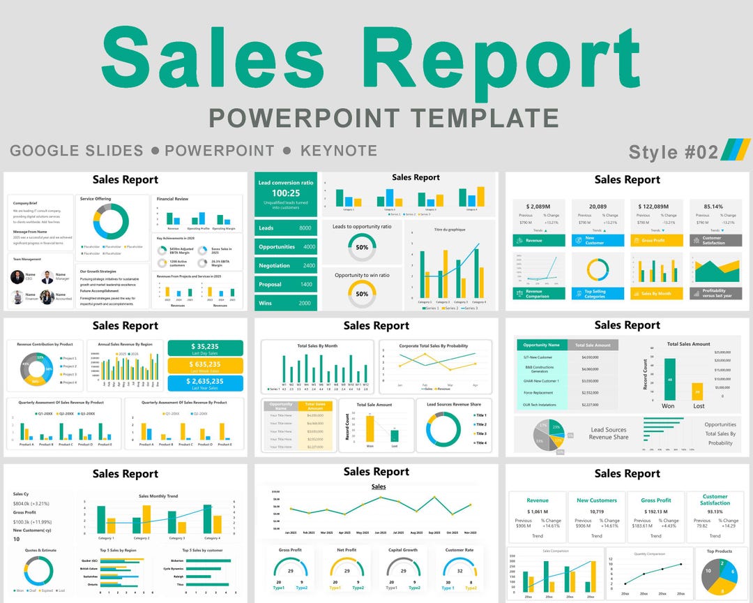
Use of Data Visualizations
- Bar and Column Charts for comparative sales figures across regions or product categories.
- Line Graphs for trend analysis over multiple periods.
- Pie Charts to represent market share or product mix percentages.
- Waterfall Charts to illustrate how different factors contribute to net revenue.
- Heat Maps for geographic sales density.
Minimalist Layouts with Strategic White Space
Cluttered slides dilute impact. Keep each slide focused on a single message. Leave ample white space around key data points so the eye can rest and absorb the information.
Incorporating Storytelling Elements
Every slide should contribute to a larger narrative. Begin with the current state, progress through challenges, and finish with actionable recommendations or next steps. Storytelling turns static data into a compelling business case.
Step‑by‑Step Guide to Building Your Sales Report Template

Step 1: Gather and Clean Your Data
Compile sales data from CRM, spreadsheets, and financial systems. Remove duplicates, correct inconsistencies, and ensure all timestamps align for accurate period comparisons.
Step 2: Define Your Slide Structure
Outline the deck in a logical sequence:
- Cover slide with title, date, and presenter.
- Executive summary highlighting key takeaways.
- Revenue overview and growth analysis.
- Pipeline health and conversion rates.
- Regional and product breakdowns.
- Quota attainment.
- Cost vs. value metrics (CAC & LTV).
- Action items and next steps.
Step 3: Populate Slides with Visuals
Insert charts directly from Excel or use PowerPoint’s native chart tools. Link data tables to enable dynamic updates whenever new data is imported.
Step 4: Add Narrative Text and Calls to Action
Accompany each visual with concise bullet points that explain what the data shows and why it matters. Conclude with clear next steps, such as “Increase outbound leads by 15%” or “Allocate additional budget to the top‑performing region.”
Step 5: Review and Iterate
Ask a colleague to review for clarity and accuracy. Test the deck on multiple devices to ensure compatibility and readability. Iterate based on feedback before final distribution.
Real‑World Examples of Effective Sales Report PowerPoint Templates

Case Study 1: SaaS Company Boosts Renewal Rates
A subscription‑based software firm used a quarterly sales report template that highlighted churn rates, renewal pipeline stages, and upsell opportunities. By visualizing renewal trends and overlaying them with marketing campaign timelines, the sales and marketing teams aligned efforts, resulting in a 12% increase in renewal revenue.
Case Study 2: Retail Chain Optimizes Product Mix
A national retailer leveraged a sales report deck that broke down revenue by SKU and geographic segment. Heat maps revealed underperforming products in the Northeast region, prompting a localized promotion strategy that lifted sales in that area by 8%.
Case Study 3: B2B Service Firm Reduces CAC
By comparing CAC across marketing channels in a single slide, a consulting firm identified that paid search was the most expensive yet least effective channel. Shifting budget to webinars and referral programs cut CAC by 20% while maintaining lead volume.
Common Pitfalls and How to Avoid Them

Overloading Slides with Text
Text‑heavy slides distract from the data. Keep bullet points short—ideally no more than 8 words per line—and let visuals carry the story.
Using Inconsistent Data Sources
Data from disparate systems can lead to misaligned metrics. Standardize data collection and use a single source of truth wherever possible.
Neglecting Audience Needs
Tailor the depth of detail to the audience. Executives require high‑level insights, while sales reps may need granular territory data.
Failing to Update Regularly
A static template that doesn’t refresh can misinform decisions. Set a schedule to update charts and metrics at least every reporting cycle.
Integrating Your Template into Your Sales Workflow

Automation with Data Connectors
Use tools like Power BI, Tableau, or native PowerPoint data connections to pull live data directly into slides. Automation reduces manual effort and ensures real‑time accuracy.
Collaborative Editing Platforms
Store the template in a shared workspace (e.g., SharePoint, OneDrive, Google Drive) so team members can edit, comment, and track changes in real time.
Version Control and Archiving
Maintain a version history for each reporting cycle. Archiving previous decks allows trend analysis and audit trails for compliance purposes.
Tips for Presenting Your Sales Report Effectively
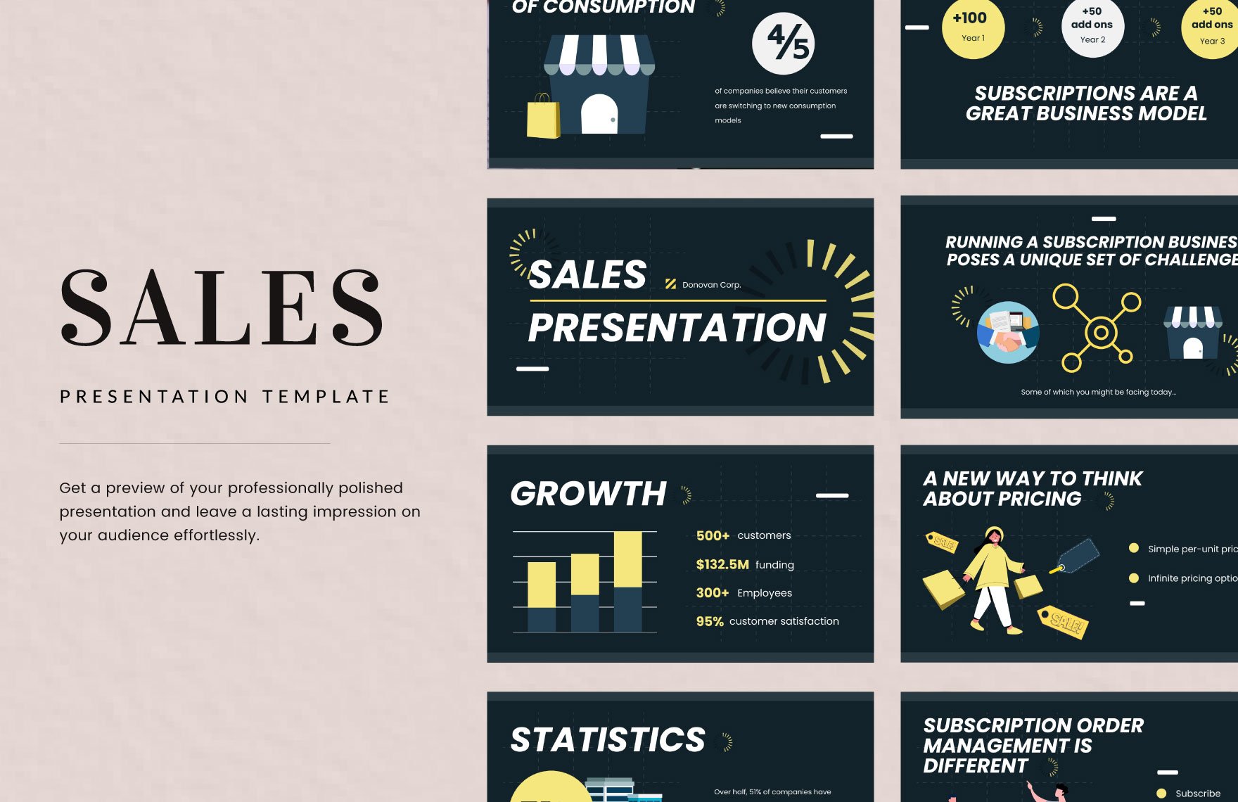
Practice a Clear Narrative
Rehearse how each slide leads into the next. Focus on the “why” behind the numbers, not just the “what.”
Engage Your Audience with Interactive Elements
Use clickable drill‑downs or embedded dashboards that let stakeholders explore deeper data layers during the presentation.
Time Your Deck
Keep the presentation concise—ideally under 20 minutes. Allocate extra time for Q&A to address stakeholder concerns.
Conclusion

Creating a Sales Report Template Powerpoint that balances clarity, visual appeal, and actionable insights is essential for driving sales performance. By defining critical KPIs, applying thoughtful design principles, following a structured build process, and integrating the deck into your sales workflow, you empower teams to make data‑driven decisions faster. Use these guidelines to transform raw data into a compelling story that informs strategy, motivates action, and ultimately accelerates revenue growth.

Related posts of "Sales Report Template Powerpoint"
